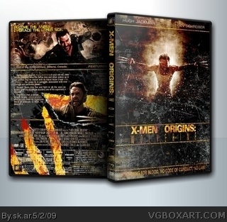
I'm a fan of the grunge look. I use it a lot myself, so I think it's a respectable art choice. However, I think the cover here is mostly grunge and little else. It just isn't that interesting to look at. I think when you use grunge to accent the artwork, that's fine, but it's almost like the design has taken a backseat to the shattered overlay effect on the cover.
The back is much better though the photos are a little under-exposed for my liking. I get what you were going for here and I can appreciate it, but it's just not taking my breath away.
 X-Men Origins: Wolverine Box Cover Comments
This is your best. 100/5 +fav.
[ Reply ]
I was waiting for you to post this one! Definately your best box yet. Fav
[ Reply ]
Thats just plain amazing. 5/5 + Fav.
[ Reply ]
Kick Ass the is amazing, Great job dude your on of the bet artist on the site.
[ Reply ]
I love you.
[ Reply ]
#5, me too.
[ Reply ]
I'm liking the semi retro feel.
[ Reply ]
Haha,eat your heart out jevan.
[ Reply ]
Ugh.... waaaaay too much grunge. It's hard to look at.
[ Reply ]
#5, sorry nothing can be done, too young:!!!
#6 euh, wrong sex???
#9 i've done worse!!!!!
#8 no he didn't have to
[ Reply ]
Too much grunge.
Try to make your designs as clean as possible, even for movies/games like this. It comes off as professional and appealing. ;)
[ Reply ]
Im a sucker for grunge, i love it, so its only natural that i love this! And i also agree this is your best.
[ Reply ]
#10, awwwww :(
Looking forward to your next ;)
[ Reply ]
Bloody awesome.
[ Reply ]
A little too much grunge for me but still awesome.
[ Reply ]
#12, Same here. EPIC.
[ Reply ]
#10, You forget your on this site with like 95% of childish children,
Anyway, ,this box does look really nice, i also like the grunge.
[ Reply ]
#17, yeah, i've notice and it's still not usual to me, but that will come, just hope not getting infected.
[ Reply ]
I'm a fan of the grunge look. I use it a lot myself, so I think it's a respectable art choice. However, I think the cover here is mostly grunge and little else. It just isn't that interesting to look at. I think when you use grunge to accent the artwork, that's fine, but it's almost like the design has taken a backseat to the shattered overlay effect on the cover.
The back is much better though the photos are a little under-exposed for my liking. I get what you were going for here and I can appreciate it, but it's just not taking my breath away.
[ Reply ]
#19, great comment thx.
[ Reply ]
wow this is pretty sick
[ Reply ]
doesnt Exactly have the MARVEL feel to it, but it is 1 of my favs XD
[ Reply ]
i :)
[ Reply ]
This is Amazing .
[ Reply ]