No.
Looks like it was made on Paint.
It looks like a background.
If the logo is yours then I give it a 3/5
10/10 was copy/pasted off another box.
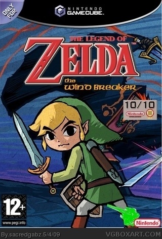
10/10 sign cover's Ganondorfs head.
PEGI is too much at the edge.
'it' does not fit the style.
Nintendo logo is too vertically streched.
I give it a 1.5/5
 The Legend of Zelda: The Wind Breaker Box Cover Comments
Ok, I know other people have done this,
but i just thought of the idea before i saw theme and I am Determined
[ Reply ]
No.
Looks like it was made on Paint.
It looks like a background.
If the logo is yours then I give it a 3/5
10/10 was copy/pasted off another box.
10/10 sign cover's Ganondorfs head.
PEGI is too much at the edge.
'it' does not fit the style.
Nintendo logo is too vertically streched.
I give it a 1.5/5
Edited at 1 decade ago
[ Reply ]
#2, Agreed apart from the Pegi.That is fine.
[ Reply ]
I agree with #2 also.
[ Reply ]