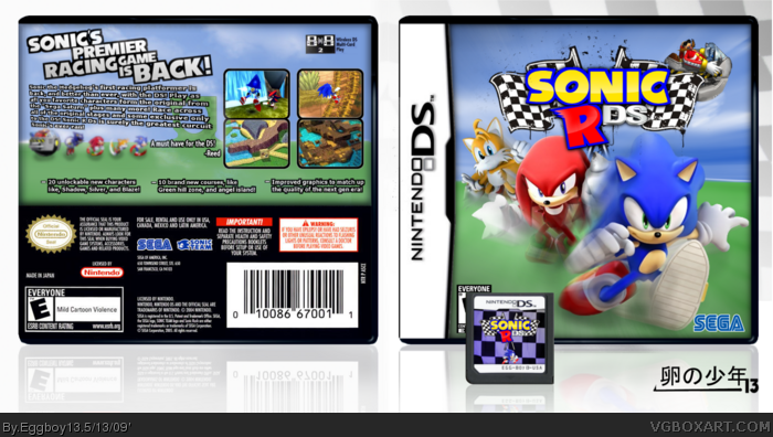
This was my entry for round one of the Midas Touch Cometition, I decided it could look good with a back, started messing around, and it came out pretty nice! ;)
--Credit--
Sonic Research for the renders
I found the temps in the database I believe
and that's all I can think of.
I like it. It has a very nice design. My only request is adding a Sega logo on the front because it just feels empty to me without it, but great box anyway :)
#4, Thanks for the tip, I've already been told about the dev logos and such when posted in the comp, I just couldn't remember to do it..
ps. I'm hoping to get my 3rd Hall with this box! :D
It's pretty nice I guess. A few grammar and punctuation issues on the back but nothing major.
I hope this never will happen though because the original game was just awful really! Horrible controls, horrible camera, everything was glitchy as hell...etc
 Sonic R: DS Box Cover Comments
This was my entry for round one of the Midas Touch Cometition, I decided it could look good with a back, started messing around, and it came out pretty nice! ;)
--Credit--
Sonic Research for the renders
I found the temps in the database I believe
and that's all I can think of.
Enjoy!
[ Reply ]
I like it. It has a very nice design. My only request is adding a Sega logo on the front because it just feels empty to me without it, but great box anyway :)
[ Reply ]
#2, Thanks, added dev and esrb.
[ Reply ]
Ah better! +fav
[ Reply ]
#4, Thanks for the tip, I've already been told about the dev logos and such when posted in the comp, I just couldn't remember to do it..
ps. I'm hoping to get my 3rd Hall with this box! :D
[ Reply ]
Cool :) i want this to happen!
[ Reply ]
ehh...it could possibly happen, but i just don't like it. The fronts ok, but the backs not that great.
[ Reply ]
i think it is hof worthy
[ Reply ]
It's pretty nice I guess. A few grammar and punctuation issues on the back but nothing major.
I hope this never will happen though because the original game was just awful really! Horrible controls, horrible camera, everything was glitchy as hell...etc
[ Reply ]
#7, What's the matter with the back?
[ Reply ]
#10, NOTHING.... Don't change one thing, this is amazing and totally HoF worthy. 100/100 + fav.
[ Reply ]
#10: like Cerium said, and it just doesn't look like it would be official...
[ Reply ]
Might I suggest removing or at least, lessening the motion blur on the front? I think it'd look even better!
[ Reply ]
What does "all you favorite characters form the origanl"? it says it on the back
[ Reply ]
#14, That made no sense... rephrase the question.
[ Reply ]
I love the design and everything! 5/5
[ Reply ]