#5, I'm guessing they meant the font? That's what I have issues with anyway. Also, I absolutely hate the background you did, just a simple filter job. I've come to notice you're good with textures, so I think you can do better with that.
Not really feeling the design as a whole, to be honest.
Hmmm I quite like the front yet I don't like the background. And though they probably can float as it is dragonball Z try and put there feet under the template maybe.
As for the back,
I really don't like the choice of font for synopsis or tagline. And the image placement is not to my liking either.
It is a good box,so don't get me wrong on that,it just needs some relatively minor improvements.
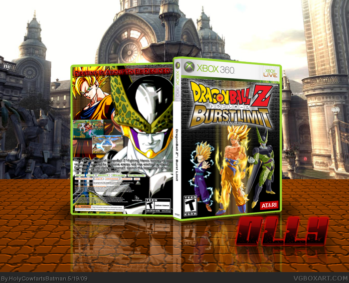
 Dragonball Z: Burst Limit Box Cover Comments
PHOTOSHOP CS4!
Haha! Took me a long time, my friend requested this and is currently using it.
I hope you enjoy,
Olly.
[ Reply ]
Very nice, except I'm not digging the text on the back. Also, the spine is for PAL boxes only but this box is NTSC.
[ Reply ]
Nice, but the BG kinda... where is it?
[ Reply ]
Not bad.
[ Reply ]
#2, That's the official back text.
[ Reply ]
Me likey likey!
+favorited boxart
+author is now favorited
[ Reply ]
#5, So? Dosen't mean its good.
[ Reply ]
#7, I try to keep my boxes as official as possible.
[ Reply ]
Very nice, loving the presentation. xD
Unfortunately, the demo never won me over with this game.
Edited at 1 decade ago
[ Reply ]
#8, You should go with what looks best.
[ Reply ]
Nice, I think its cool! :D
[ Reply ]
#9, I hate the DragonBall Z series, however, I love this game.
[ Reply ]
I like it, especially the front. The only thing I would change is the text on the back.
[ Reply ]
#5, I'm guessing they meant the font? That's what I have issues with anyway. Also, I absolutely hate the background you did, just a simple filter job. I've come to notice you're good with textures, so I think you can do better with that.
Not really feeling the design as a whole, to be honest.
[ Reply ]
#14, Do you have any ideas for a new one? I need it dark.
[ Reply ]
It's Nice!
[ Reply ]
I dont find the original effort you once had
But it still is pretty good
[ Reply ]
Hmmm I quite like the front yet I don't like the background. And though they probably can float as it is dragonball Z try and put there feet under the template maybe.
As for the back,
I really don't like the choice of font for synopsis or tagline. And the image placement is not to my liking either.
It is a good box,so don't get me wrong on that,it just needs some relatively minor improvements.
[ Reply ]
#17, Really, I worked the hardest on this one... well... it's among the hardest...
[ Reply ]
#14, yeah, I was talking about the font.
[ Reply ]
#20, Any ideas for the next font?
[ Reply ]
Yeah, after some thought I do think the front works well but the back needs to be improved alot.
Look at #18 for my critique if you want.
[ Reply ]
#22, Arghh! Photoshop CS4's cocking up!
[ Reply ]
*double post*
Edited at 1 decade ago
[ Reply ]