READ FIRST
I grew up watching this movie, and to this date it's one of my all time favorite movies of all time! And I really wanted to do it justice.
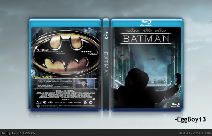
If you don't know, the front is supposed to be the (Close to) the last scene of the movie after the Joker's big party, and here comes the Bat-Wing, BANG! and here down comes batman, which I felt to be a pretty good scene to represent the box.
The BG of the front was formerly the wallpaper of TDK with the joker, I removed the joker for the fun of it and just now relised this purpose.
The back I wanted to keep very clean, dark, and simple.
--Credit--
Sentry: Template
Pretty much everyhting else was made by me, ripped from the DVD by me, or found on various websites.
Nice, my only issue is with the logos: you could try incorporating the classic 1989 logo and the classic emblem instead of the 2005 DVD one. I really dislike this "spiky" font Warner Bros used for the 2005 box set.
Well it's quite good but:
The logo on the front isn't too my liking.
I don't really know what is with the spaceship on the front.
The batman logo is on the back twice and the big one is too big.
The special features are very squashed.
If you want humour put it under satire,please,PLEASE stop with these quotes.
 Batman Box Cover Comments
READ FIRST
I grew up watching this movie, and to this date it's one of my all time favorite movies of all time! And I really wanted to do it justice.
If you don't know, the front is supposed to be the (Close to) the last scene of the movie after the Joker's big party, and here comes the Bat-Wing, BANG! and here down comes batman, which I felt to be a pretty good scene to represent the box.
The BG of the front was formerly the wallpaper of TDK with the joker, I removed the joker for the fun of it and just now relised this purpose.
The back I wanted to keep very clean, dark, and simple.
--Credit--
Sentry: Template
Pretty much everyhting else was made by me, ripped from the DVD by me, or found on various websites.
Enjoy!
Edited at 1 decade ago
[ Reply ]
I love it 5/5
[ Reply ]
Seems almost as if you should have the back as the front, and the front as the back.
[ Reply ]
Fellow B89 fan here :)
Nice, my only issue is with the logos: you could try incorporating the classic 1989 logo and the classic emblem instead of the 2005 DVD one. I really dislike this "spiky" font Warner Bros used for the 2005 box set.
[ Reply ]
Well it's quite good but:
The logo on the front isn't too my liking.
I don't really know what is with the spaceship on the front.
The batman logo is on the back twice and the big one is too big.
The special features are very squashed.
If you want humour put it under satire,please,PLEASE stop with these quotes.
[ Reply ]
I Wish you had a printable. thats all I can say.
[ Reply ]
i kinda agree with #3 about swapping them, either way it still looks great.
[ Reply ]
#6, Yeah, sorry, no printable.
[ Reply ]
Weird... I submitted this almost exactly one month before the movie's 10th birthday... o.O
[ Reply ]
#9, I mean 20th...
[ Reply ]
#1, Good job I love it.
Edited at 1 decade ago
[ Reply ]
#1 Good job I love it.
Edited at 1 decade ago
[ Reply ]