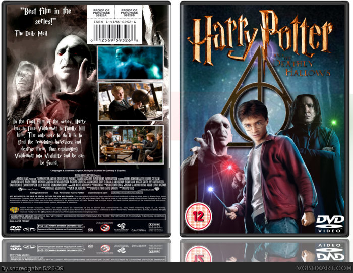
[ Box updated on May 26th, 2009 ] [ original ]
 Harry Potter and the Deathly Hallows Box Cover Comments
Comment on sacredgabz's Harry Potter and the Deathly Hallows Box Art / Cover.
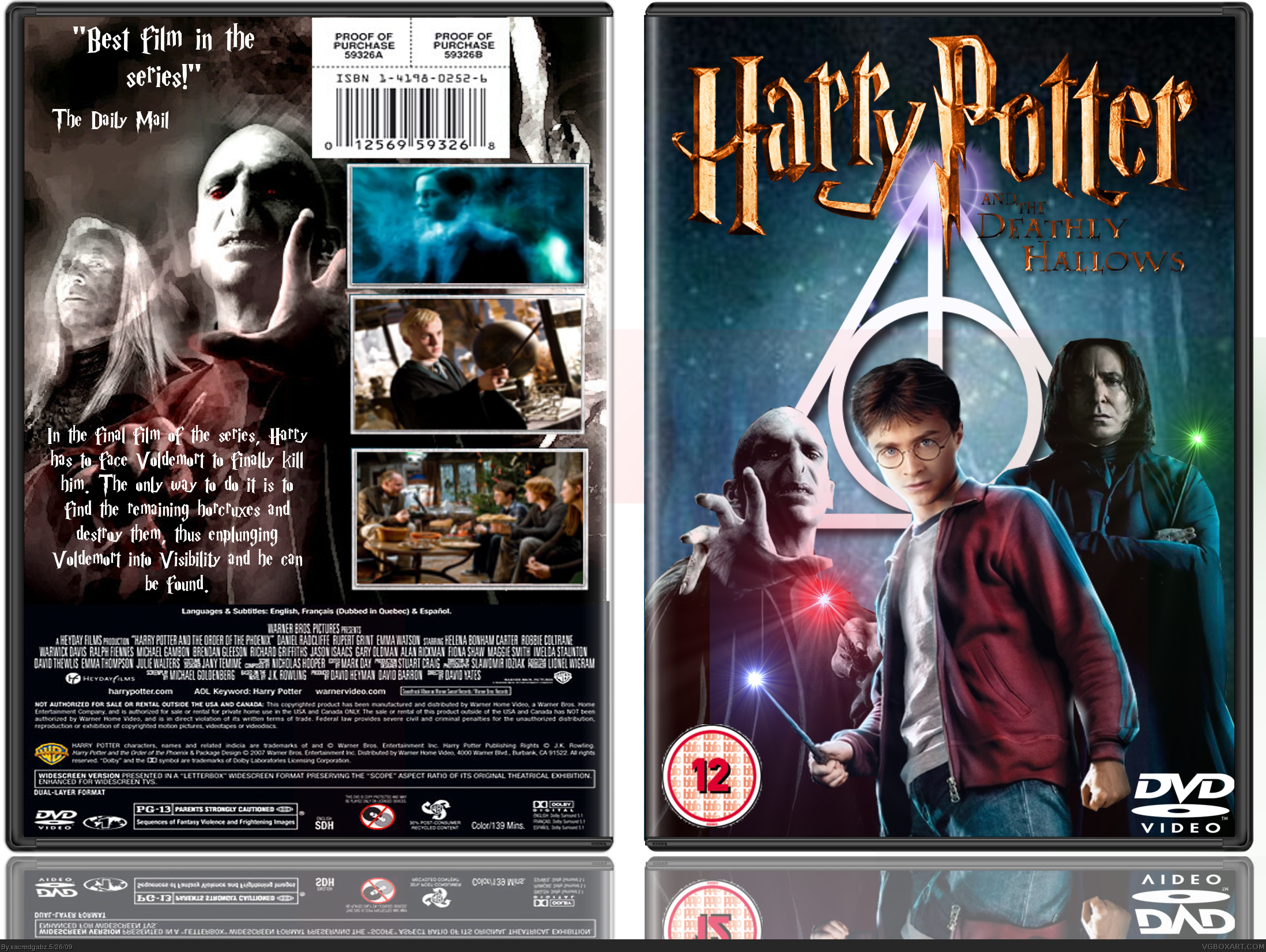
[ Box updated on May 26th, 2009 ] [ original ]
Comment on sacredgabz's Harry Potter and the Deathly Hallows Box Art / Cover.
My first Harry Potter DVD box (the other one was on blu-ray.)
I'm gonna update soon because the sign is a bit too simple
[ Reply ]
I love it!
I have sent the more grungy symbol.
Edited at 1 decade ago
[ Reply ]
Oh by the way Ray Blade for the logo and SMHS for temp
[ Reply ]
Noice!
[ Reply ]
Updated with grunge sign
[ Reply ]
Wow. Your first bearable box ;)
[ Reply ]
I like how you put the Deathly Hallows Symbol.
[ Reply ]
snakes head is cut sharp
[ Reply ]
#8, Yeah I know. Soz about that
[ Reply ]
#6- COnt.
Yeah. The back is horrible.
Why does everyone have to use the Harry Potter font for big amounts of text!
YOU CAN'T READ IT/ IT'S FREAKING HARD TO READ!
The back is picture - good, text- absolute crud.
So, after that rant, I ask that you change the text's font for the main body of the back.
[ Reply ]
#10, thats why there is such a thing as view full size, you know, the thing under the box and above
Version 2 added on 05/26/09 by sacredgabz
[ Reply ]
#11, No. It's just a box that goes with all the other non-standing out backs of Harry Potter boxes.
They're just recycling one font.
If I make a box, I get 5 different fonts that resemble what i'm designing.
I use them all and I have some for taglines, and other clear to read fonts that I use for descriptions.
Seriously. Get any majorly amazing DVD and look at it's back. It should be clear to read so people who aren't so fluent in reading find it simple and easy to read.
IT'S THE SAME FONT, from BACK TO FRONT.
And BTW:, I don't think you should be insulting my vision. I think that it should be simple and clear. Not that i'm blind. And be careful who you pick a fight with. I'm probably older than you. No threat.
Edited at 1 decade ago
[ Reply ]
love it
[ Reply ]