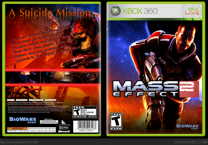
The front looks fine, but there's something about the back that makes it look lacking. I think that you could change the text down to were it's straight and not slanted.
The front looks good. The back though, isn't really. You should find a better, maybe more futuristic font and don't slant it. It'd also look better if you increased the size of the screenshots, as the borders seem too large.
#3, Thanks.
#4, Yeah, I did originally have it straight, but the box looked to empty.
#5, Yeah, you're right about the screenshots, either I do that or I make the borders smaller and, about the font, I dunno. It could look a little cheap and tacky if it looks TOO futuristic. Like say, use the halo font.
#9, Agreed. except for the logo.
Really nice front, meh back.
Try using some other border for the screenshots, and try searching a site like dafont for futuristic fonts.
Remember kids, it is always better for your box to be more than a wallpaper with the contrast turned up than it is for it to be the first for the game.
 Mass Effect 2 Box Cover Comments
I was bored.
I don't care if the back sucks. =P
[ Reply ]
I love how much attention I get.
[ Reply ]
the fronts ok, the backs not as good but i'll fav
[ Reply ]
The front looks fine, but there's something about the back that makes it look lacking. I think that you could change the text down to were it's straight and not slanted.
[ Reply ]
The front looks good. The back though, isn't really. You should find a better, maybe more futuristic font and don't slant it. It'd also look better if you increased the size of the screenshots, as the borders seem too large.
[ Reply ]
#3, Thanks.
#4, Yeah, I did originally have it straight, but the box looked to empty.
#5, Yeah, you're right about the screenshots, either I do that or I make the borders smaller and, about the font, I dunno. It could look a little cheap and tacky if it looks TOO futuristic. Like say, use the halo font.
[ Reply ]
If you don't really care about the back, then I can't really give you any criticism.
[ Reply ]
#7, Well, I didn't say I wasn't willing to listen.
I meant I just won't change everything. Mainly because I fattened the image =P
[ Reply ]
not a big fan of the text placement and font on the back. the front looks really nice though. i just don't like how the 2 looks.
[ Reply ]
#9, It's the official logo.
[ Reply ]
#9, Agreed. except for the logo.
Really nice front, meh back.
Try using some other border for the screenshots, and try searching a site like dafont for futuristic fonts.
[ Reply ]
Can i ask where you got that john sheppard pic from?
[ Reply ]
got some spelling errors too
[ Reply ]
Remember kids, it is always better for your box to be more than a wallpaper with the contrast turned up than it is for it to be the first for the game.
[ Reply ]
#12, Bioware's website
#13, Yeah, I realised that before I posted. But I was far to tired to go on.
#14, Wouldn't dream of doing that =p
Edited at 1 decade ago
[ Reply ]
it an ok box lol plus its not gonna be rated T
[ Reply ]
#16, What's it gonna be rated then?
[ Reply ]