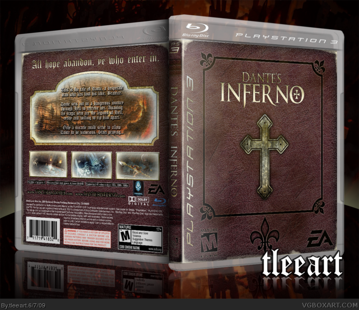
Here's my latest offering. I was inspired by KoopaDasher's Pikmin box and dmshaposv's Diablo III box. That is to say, take the subject matter and use that as the basis of the box design (Koopa) and the book design (dmshaposv). I wanted the book to look aged and weathered.
I really feel this is going to be an awesome game, I've been following its progress when I can.
For the presentation I attempted at Imandix again, I haven't used it for awhile because of how bad it screws with the image, especially text.
Stupid browser crapped out on me! Anyway @sk.ar: Unfortunately, the issues you mentioned are a result of the program I used to render it in 3D view. I might go back and make the shadow not so dark and make a embossing effect on the front.
This is very very good. A lot of subtle detail obviously went into it and I really like the classic book feel of it. I especially love the faded white border,outstanding work tleeart :)
Nice textured box, especially the front design. Back is good, although I don't like the glow much as it obscures the images especially as you haven't added any game details. Nice work.
#9, Well, this was basically a Special Edition approach to the game. I actually have a WIP of a standard edition, but I need to find some better frontal images of Dante to pull it off. Thank you so much for your critique and fav!
#13, I plan on reading it because I'm so excited for the game, it looks so good!
For everybody else, thank you so much for your comments and favs!
#18, Maybe I should do something about that. I was going for old book illustrations where you have that fading effect happening, but I guess it didn't work. I'll see about getting that out of there.
 Dantes Inferno Box Cover Comments
Hello
interresting one, but to me the with shade on the back is too big and on the front it misses some bevel effect.
it's a nice one!!
[ Reply ]
Here's my latest offering. I was inspired by KoopaDasher's Pikmin box and dmshaposv's Diablo III box. That is to say, take the subject matter and use that as the basis of the box design (Koopa) and the book design (dmshaposv). I wanted the book to look aged and weathered.
I really feel this is going to be an awesome game, I've been following its progress when I can.
For the presentation I attempted at Imandix again, I haven't used it for awhile because of how bad it screws with the image, especially text.
Let me know what you think!
[ Reply ]
Stupid browser crapped out on me! Anyway @sk.ar: Unfortunately, the issues you mentioned are a result of the program I used to render it in 3D view. I might go back and make the shadow not so dark and make a embossing effect on the front.
Edited at 1 decade ago
[ Reply ]
Nice one!
Love the book style.
[ Reply ]
#4, Thanks!
In addition, I uploaded my printable! Now you can see some of the details lost in translation to 3D.
[ Reply ]
You kill at making boxes.
5/5 FAV!
[ Reply ]
oooooh! Very cool!
[ Reply ]
This is very very good. A lot of subtle detail obviously went into it and I really like the classic book feel of it. I especially love the faded white border,outstanding work tleeart :)
[ Reply ]
Nice textured box, especially the front design. Back is good, although I don't like the glow much as it obscures the images especially as you haven't added any game details. Nice work.
[ Reply ]
It's plain in a good way.
[ Reply ]
Great job capturing the book feeling.
[ Reply ]
#3, ok, printable looks better, nice work!
[ Reply ]
I'm actually reading this book right now haha. Good job capturing the aged Gothic look.
[ Reply ]
#9, Well, this was basically a Special Edition approach to the game. I actually have a WIP of a standard edition, but I need to find some better frontal images of Dante to pull it off. Thank you so much for your critique and fav!
#13, I plan on reading it because I'm so excited for the game, it looks so good!
For everybody else, thank you so much for your comments and favs!
[ Reply ]
Very nice, it matches the game very well. Fav
[ Reply ]
This is what they were playing back in 13-15th century Italy? :)
[ Reply ]
Yes.
[ Reply ]
I love everything except for the large inner glows on the screenshots and stuff on the back.
[ Reply ]
#18, Maybe I should do something about that. I was going for old book illustrations where you have that fading effect happening, but I guess it didn't work. I'll see about getting that out of there.
[ Reply ]
Ah, I see!
Btw, I love the way you made the ESRB logo, developer logo, and the Playstation logo a part of the box. Awesome!
[ Reply ]
#20, I was hoping I wouldn't get anybody mad for doing that (some people believe that you don't mess with certain parts of a template, lol)
[ Reply ]
Can't believe this isn't in HoF.
BUMP!
[ Reply ]