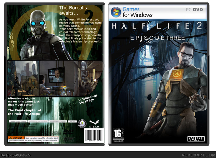
Front looks good ... maybe a bit too plain on the left? Back looks abit more rushed and the pictures don't look right with a simple black border. The blue writing doesn't work and would look better maybe white? Finally the back text could do with some sort of flashy background. Good job 8/10 :)
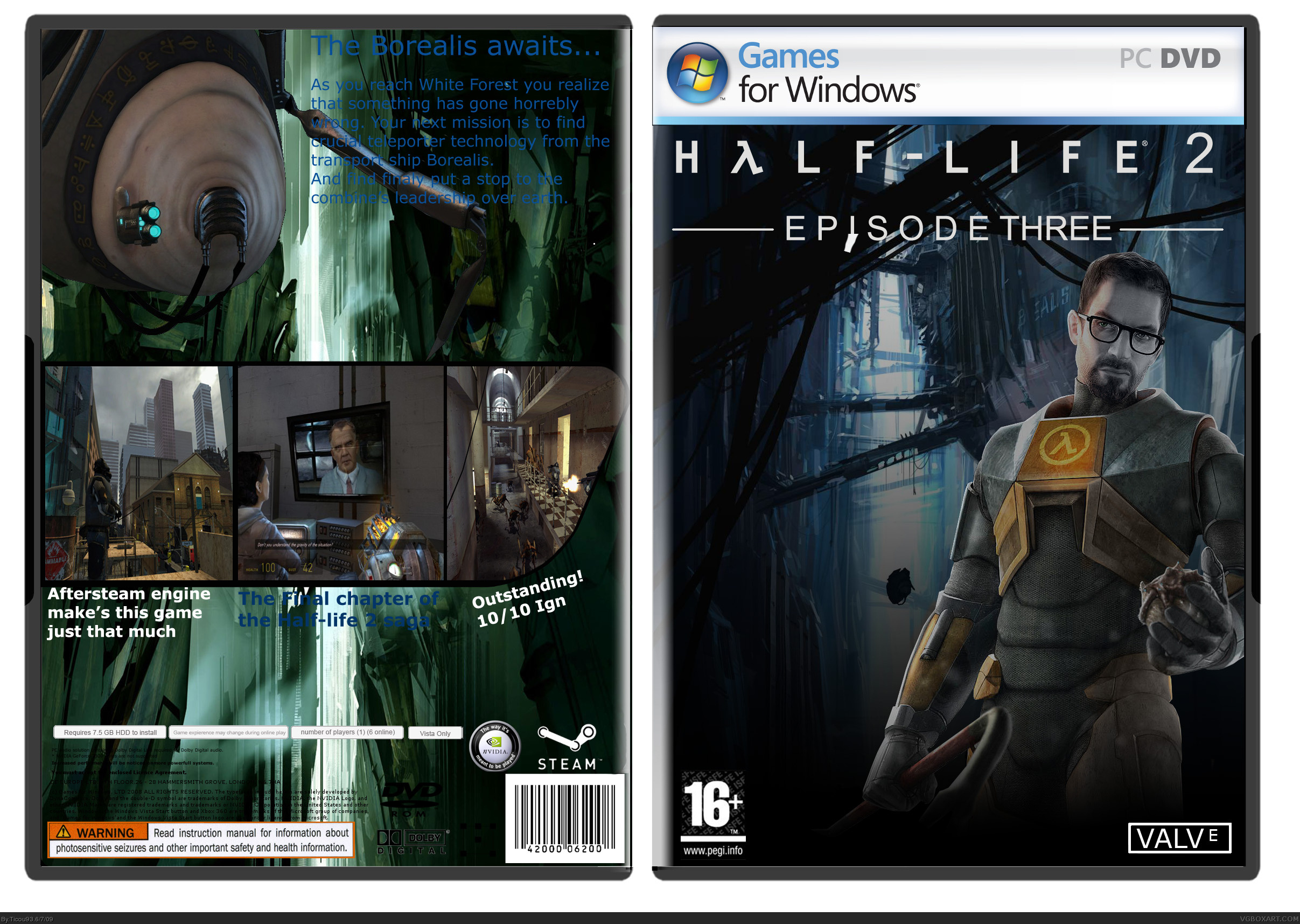
Changed color on text and replaced the
Back , also lightend the front, i have also for your informations made the acctual Episode three text and valve logo :)
The screenshots on the back are awfully streched. The front looks good but I think that Gordon Freeman should have some blue light on him. Try and recolor the very shiny parts of his body with blue. And there's a white space on the PEGI logo (Magic Eraser!).
 Half Life 2: Episode 3 Box Cover Comments
Hey guys, this is my half life 2 episode 3 box :) please tell me what you think of it
Credits to Ojoe2000 for template
[ Reply ]
Anyone?
[ Reply ]
Front looks good ... maybe a bit too plain on the left? Back looks abit more rushed and the pictures don't look right with a simple black border. The blue writing doesn't work and would look better maybe white? Finally the back text could do with some sort of flashy background. Good job 8/10 :)
[ Reply ]
Edited at 1 decade ago
[ Reply ]
#3, k ill update it soon :) thanks for advice
[ Reply ]
Changed color on text and replaced the
Back , also lightend the front, i have also for your informations made the acctual Episode three text and valve logo :)
[ Reply ]
The screenshots on the back are awfully streched. The front looks good but I think that Gordon Freeman should have some blue light on him. Try and recolor the very shiny parts of his body with blue. And there's a white space on the PEGI logo (Magic Eraser!).
[ Reply ]