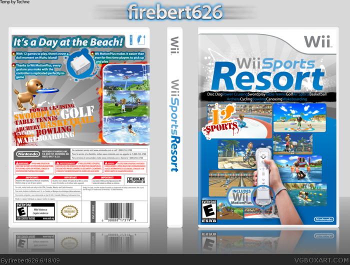
So, this is my fourth box now, and I worked on it on and off for about a week. I started off with the simplistic style that Nintendo is giving these games, but it was so boring, that after I made the "12 SPORTS" thing on the front, I wanted to do a paint splatter theme. Hope you like it, thanks.
#3, On the back with the wii motion plus thing? Theres also some issues with the qaulity of those splats behind the screens, and with the screen borders themself, but other than that you got your hands on a cool box.
Not bad, not bad. But i dont think the splatters fit that well, or the stencil back text. Maybe just more strokes out halftone patterns or just something else. Very well put together, great concept
#7 Thanks, it is mostly a concept, because if I did it more along the lines of what the actual box looks like, it would be so boring I'd hate it. Hence the variety from the traditional look with the paint splatters. I appreciate the favs and critiques guys!
 Wii Sports Resort Box Cover Comments
So, this is my fourth box now, and I worked on it on and off for about a week. I started off with the simplistic style that Nintendo is giving these games, but it was so boring, that after I made the "12 SPORTS" thing on the front, I wanted to do a paint splatter theme. Hope you like it, thanks.
[ Reply ]
This looks very official nice job, but in full view it doesn't seem as clean (espeacially the back) You should try not to stroke splatters.
[ Reply ]
Hmm, anywhere specifically? I don't think I stroked any..
[ Reply ]
#3, On the back with the wii motion plus thing? Theres also some issues with the qaulity of those splats behind the screens, and with the screen borders themself, but other than that you got your hands on a cool box.
[ Reply ]
I suppose I'm guilty, but most everything was on purpose unless I'm completely missing something. Thanks though.
[ Reply ]
Wow this looks really cool! i cant wait for this game. + Fav =D
[ Reply ]
Not bad, not bad. But i dont think the splatters fit that well, or the stencil back text. Maybe just more strokes out halftone patterns or just something else. Very well put together, great concept
[ Reply ]
#7 Thanks, it is mostly a concept, because if I did it more along the lines of what the actual box looks like, it would be so boring I'd hate it. Hence the variety from the traditional look with the paint splatters. I appreciate the favs and critiques guys!
[ Reply ]