
[ Box updated on June 30th, 2009 ] [ original ]
 Resident Evil: The Darkside Chronicles Box Cover Comments
Comment on Tucker1140's Resident Evil: The Darkside Chronicles Box Art / Cover.
[ Box updated on June 30th, 2009 ] [ original ]
Comment on Tucker1140's Resident Evil: The Darkside Chronicles Box Art / Cover.
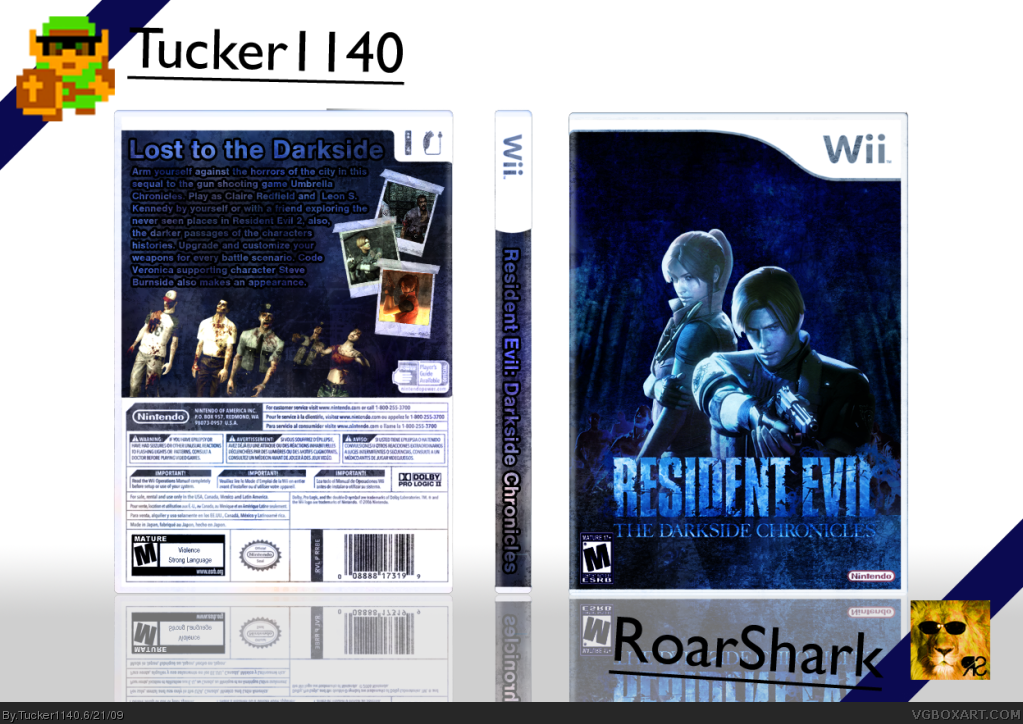
2nd day in a row I posted a box! Woo! So, anyway, Me and RS did a collab together. He did the front and presentation, I did the back and spine. I put an hour and a half into this!
Credits:
Screenborders: Rosa?
Zombies renders: LEGOSlayer
Template: Techne
Screenshots: Google
Back ESRB editing: Me
Background: Google, major editing by me.
Enjoy!
[ Reply ]
Dude I just noticed that the tagline sounds like something from Star Wars. Credits for the front are LEGOSlayer for the render. This was really fun to make.
Edited at 1 decade ago
[ Reply ]
#2, Haha, It does.
[ Reply ]
You might as well add my name to the collab since I rendered everything lol...
Nice job guys
[ Reply ]
abit to much text on the back Tuc but apart from that your best ;)
[ Reply ]
Thanks for the tips!
[ Reply ]
#4, I did the logo.
[ Reply ]
#5, its not too much text, it just needs to be smaller and more clear.
it is a good box but it is missing something to give it that wow effect.
but you have impressed me tucker. So on to your next task.
+fav
[ Reply ]
#8, Thanks, I'll do some stuff on it.
[ Reply ]
#8, What do you think of the front. How could I improve on that.
[ Reply ]
Update:
- Text outline is now a glow
- Added grunge background on screen
- Changed presentation
- Made text smaller by request
Enjoy the update!
[ Reply ]
#11, Dude WTF did you do to my front, It looks shitty now. I also would have appreciated you telling me about the update.
Edited at 1 decade ago
[ Reply ]
#11, ...wtf? Why did you just edit your collab partner's work?
[ Reply ]
something seems real off with the saturation and contrast. the presentation (background) does not work that way. it looks a bit cheap and does not add anything. there is no reason for changing the color of the rating-logo on the front. its design is fixed, so you gotta take it the way it is. besides: why change it on the front and not on the back? doesn't make any sense.
you could move leon, claire and the logo on the front a bit up, to place it more in the center. there is enough room for that after all.
overall impression is real basic, nothing special.
Edited at 1 decade ago
[ Reply ]
#14, Just look at version one of the front.
[ Reply ]
#15, it is not about "look at the old version". besides it got the same flaws. the only diffrence is the saturation and contrast are way to much (darker)
[ Reply ]