Newest box! I wanted to keep the retro NES feel, but put a modern spin on it. Spypilot told me my backs were boring, so I tried to make an interesting one. I also wanted a sort of "wow" presentation. It took me a long time to make this, so I hope you like it. The template belongs to Runaway Red, with a lot of editing by me. So comment, criticize, and enjoy!
#2, I know, that's the only thing that wasn't right. I couldn't find another render that fit right. When I tried to make Luigi shiny like Mario, It didn't turn out good. Thanks for the fav!
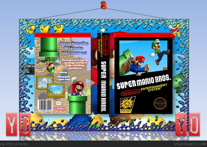
I definitely like the style you were going with but the only thing keeping me from a fav. is that the renders you chose are extremely overdone on this site. Maybe you could draw, scan, and ink your own art?
You certainly on the right track with the retro feel of the design. I actually don't mind the break dancing Mario render on the front, but as #16 mentions, the Bowser looks a little weird, especially the way he's just kind of cut off. I also don't quite understand the broken warp pipe on the front.
The back is looking pretty good as is, but the background you used for it clashes with the front of your box that follows the classic NES box template.
If you can polish some things up I can definitely seeing myself faving this. Keep up the good work!
I'd like to see more consistency with the front and back as I mentioned, but this looks pretty authentically retro, and you've earned the fav for effort.
You know, this mainly comes off as simple and effortless. The funny thing is however, it works in that way. It looks good in the fact that its amateurish, and I mean that in a good way!
It's not horrible, but it's not Super Mario Bros. If this was like Mariolee's and YoshiStar's boxes, putting a newer game in classic packaging, I'd be a little happier with it. Also, the front is lacking. There's too much open sky space showing.
It's decent, but somehow doesn't feel right to me.
#51, That comment made no sense in light of what I just said unless you're looking for an argument. It is against the rules to constantly bump, do you not realise that?
I can't believe this got HOF. It's an average box. It doesn't look fully NES-style but it doesn't qualify as modern, either. Almost half of the comments on the box are bumps by the author and he spread it around like gonorrhea.
When you individually thank someone every single day, that's called bumping your box. I think that this should be removed from the HOF because of just that reason.
I understand leaving one overarching 'thank you' to everyone who commented and faved, but doing it every single day? BUMPING.
No fave from me for two reasons:
1. The box isn't that great.
2. The maker is a self promoting douche.
#59, I agree as well. I don't really understand how this got so much... just a few renders and a background, it's really confusing me. And the bumping on this box is probably the worst on the site, really pathetic.
#66, wait you stopped
and grand:
If you merely say "this sucks!" or attack the author, your comment will be deleted and you will be banned
even if he did bump, dont attack him, that makes you look like the ass.
#67, One insult doesn't exactly qualify as an attack and 'douche' isn't exactly a strong word. And seeing as I prefaced that one insult with constructive criticism (albeit bluntly put) I don't see a problem.
I actually like the rendered art you chose, and both the front and back art look great. My only critique regards the back text; the text describing the features is limited. Also, instead of "great graphics," something like "colorful worlds" would be more descriptive.
 Super Mario Bros. Box Cover Comments
Newest box! I wanted to keep the retro NES feel, but put a modern spin on it. Spypilot told me my backs were boring, so I tried to make an interesting one. I also wanted a sort of "wow" presentation. It took me a long time to make this, so I hope you like it. The template belongs to Runaway Red, with a lot of editing by me. So comment, criticize, and enjoy!
[ Reply ]
Nice, you shouldn't use that Mario on the front.
[ Reply ]
#2, I know, that's the only thing that wasn't right. I couldn't find another render that fit right. When I tried to make Luigi shiny like Mario, It didn't turn out good. Thanks for the fav!
[ Reply ]
Your "Yo Yo" logo reminds me a lot of HCFB's logo.
As for the box, I don't like the mixture of character styles. I would say pick a consistent look, like using renders from "New Super Mario Bros."
[ Reply ]
#4, that's what I tried to do, but as you can see by comment #3, I didn't have much to work with.
Okay, I updated with same-style renders (and a "thought" of Bowser).
Edited at 1 decade ago
[ Reply ]
That's real nice man.
I like the way Mario Appears to be jumping over the bar.
[ Reply ]
#6, thanks! That means a lot coming from you!
[ Reply ]
nice job YOYO!
[ Reply ]
#8, thank you! And thanks to everyone for the great responses!
[ Reply ]
I like this.
[ Reply ]
#10, thanks for the fav!
#12, thank you!
Edited at 1 decade ago
[ Reply ]
Great job!
[ Reply ]
Pretty good
[ Reply ]
I definitely like the style you were going with but the only thing keeping me from a fav. is that the renders you chose are extremely overdone on this site. Maybe you could draw, scan, and ink your own art?
[ Reply ]
#13, thanks for the fav!
#14, thanks, but I absolutely cannot draw!
Edited at 1 decade ago
[ Reply ]
Wow, nice, but the Bowser ruins it for me. Remove him and you got yourself a fav ;)
[ Reply ]
You certainly on the right track with the retro feel of the design. I actually don't mind the break dancing Mario render on the front, but as #16 mentions, the Bowser looks a little weird, especially the way he's just kind of cut off. I also don't quite understand the broken warp pipe on the front.
The back is looking pretty good as is, but the background you used for it clashes with the front of your box that follows the classic NES box template.
If you can polish some things up I can definitely seeing myself faving this. Keep up the good work!
[ Reply ]
Alright, I took away the Bowser and the pipe is no longer broken.
[ Reply ]
I'd like to see more consistency with the front and back as I mentioned, but this looks pretty authentically retro, and you've earned the fav for effort.
[ Reply ]
Thank you so much, Drakxxx!
You too, Link!
Edited at 1 decade ago
[ Reply ]
Thanks for fixing that. I'll fav. I love the effect of Luigi jumping out of the pipe! ;)
[ Reply ]
You know, this mainly comes off as simple and effortless. The funny thing is however, it works in that way. It looks good in the fact that its amateurish, and I mean that in a good way!
Clean and retro I like it ;)
[ Reply ]
#22, Well, you're an amateur artist too, in a good way... JUST KIDDING lol!
Thanks for the fav!
Edited at 1 decade ago
[ Reply ]
This box already has 102 points! I feel so honored!
#25, thank you very much!
#26, thank you also... I say thank you a lot, huh?
Edited at 1 decade ago
[ Reply ]
Nice Job!
[ Reply ]
Dude, great work!
[ Reply ]
cool.
[ Reply ]
I usually don't respond to advertising boxes, but i really like this design.Faved.
[ Reply ]
Pretty cool, I think this desreves a fav!
[ Reply ]
Well my good sir this has gotten a fav.
[ Reply ]
Please could you stop advertising on my page.
I will not say anything further.
[ Reply ]
Who removed a fav?
BTW thanks for all the great responses!
Edited at 1 decade ago
[ Reply ]
Sorry, i thought i faved it. My bad.
[ Reply ]
#33, that's quite alright!
[ Reply ]
This is my most successful box!
[ Reply ]
Nice and fav man
[ Reply ]
Thank you, narutosam1!
[ Reply ]
Thanks to Sentry for his fav, too!
[ Reply ]
It's not horrible, but it's not Super Mario Bros. If this was like Mariolee's and YoshiStar's boxes, putting a newer game in classic packaging, I'd be a little happier with it. Also, the front is lacking. There's too much open sky space showing.
It's decent, but somehow doesn't feel right to me.
[ Reply ]
Thank you for the criticism, Tleeart!
[ Reply ]
Thanks to Rex for faving!
[ Reply ]
I can't believe this almost got into the hall of fame and it was only my fourth box!
Edited at 1 decade ago
[ Reply ]
Thank you, Luigi, for faving.
[ Reply ]
Thanks for faving, GRP.
[ Reply ]
Thanks to everyone who faved!
[ Reply ]
this box is sick i am the 30st one so its going to be HOF doesnt it ;)
Edited at 1 decade ago
[ Reply ]
#46, it'd be cool if it made the hall! BTW thanks to oxol for faving!
[ Reply ]
#47, Most of these comments are your own, it's a bit ridiculous.
[ Reply ]
#48, only 23 are.
[ Reply ]
#49, only? That's a bit more than only. That's almost half.
This box is particurly overrated and don't forget you've been advertising on everyone's page and bumping to help more decent boxarts get pushed off.
[ Reply ]
#50, I'm sorry that you're not as smart as me. I like commenting on my page. Sorry if I sound mean.
[ Reply ]
#51, That comment made no sense in light of what I just said unless you're looking for an argument. It is against the rules to constantly bump, do you not realise that?
[ Reply ]
#51, when E_G tells you to stop, you stop.
[ Reply ]
Yes, IMO this is way too overrated. This really isn't that good. Sorry
[ Reply ]
Loved this one!!!very good cover,and its a mario game...cant help it lol
[ Reply ]
..and FAV author :)
[ Reply ]
The screenshots don't go well with a NES box, but I'll fav.
[ Reply ]
#54, Agreed.
[ Reply ]
I can't believe this got HOF. It's an average box. It doesn't look fully NES-style but it doesn't qualify as modern, either. Almost half of the comments on the box are bumps by the author and he spread it around like gonorrhea.
When you individually thank someone every single day, that's called bumping your box. I think that this should be removed from the HOF because of just that reason.
I understand leaving one overarching 'thank you' to everyone who commented and faved, but doing it every single day? BUMPING.
No fave from me for two reasons:
1. The box isn't that great.
2. The maker is a self promoting douche.
[ Reply ]
#59, 100% agreed, after looking at this again, I well have removed my fav.
Edited at 1 decade ago
[ Reply ]
#59, I agree as well. I don't really understand how this got so much... just a few renders and a background, it's really confusing me. And the bumping on this box is probably the worst on the site, really pathetic.
Edited at 1 decade ago
[ Reply ]
wow chill guys, sure it maybe didnt desereve the halll, but dont attack him *cough*grand*cough*
[ Reply ]
#62, Isn't YOYO the one on Youtube who was like six?
Anyway, I don't recall favouriting this. I must have been mad. This really doesn't deserve the Hall.
[ Reply ]
#62, Shameless bumping is an offense worthy of an attack.
[ Reply ]
I don't like this!
[ Reply ]
This is one of the reason, why I stopped making box arts...
[ Reply ]
#66, wait you stopped
and grand:
If you merely say "this sucks!" or attack the author, your comment will be deleted and you will be banned
even if he did bump, dont attack him, that makes you look like the ass.
[ Reply ]
#67, One insult doesn't exactly qualify as an attack and 'douche' isn't exactly a strong word. And seeing as I prefaced that one insult with constructive criticism (albeit bluntly put) I don't see a problem.
[ Reply ]
Grand, get over it. No offense but its in hall now and theres no way to change that. If you hate this box that much you would stop bumping it.
Also, grand, go tell people that this didnt deserve hall. Because this is even worse. link
[ Reply ]
#69, WOW. I can't believe that go HoF.
[ Reply ]
really, i cant believe this got into hall, my new box deserves its spot :(
[ Reply ]
Well, ummmm wow.....
There's um...
This got in the HOF?
Well... alright...
OH NO! I'm BUMPING AGAIN! CALL THE POLICE! I'm A CRIMINAL!
Edited at 1 decade ago
[ Reply ]
I actually like the rendered art you chose, and both the front and back art look great. My only critique regards the back text; the text describing the features is limited. Also, instead of "great graphics," something like "colorful worlds" would be more descriptive.
[ Reply ]