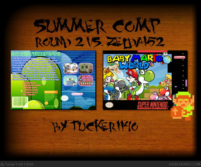
Full view please! New box. This is more of an alternate title for "Super Mario World 2: Yoshi's Island" with some different things. But, anyway, I made this for the second round of the Summer Comp. I don't have time to do credits right now, but I will do them.
Very nice, I like that back text and such, the front is a little odd wihtout bowser (Cause he seems like he's important in the game) and because of the yoshi's lined up like that.
Faved anywho.
#5 Agreed. I like the ambition you went with the box, but I have a few things you should fix about it.
1. The background has too much emphasis put on it, rather than on the boxes.
2. Like coolguy said, the front is vibrant while the back is dull and dark. Look at some other SNES boxes (HOF ones please) and see how they dealt with the back.
3. I don't like how the Yoshis art are different than some of the other art.
4. The baby part of the logo is too slanted, make it straight like the Mario part, and it'll look good. Right now it looks uneven.
Hoep that helps. Don't be too initmidated by all the text.
4/5 things by Mariolee fixed. The background wasn't changed, because only Mariolee said he doesn't like it, no one else, and I like it. Its also much bigger now.
 Baby Mario World Box Cover Comments
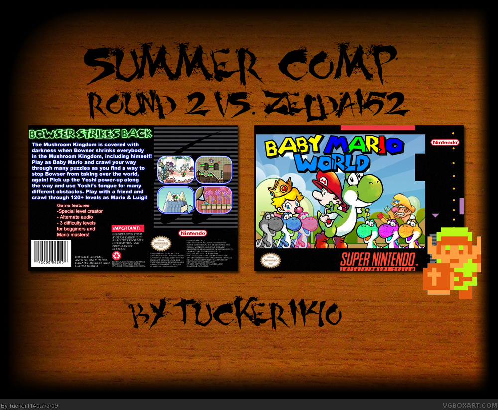
Full view please! New box. This is more of an alternate title for "Super Mario World 2: Yoshi's Island" with some different things. But, anyway, I made this for the second round of the Summer Comp. I don't have time to do credits right now, but I will do them.
Enjoy!
Hoping for HoF!
#2, thanks.
Edited at 1 decade ago
[ Reply ]
Good one!
[ Reply ]
Very nice, I like that back text and such, the front is a little odd wihtout bowser (Cause he seems like he's important in the game) and because of the yoshi's lined up like that.
Faved anywho.
[ Reply ]
Thanks everybody! I'm Rank 4 now!!
[ Reply ]
I hate the way the yoshi's are lined up on the front and the back has none of the vibrantness of the front.
[ Reply ]
This gets a fav.
[ Reply ]
#5 Agreed. I like the ambition you went with the box, but I have a few things you should fix about it.
1. The background has too much emphasis put on it, rather than on the boxes.
2. Like coolguy said, the front is vibrant while the back is dull and dark. Look at some other SNES boxes (HOF ones please) and see how they dealt with the back.
3. I don't like how the Yoshis art are different than some of the other art.
4. The baby part of the logo is too slanted, make it straight like the Mario part, and it'll look good. Right now it looks uneven.
Hoep that helps. Don't be too initmidated by all the text.
[ Reply ]
#7, Thanks for the help, I'll fix it tomorrow.
[ Reply ]
Update:
4/5 things by Mariolee fixed. The background wasn't changed, because only Mariolee said he doesn't like it, no one else, and I like it. Its also much bigger now.
Edited at 1 decade ago
[ Reply ]
Over 10 favs! Thanks everyone!
[ Reply ]
I give this box a 10 out of 10!
[ Reply ]
Breat, but you could've called it Yoshi's Island. (Not that is doesn't rock, I could never make something that good.)
4/5!
[ Reply ]
Definitely you best so far, and what I would imagine the box to this game looking like had it existed.
[ Reply ]
#13, Thanks, that means a lot to me.
[ Reply ]
shouldn't this be on humor
[ Reply ]