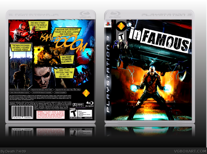
I wanted this box to look exactly like a comic book. Please, no this wouldnt be official. I love how it turned out. I have been working on and off on this box for weeks. Many thanks to YoshiStar for helping me so much on the back. Technes temp. C and c welcome
i dont like the misplacead logos, and yes i have read a comic, but have never seen that kind of layout for a game. move them to thier proper spots, notify me when you do that and i will fav because everything else is amiazing!
I like your front, the logos are little off putting at first but they grow on me so i don't mind. The back, however, the back kicks ass at every possible point. Fucking awesome man, one of your best!
i think its cool having the dev logos like that makes it look more like a comic book and don't listen to the people that say everything has to look official sometimes you just wanna be creative...
AWESOME! Sorry I wasn't able to critique you on the front earlier. Personally, I didn't like the first front you sent me very much. I was going to suggest to change the whole thing around, but you did that already. And you did an awesome job.
It's a cool idea keeping the developer logos like that, but the gray strip that they're on looks a little bland. Otherwise its nice!
Thanks so much everyone. @ #21 (and all others who said so) i changed it and hated how it ruined the comic book feal. So sorry all, but it stays the way it is.
I had almost the exact same idea for the back of the inFamous box Good thing I didn't go through with it, as it wouldn't look that good!
The front isn't all that impressive though, as it's just a single image, and I'm not loving the logos at the top. Still, the back alone is worth a fav.
Being a comic book fan myself, I see and appreciate what you tried to do with the dev logo and rating, but I don't really think they work. They look so weird up there... and especially since most comic books have stuff like "Issue #X" and a price and stuff.
 inFAMOUS Box Cover Comments
awesome
[ Reply ]
I wanted this box to look exactly like a comic book. Please, no this wouldnt be official. I love how it turned out. I have been working on and off on this box for weeks. Many thanks to YoshiStar for helping me so much on the back. Technes temp. C and c welcome
Edited at 1 decade ago
[ Reply ]
slick. Your best yet.
[ Reply ]
The back is awesome, but the front, I don't like what you did with the esrb and dev logos.
[ Reply ]
Well #4, have you ever seen a comic book? Its got all the info on the bar up on the top left.
[ Reply ]
i dont like the misplacead logos, and yes i have read a comic, but have never seen that kind of layout for a game. move them to thier proper spots, notify me when you do that and i will fav because everything else is amiazing!
[ Reply ]
yes.
yes.
yes.
yes.
YES.
[ Reply ]
Yup this is very slick and different but I agree with #6 about the logos.
[ Reply ]
Awesome.
[ Reply ]
Thank you guys so much :D
@#6, i know you have never seen it on a game. I dont make boxes to be offical, i make them to be unique and interesting
Edited at 1 decade ago
[ Reply ]
I like your front, the logos are little off putting at first but they grow on me so i don't mind. The back, however, the back kicks ass at every possible point. Fucking awesome man, one of your best!
[ Reply ]
Fantastic.
[ Reply ]
thanks everyone. I worked really hard on this and am glad people like it.
[ Reply ]
i think its cool having the dev logos like that makes it look more like a comic book and don't listen to the people that say everything has to look official sometimes you just wanna be creative...
good job!
Edited at 1 decade ago
[ Reply ]
awesome,i just got the game last month and is the best game i played for ps3 (along with LittleBigPlanet) fav!
[ Reply ]
AWESOME! Sorry I wasn't able to critique you on the front earlier. Personally, I didn't like the first front you sent me very much. I was going to suggest to change the whole thing around, but you did that already. And you did an awesome job.
It's a cool idea keeping the developer logos like that, but the gray strip that they're on looks a little bland. Otherwise its nice!
Edited at 1 decade ago
[ Reply ]
The bac is great, but the ESRB and dev logo on the front, I know you wanted it to look like a comic book, but it just doesn't work IMO.
[ Reply ]
Oh Jesus this box needs a lot more attention! Great work!
[ Reply ]
Thanks everybody :) Oh, and don't worry yoshistar
[ Reply ]
yes, this is awesome
[ Reply ]
Move the esrb and dev. I'll fav after you do that! Definitely your best!
[ Reply ]
Just amazing, amazing.
[ Reply ]
Thanks so much everyone. @ #21 (and all others who said so) i changed it and hated how it ruined the comic book feal. So sorry all, but it stays the way it is.
[ Reply ]
#23, you gotta do what you gotta do. I'll fav for your solid attitude!
[ Reply ]
Thanks YOYO :D
[ Reply ]
You're welcome!
[ Reply ]
KaAa-BoOom!
NOw that's just freacking awewsome!
[ Reply ]
Thanks #27 :D
[ Reply ]
Love it. Fav. + Author Fav. Keep it up.
[ Reply ]
I really like the comicy style of this. Great job!
[ Reply ]
Now this is brutal! This is what the box art should of been! And Death, you really amaze me, I never know what to expect out of you next! FAV+ AFAV!
[ Reply ]
Now this is great. One of the best boxes I've ever seen on this site. +fav.
[ Reply ]
Wow, i hoping this box would go over well, but i didnt think people would love it this much. Thanks everyone :D
[ Reply ]
This could be your first HoF! +fav
[ Reply ]
Great job. +fav
[ Reply ]
I had almost the exact same idea for the back of the inFamous box Good thing I didn't go through with it, as it wouldn't look that good!
The front isn't all that impressive though, as it's just a single image, and I'm not loving the logos at the top. Still, the back alone is worth a fav.
Edited at 1 decade ago
[ Reply ]
Thanks everyone :) @#34. I never thought about it, but maybe
[ Reply ]
I missed this how?
[ Reply ]
Congrats on the HoF Death, you deserved it!
[ Reply ]
congrats on the hof, still working on getting my first. :P
[ Reply ]
Congrats on the Hof, Death!! Well deserved!
[ Reply ]
Very cool stuff man. The back is outstanding! Congrats on your hall of fame as well!
[ Reply ]
Thanks everyone. I didnt see this comming at all :D
[ Reply ]
I told you this would make the hall!
[ Reply ]
the developer logo and ESRB rating would have looked fine in their assigned spots
[ Reply ]
Being a comic book fan myself, I see and appreciate what you tried to do with the dev logo and rating, but I don't really think they work. They look so weird up there... and especially since most comic books have stuff like "Issue #X" and a price and stuff.
[ Reply ]