Well guys here's my new box for the 1st annual VGBA Cup Round 1. Would've posted it yesterday but I didn't get the chance to. Anyway I'll be crediting Google, qwerty, jevangod, The Final Fantasy Wiki, and VGBASimpleNeeds. Enjoy!
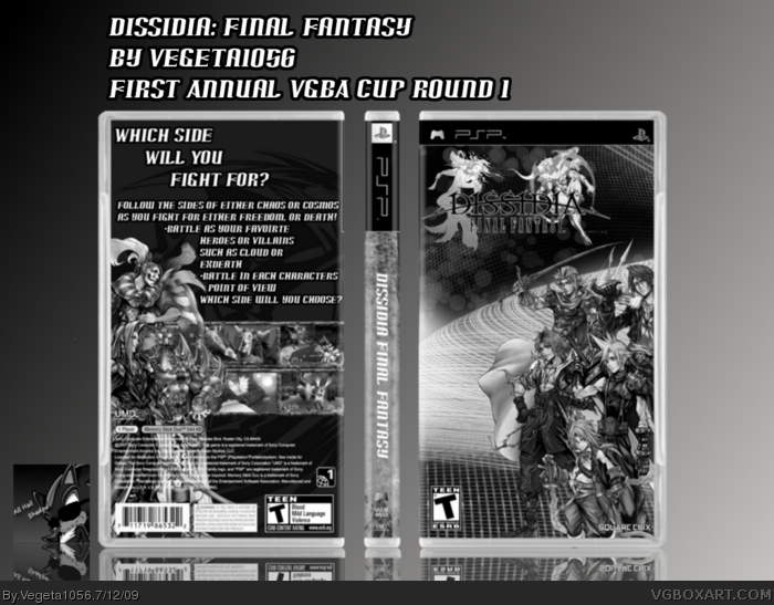
I don't like it, as you've just compiled a box, and changed it to black & white.
Would have been good as a colour box, but its just not the point of the round.
I agree with SilentOblivion here. I think the characters blur into each other without color to separate them. The whole layout needs some added contrast to make the logos and characters stand out from the heavy background.
 Dissida: Final Fantasy Box Cover Comments
Well guys here's my new box for the 1st annual VGBA Cup Round 1. Would've posted it yesterday but I didn't get the chance to. Anyway I'll be crediting Google, qwerty, jevangod, The Final Fantasy Wiki, and VGBASimpleNeeds. Enjoy!
[ Reply ]
Nicely done, a bit blurry but the box overall is good, good luck also btw in the comp.
[ Reply ]
#2, Thanks. I've been wanting to go for a Final Fantasy box for a while. Afifian's Dissidia box inspired me.
[ Reply ]
I don't like it, as you've just compiled a box, and changed it to black & white.
Would have been good as a colour box, but its just not the point of the round.
[ Reply ]
#4, This man is a wise one indeed.
[ Reply ]
I agree with SilentOblivion here. I think the characters blur into each other without color to separate them. The whole layout needs some added contrast to make the logos and characters stand out from the heavy background.
[ Reply ]