Really love the front its simple but effective. Im not going to fav it though because you could have made the back a little more interesting instead of just having a black bg colour.
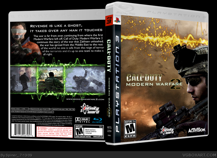
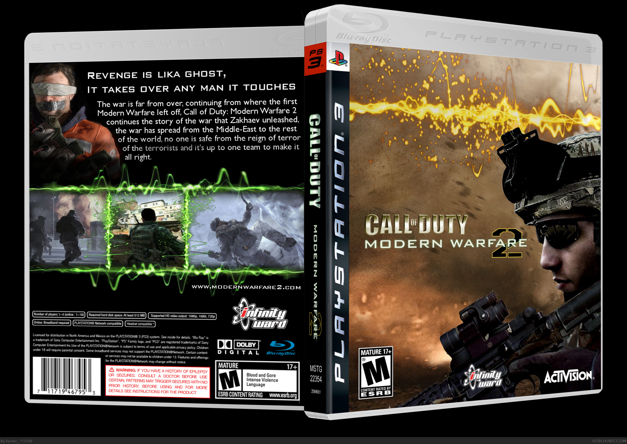
Really good for the most part but there are a couple of kinks---- first off on the back of the box the description would not start (atleast for an actual game) saying that the war is continuing off from the first modern warfare usually games don't really reference the previous game especially not with the name of the previous game on the back off the box usually it is fitted in the game with dialogue and such things if that makes sense they don't really want you to know that your playling a game here's an example like if you were reading harry potter and the chamber of secrets they wouldn't be like well harry got this scar from the time he fell in harry potter and the sorcers stone i'm being picky I know but all I'm saying is revise it allitle make it fluent and descriptive so if someone who never played COD could get it and try not to reference COD4 and the one other and last thing is the cover not a really big fan of it ... it is well done and executed just don't think someone would notice it as a cod game make a cover more traditional to the franchise and eye catching
The front is pretty good, I don't like the placement of the logo though. The back isn't the greatest.. I don't like the plain black background, and the green borders look a lot like slime..
 Call Of Duty: Modern Warfare 2 Box Cover Comments
Okey, here's my boxart to Call of Duty: Modern Warfare.
The official name now includes "Call of Duty" in the title:
link
Credits to Sens for the template.
Please rate it and leave a comment, I don't want this to get ignored....
Edited at 1 decade ago
[ Reply ]
I won't ignore it! Very nice job!
[ Reply ]
This looks great, especially the back. Very authentic looking
[ Reply ]
#3, So why don't you fav it? ;D
[ Reply ]
Really love the front its simple but effective. Im not going to fav it though because you could have made the back a little more interesting instead of just having a black bg colour.
[ Reply ]
Great, 71 views and 3 comments...
[ Reply ]
Really good for the most part but there are a couple of kinks---- first off on the back of the box the description would not start (atleast for an actual game) saying that the war is continuing off from the first modern warfare usually games don't really reference the previous game especially not with the name of the previous game on the back off the box usually it is fitted in the game with dialogue and such things if that makes sense they don't really want you to know that your playling a game here's an example like if you were reading harry potter and the chamber of secrets they wouldn't be like well harry got this scar from the time he fell in harry potter and the sorcers stone i'm being picky I know but all I'm saying is revise it allitle make it fluent and descriptive so if someone who never played COD could get it and try not to reference COD4 and the one other and last thing is the cover not a really big fan of it ... it is well done and executed just don't think someone would notice it as a cod game make a cover more traditional to the franchise and eye catching
[ Reply ]
The front is pretty good, I don't like the placement of the logo though. The back isn't the greatest.. I don't like the plain black background, and the green borders look a lot like slime..
+Fav anyways, though.
[ Reply ]
Really nice box man
[ Reply ]
cool just looking at that box i would buy it
[ Reply ]
cool just looking at that box i would buy it
[ Reply ]
i luv the screen shot borders were did u get em?
[ Reply ]
really nice man the soldier in the front its new son is like 9/10 so good
[ Reply ]