I like it. The only things I would change are the front and back tagline. I think it would be more effective if the characters were looking in opposite directions (horizontally flip the girl on the bottom to be looking to the left). As for the back, I would suggest trying to make the tagline bigger or extend out further by putting all the white text on one line.
Updated - made the tagline all on one line.
#2, thanks for the critique. I don't really think the front needs changing, because the girl is pretty much facing the other way, it's just that her head is turned.
 The Agency Box Cover Comments
Hey everyone,
here's something I've been working on. Please bear with the plainness, there's a real absence of art for this game. XD
[ Reply ]
I like it. The only things I would change are the front and back tagline. I think it would be more effective if the characters were looking in opposite directions (horizontally flip the girl on the bottom to be looking to the left). As for the back, I would suggest trying to make the tagline bigger or extend out further by putting all the white text on one line.
Edited at 1 decade ago
[ Reply ]
Updated - made the tagline all on one line.
#2, thanks for the critique. I don't really think the front needs changing, because the girl is pretty much facing the other way, it's just that her head is turned.
[ Reply ]
The front is interesting.
The back..well..try and remove the images on the bottom and put some kind of quote (IGN, etc.).
[ Reply ]
#4, Yeah, the screens do feel out of place.
-UPDATE- Took out the screens and replaced it with a quote.
Edited at 1 decade ago
[ Reply ]
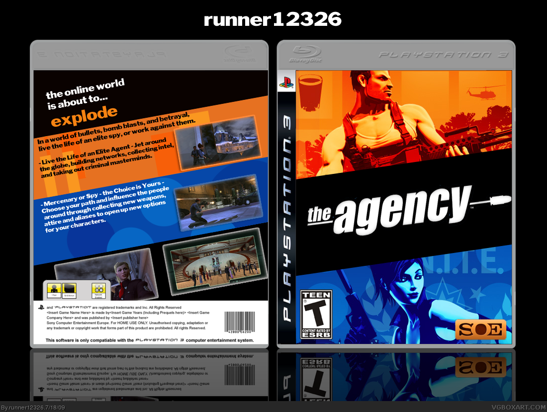
Looks really godd, but render out the logo at the front =P
[ Reply ]
#6, it's meant to look like that. ;)
[ Reply ]
But thers's to much black space.
[ Reply ]
#8 - Its meant to be like that -______________-
Anyway, great work, love the whole 'comic book' feel.
[ Reply ]