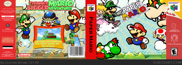
Looks great, only issue that I see is very minor, If this is the original you have several characters who are not from the original on the box other wise fantastic job.
Did you copy and paste my tagline? It looks exactly the same (except for color).
Otherwise, not a bad box. The front seems a little odd though; the logo is way too small.
 Paper Mario Box Cover Comments
My Box for the Summer Comp,
Credit to:
Planet Renders
Ninty
VGBA Simple Needs
Edited at 1 decade ago
[ Reply ]
Nice Job
[ Reply ]
like the back but the front is too much randomly placed renders
Edited at 1 decade ago
[ Reply ]
This is AWESOME!
[ Reply ]
Everything is stretched. It's pretty nice, though!
[ Reply ]
Any other advise?
[ Reply ]
Good work!
Love the tagline, and back arrangment, only nitpick is that the screenborder text is very hard to see.
I see a giant improvement in this, because of that +fav.
[ Reply ]
Looks great, only issue that I see is very minor, If this is the original you have several characters who are not from the original on the box other wise fantastic job.
[ Reply ]
Did you copy and paste my tagline? It looks exactly the same (except for color).
Otherwise, not a bad box. The front seems a little odd though; the logo is way too small.
Edited at 1 decade ago
[ Reply ]
It looks alright, there's a difference in the art between some of the renders though, and the back is a bit confusing at first glance.
[ Reply ]
Extra Credit: RunawayRed (Tagline idea)
[ Reply ]
I think your effort was far too inconsistent. The covers look good but what happened to the temp?
[ Reply ]
Mr. L, Grodus, Yoshi Kid=Not in Original N64 Paper Mario. Also the screenshots are from SPM. Other than that, good job.
[ Reply ]