I agree with HalfSwiss bout the back text, there is something about it that makes it look.. I don't know, choppy maybe. But +Fav for the awesome template.
The back text leaves more to be desired. The font (Century Gothic, Avant Garde?) looks too feminine IMO, and it's hard to read with the awkward text-wrapping.
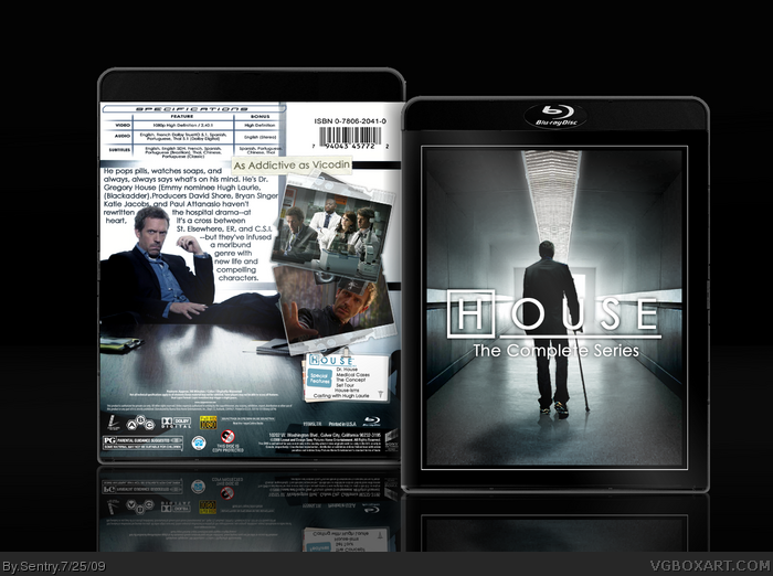
 House M.D. Box Cover Comments
Oh.Mah.Gawd.
[ Reply ]
Nice one!
[ Reply ]
No one else has anything to say?
[ Reply ]
Not so sure about the back text...
But the series isn't over, right? Wasn't that just a season finale?
[ Reply ]
#4, I know but I've done a box for every other season for House already so why not make one for the series?
[ Reply ]
#3, You only waited 10 minutes.
[ Reply ]
I agree with HalfSwiss bout the back text, there is something about it that makes it look.. I don't know, choppy maybe. But +Fav for the awesome template.
[ Reply ]
This turned out great, I really like the template.
[ Reply ]
Looks pretty good, but the fact that it's in the Movie section makes me wonder why there is no TV section as well.
[ Reply ]
Mighty.
[ Reply ]
#6, I believe I waited an hour before my second comment. I'll fix the text don't worry an update will come soon.
[ Reply ]
O_O
Wow
[ Reply ]
The front is veranice, great job!
The back text leaves more to be desired. The font (Century Gothic, Avant Garde?) looks too feminine IMO, and it's hard to read with the awkward text-wrapping.
[ Reply ]
Looks great, very professional ! :]
[ Reply ]