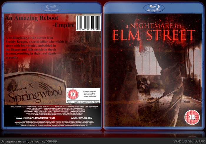
freddy [ Buy A Nightmare ... at Amazon ] By super-mega-hyper-sonic 41 on July 29th, 2009 No Printable Available [ Box updated on July 30th, 2009 ] [ original ] A Nightmare on Elm Street Box Cover Comments Comment on super-mega-hyper-sonic's A Nightmare on Elm Street Box Art / Cover. Cancel Reply super-mega-hyper-sonic 41 [ 1 decade ago ] Credit to Jeven Silent Man and Barney(He made some of the posters on another site.) [ Reply ] super-mega-hyper-sonic 41 [ 1 decade ago ] No comments? [ Reply ] bigwillystyle 21 [ 1 decade ago ] so what did you do to it apart from add the logo and the text on the back? [ Reply ] super-mega-hyper-sonic 41 [ 1 decade ago ] #3, I added a grunge Layer then edited the transparency to make the image a more grunge feel.I also edited the brightness. [ Reply ] SilentMan101 44 [ 1 decade ago ] These Nightmare on Elm Street boxes arnt seem to be gettin like any attention (happened to mine to :( ) But nice, I like the front but not the text used on the bottom and that goes for the back to. [ Reply ] super-mega-hyper-sonic 41 [ 1 decade ago ] #5, Can you suggest a font? [ Reply ] SilentMan101 44 [ 1 decade ago ] #6, On Blu Ray boxes I usually just use Times New Roman, it just looks the best. [ Reply ] super-mega-hyper-sonic 41 [ 1 decade ago ] #7, Ok But on the front it looks odd. Edited at 1 decade ago [ Reply ] SilentMan101 44 [ 1 decade ago ] #8, Well if I were you, I would not put anything on the front other then logo, picture and rating. [ Reply ] super-mega-hyper-sonic 41 [ 1 decade ago ] #9, Oh...Ok I'll update again! [ Reply ] SilentMan101 44 [ 1 decade ago ] #10, All the red with the text kills it. [ Reply ] super-mega-hyper-sonic 41 [ 1 decade ago ] #11, What should I do with that? Black doesn't stand out well on the background. [ Reply ] Ticou93 8 [ 1 decade ago ] Oh nvm you just removed the text ^^ btw instead of the red on back try some blood splatter? Edited at 1 decade ago [ Reply ] super-mega-hyper-sonic 41 [ 1 decade ago ] #13, I really struggle with blood splats.On PDN It is difficult to make 'em look good. [ Reply ]
 A Nightmare on Elm Street Box Cover Comments
Credit to Jeven Silent Man and Barney(He made some of the posters on another site.)
[ Reply ]
No comments?
[ Reply ]
so what did you do to it apart from add the logo and the text on the back?
[ Reply ]
#3, I added a grunge Layer then edited the transparency to make the image a more grunge feel.I also edited the brightness.
[ Reply ]
These Nightmare on Elm Street boxes arnt seem to be gettin like any attention (happened to mine to :( )
But nice, I like the front but not the text used on the bottom and that goes for the back to.
[ Reply ]
#5, Can you suggest a font?
[ Reply ]
#6, On Blu Ray boxes I usually just use Times New Roman, it just looks the best.
[ Reply ]
#7, Ok But on the front it looks odd.
Edited at 1 decade ago
[ Reply ]
#8, Well if I were you, I would not put anything on the front other then logo, picture and rating.
[ Reply ]
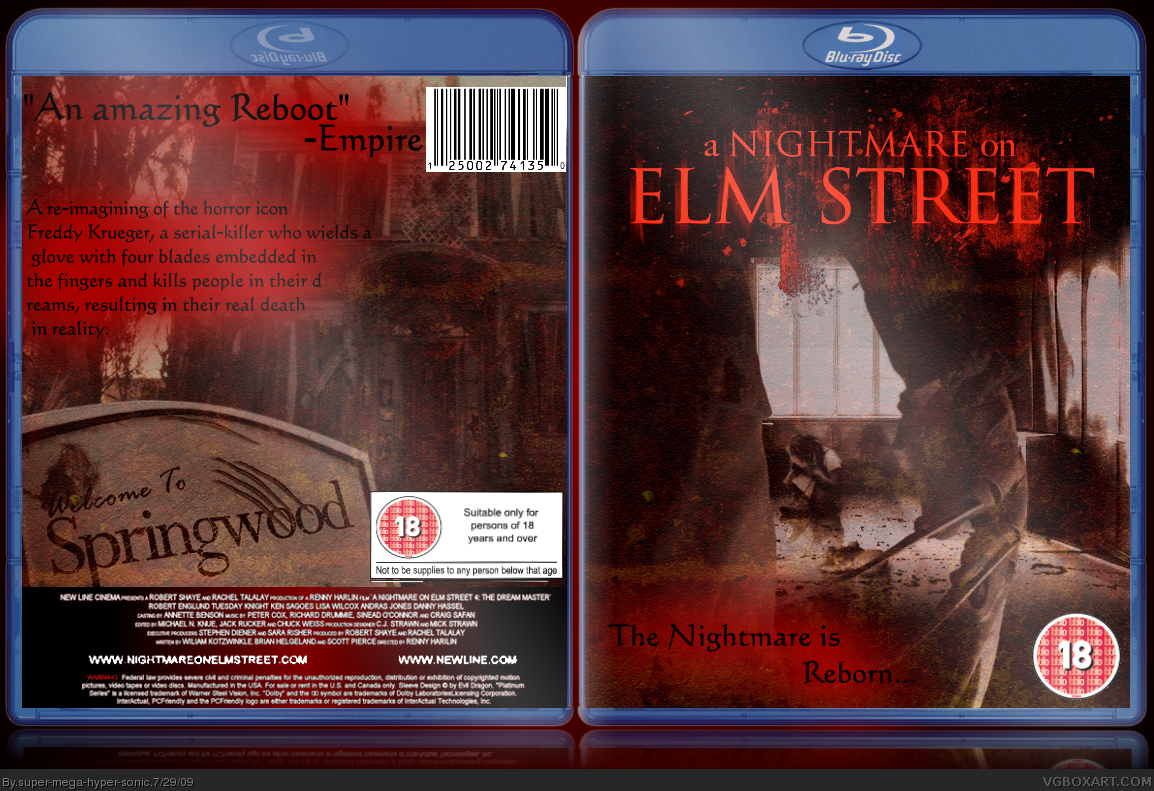
#9, Oh...Ok I'll update again!
[ Reply ]
#10, All the red with the text kills it.
[ Reply ]
#11, What should I do with that?
Black doesn't stand out well on the background.
[ Reply ]
Oh nvm you just removed the text ^^ btw instead of the red on back try some blood splatter?
Edited at 1 decade ago
[ Reply ]
#13, I really struggle with blood splats.On PDN It is difficult to make 'em look good.
[ Reply ]