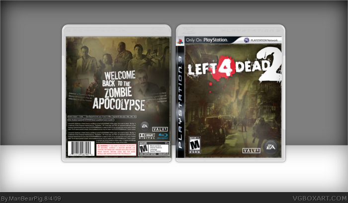
I want to point out that the front is NOT just a wallpaper. It's heavily edited, and to prove that, here is the original wallpaper: link
Anyways, this one took a lot of blending and layer work and I'm satisfied how it turned out. If you find any "screw-ups" I overlooked in the making of this box (sorry, I'm tired lol), please let me know.
Hasta la vista, baby.
EDIT: And btw, the reason the "Only on PS" logo is there is:
Agreeing to what Pan said. The front looks pretty good, has a neat concept, and the color scheme matches the game well. The back feels empty though, with the screenshots' opacity too low.
About the screenshots, I really took strides NOT to make them just square boxes, and to give them a different feel. But, I will higher the opacity of the screenshots and add some more words to the back, or something.
 Left 4 Dead 2 Box Cover Comments
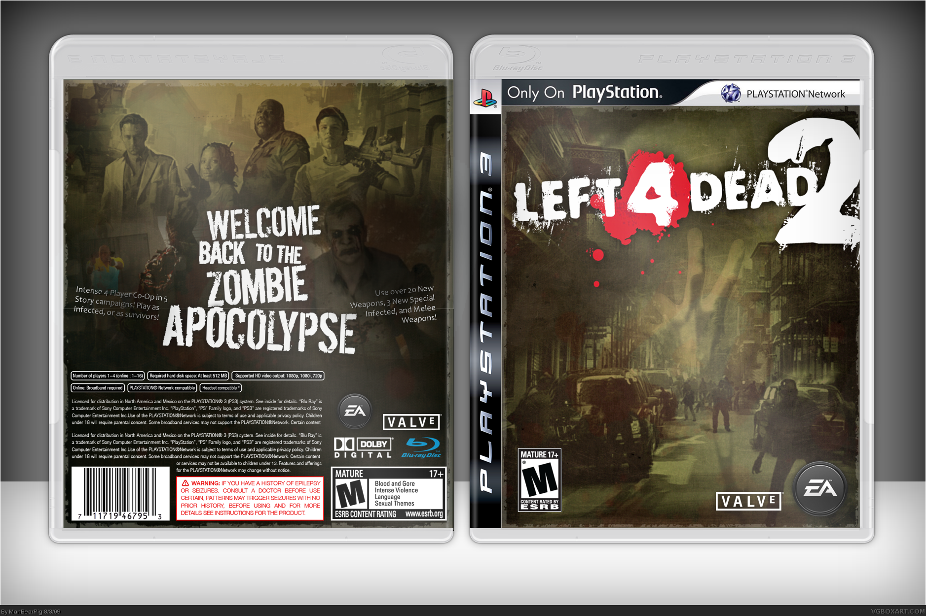
I want to point out that the front is NOT just a wallpaper. It's heavily edited, and to prove that, here is the original wallpaper: link
Anyways, this one took a lot of blending and layer work and I'm satisfied how it turned out. If you find any "screw-ups" I overlooked in the making of this box (sorry, I'm tired lol), please let me know.
Hasta la vista, baby.
EDIT: And btw, the reason the "Only on PS" logo is there is:
1. I needed something to take up space.
2. There's some irony in it. :)
Edited at 1 decade ago
[ Reply ]
Try and make the screen shots on the back look a little moree noticeable, they look too blended in. The front is pretty decent though.
[ Reply ]
Good work, I love that front, and the back is pretty nice to.
Though I agree with Pan about the screens.
[ Reply ]
Looks kind of like a Special Edition, its very good
[ Reply ]
Agreeing to what Pan said. The front looks pretty good, has a neat concept, and the color scheme matches the game well. The back feels empty though, with the screenshots' opacity too low.
[ Reply ]
About the screenshots, I really took strides NOT to make them just square boxes, and to give them a different feel. But, I will higher the opacity of the screenshots and add some more words to the back, or something.
[ Reply ]
Updated it. Gave the image more space, and fixed some things you guys commented about.
[ Reply ]