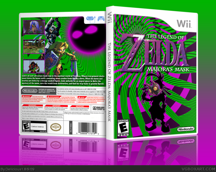
This is my Majora's Mask box. It was getting mixed reviews in the WIP thread, but I like it. I tried to work out of my comfort zone, and thats why this is so different. It has a real psychedelic/pop art feel to it which I think works really well for Majora's Mask. Let me know what you think of it, and as always favs, and comments are appreciated!!!
cool color scheme but i think both the back could've used a few more pictures...but the silhouette on the front was a great idea i would've never thought of that. keep it up
I remember this from the forums. It's pretty unique, but not at all my taste. Still a well laid out design with a lot going on. What I don't like about it the most, is the moon on the back. It's Outer Glow throws me off, because everything else has a stroke.
#3, I know what you mean about the characters not feeling grounded. I tried several different things and I couldn't really get anything to make them feel grounded.
#4, Thank you, I don't think it would have worked with any of the other Zeldas, but Majora's Mask is just so different that I think this works for it.
#5, The moon has an inner and outer glow, just like the skull kid on the front. Majora's Mask has an outer glow. None of the renders actually have a stroke.
 The Legend of Zelda: Majora's Mask Box Cover Comments
This is my Majora's Mask box. It was getting mixed reviews in the WIP thread, but I like it. I tried to work out of my comfort zone, and thats why this is so different. It has a real psychedelic/pop art feel to it which I think works really well for Majora's Mask. Let me know what you think of it, and as always favs, and comments are appreciated!!!
Credit:
ADFD - Temp
qwerty - ESRB logo
Googler - Images
[ Reply ]
cool color scheme but i think both the back could've used a few more pictures...but the silhouette on the front was a great idea i would've never thought of that. keep it up
[ Reply ]
The character's don't feel grounded, which bothers me a little, but kudos for originality and great use of color!
[ Reply ]
Very original, especially for a Legend of Zelda design. I think you've pulled it off great!
[ Reply ]
I remember this from the forums. It's pretty unique, but not at all my taste. Still a well laid out design with a lot going on. What I don't like about it the most, is the moon on the back. It's Outer Glow throws me off, because everything else has a stroke.
[ Reply ]
#3, I know what you mean about the characters not feeling grounded. I tried several different things and I couldn't really get anything to make them feel grounded.
#4, Thank you, I don't think it would have worked with any of the other Zeldas, but Majora's Mask is just so different that I think this works for it.
#5, The moon has an inner and outer glow, just like the skull kid on the front. Majora's Mask has an outer glow. None of the renders actually have a stroke.
[ Reply ]
7.5/10, not as cool as the other ones, but still pretty awesome.
[ Reply ]
Love the colors the front is awesome
[ Reply ]