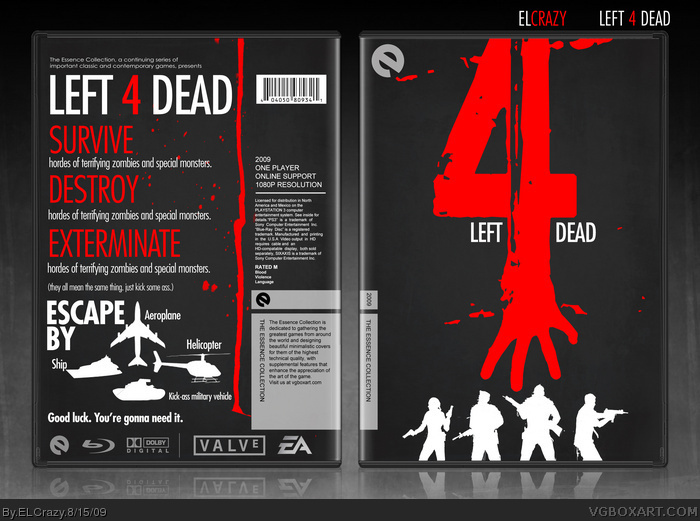
The Essence boom here is spectacular, bringing out some of the best boxes this site has seen in quite a while. The aim of the Essence group is to design boxes that capture the essence of the game. For games like RPGs, capturing the essence is much easier, as promotional campaigns rely heavily on the art factors of these games. However, I realise not many people tend to do mainstream games.
Another misconception of doing Essence boxes is it being simple. The box does not necessarily need to be simple in order to be an Essence box. I think it's the effort in interpreting and capturing the essence of the games is more important. For this box, I tried to keep it simple, and yet capture the essence of the game. The back is slightly crowded, and I tried to interpret the humor of the game by making the text more candid than how official boxes are.
I myself would like to see more mainstream games going through the Essence treatment, and for my Essence boxes, that's what I'm going to do. My next one, already in the works, is Assassin's Creed.
I don't feel the silhouettes of the characters on the front are necessary - it would look cleaner and more focused without them imo. Back typography is kickass btw. ;)
#7, I think the white character silhouettes are perfectly in place - The white contrasts nicely and fits in with the white, red and grey theme. It also balances out the front and back.
#10, It looks cool that the hand seems to be reaching towards them. From a design standpoint, however, there are already three "4's" on the front cover (number 4, 4 fingers, 4 characters) so it gets redundant.
It's just a suggestion - omitting the characters would make the red 4 a stronger focus instead of leading the eyes down somewhere else. In my opinion, less would be more. It still looks cool regardless though.
#14, if a testgroup, being tested about colour of their skin, turned out to have 99% brownish males, a dark-brown or very,very white one would still stand out,right?
I love the entire thing, the best Essence box yet. The only flaw I see is where the info on the back is for a PS3 box, and this is posted as PC, but that's just minor.
Best Essence yet in my opinion as well. You sir are a master at typography, and this box illustrates that to the extreme. I love the "Escape by" part on the back as well.
 Left 4 Dead Box Cover Comments
This one needs a bit of explanation.
The Essence boom here is spectacular, bringing out some of the best boxes this site has seen in quite a while. The aim of the Essence group is to design boxes that capture the essence of the game. For games like RPGs, capturing the essence is much easier, as promotional campaigns rely heavily on the art factors of these games. However, I realise not many people tend to do mainstream games.
Another misconception of doing Essence boxes is it being simple. The box does not necessarily need to be simple in order to be an Essence box. I think it's the effort in interpreting and capturing the essence of the games is more important. For this box, I tried to keep it simple, and yet capture the essence of the game. The back is slightly crowded, and I tried to interpret the humor of the game by making the text more candid than how official boxes are.
I myself would like to see more mainstream games going through the Essence treatment, and for my Essence boxes, that's what I'm going to do. My next one, already in the works, is Assassin's Creed.
Temp by Indexenos and qwerty334. Enjoy! (:
[ Reply ]
I was waiting for this to be posted! Definitely one of the best boxes I have seen so far, a definite +fav. :)
[ Reply ]
Epic!
[ Reply ]
My only flaw is that the splatter on the back is cut off.
[ Reply ]
too awesome!
[ Reply ]
There goes my idea Fantastic box man!
[ Reply ]
I don't feel the silhouettes of the characters on the front are necessary - it would look cleaner and more focused without them imo. Back typography is kickass btw. ;)
[ Reply ]
Amazing
[ Reply ]
amazing
[ Reply ]
#7, I think the white character silhouettes are perfectly in place - The white contrasts nicely and fits in with the white, red and grey theme. It also balances out the front and back.
[ Reply ]
You are perhaps thé best essence artist on the site.
+fav as usual
[ Reply ]
This is exactly what it should be, it's too good for words really
+fav obviously :)
[ Reply ]
#10, It looks cool that the hand seems to be reaching towards them. From a design standpoint, however, there are already three "4's" on the front cover (number 4, 4 fingers, 4 characters) so it gets redundant.
It's just a suggestion - omitting the characters would make the red 4 a stronger focus instead of leading the eyes down somewhere else. In my opinion, less would be more. It still looks cool regardless though.
[ Reply ]
Great box and nice logo.
But I'll be honest..I'm kinda tired of seeing Essence boxes as it seems every other box on the site is Essence box..oh well..
[ Reply ]
#14, if a testgroup, being tested about colour of their skin, turned out to have 99% brownish males, a dark-brown or very,very white one would still stand out,right?
[ Reply ]
I really like it. Although I do agree with Al about the silhouettes of the characters.
[ Reply ]
I too think the silhouettes on the cover are unnecessary. No, unnecessary is the wrong word. They're excessive.
I love the death out of this box, though. The 4 combined with the hand is brilliant! I'm definitely favoriting this one.
It's easily one of my most favorite boxes on the site.
[ Reply ]
Thanks a lot to everyone! :)
[ Reply ]
I love the entire thing, the best Essence box yet. The only flaw I see is where the info on the back is for a PS3 box, and this is posted as PC, but that's just minor.
[ Reply ]
Best Essence yet in my opinion as well. You sir are a master at typography, and this box illustrates that to the extreme. I love the "Escape by" part on the back as well.
[ Reply ]
Blu-Ray?
[ Reply ]
#21, Yes.
And thanks again for the response everybody!
I forgot to credit link for inspiration on the front.
[ Reply ]
This box has oodles of personality. I have similar criticisms as the others about the silhouettes, though.
[ Reply ]
#22 Yours kicks the inspiration in the face to be completely honest, this is actually good use of silhouettes
[ Reply ]
It's about time this got into the MW category. It deserves it.
[ Reply ]
Easily my favorite Essence box.
[ Reply ]
#22, So its for the PS3?
[ Reply ]
nice!
[ Reply ]
just unbelievable, good job ;)
[ Reply ]