Dont think you should have those types of Big daddy's on the box cause those arent in the game I think. They said its going to have the old big daddy's that were going to be in the first game.
ok so the front is solid gold and great only things I would change are things on the back I realize you were going for the rundown old rusted look but go the opposite way by going with pure white and make the pictures more vibrant and visually viewable I would say instead of a big daddy on the back maybe put the prototype one or put the girl from the teaser or even the big daddy doll that she is carrying on the back other than those suggestions keep going wiith this concept because the front really is amazing and the back deserves to be also
#7, Hmm lets see. I did it before they released much information about the game and you did it a few months after they said that the big daddy from Bioshock one wont be in the game. Soooo...... -.-
 Bioshock 2 Box Cover Comments
Look at that.
Me and Ryan have a few projects lined up.
So stay tuned!
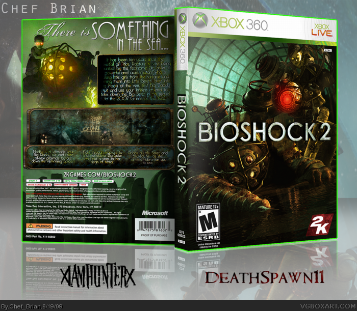
Printable and re-upload for bigger thumbnail in a tick. Please view in full, and please for the love of God comment. xP
[ Reply ]
Really nice and kinda funny front!
It's a bit hard to read text on the back and I would change screens to more visible ones.
(I guess now we'll have BioShock 2 boxes wave)
[ Reply ]
Dont think you should have those types of Big daddy's on the box cause those arent in the game I think. They said its going to have the old big daddy's that were going to be in the first game.
[ Reply ]
Why the dumb username? why not take turns uploading your boxes?
Font is a bit messy on the back, looks good though.
[ Reply ]
wow, you perfectly blended the bioshock 1 and 2 arts together...
[ Reply ]
Very nice collaboration.
[ Reply ]
#2, How is it funny? =p
And I think they fit like that. Although Ryan probably could've made the words on the left side a bit more readable.
#3, Oh but it's ok for you to do it?
-_-
#4, It's not a dumb username >_>
Andddd eye dee kay. We just felt it should be done on a collab account.
#5-6, Thank you gentlemen =)
[ Reply ]
ok so the front is solid gold and great only things I would change are things on the back I realize you were going for the rundown old rusted look but go the opposite way by going with pure white and make the pictures more vibrant and visually viewable I would say instead of a big daddy on the back maybe put the prototype one or put the girl from the teaser or even the big daddy doll that she is carrying on the back other than those suggestions keep going wiith this concept because the front really is amazing and the back deserves to be also
[ Reply ]
@#8, i think the back is the best part of the box. I love how it looks rusty. But thats just me. Great job IAMHUNTER :D
[ Reply ]
#8, I think it would look bad with more of a brighter tone to it. It wouldn't fit with the front if it was brighter and such.
[ Reply ]
Very nice job, gentlemen.
[ Reply ]
#7, Hmm lets see. I did it before they released much information about the game and you did it a few months after they said that the big daddy from Bioshock one wont be in the game. Soooo...... -.-
[ Reply ]
Holy crap, this is amazing guys
[ Reply ]
Steven + Ryan = OMG
[ Reply ]
It sucks, it's garbage, and you should seek other career opportunities.
Now, on to the box. It's great! Masterworks for sure!
[ Reply ]
#12, Stop being so butthurt.
[ Reply ]
Holy crap. Front cover is genious!
Edited at 1 decade ago
[ Reply ]
#17, Gracias mi amigo.
We had the idea months ago after seeing some of the new art, but someone else actually made a pretty similar box haha.
[ Reply ]
#3, lolmiss
[ Reply ]
#3/12, Hahahahaha get proved wrong faeg.
[ Reply ]