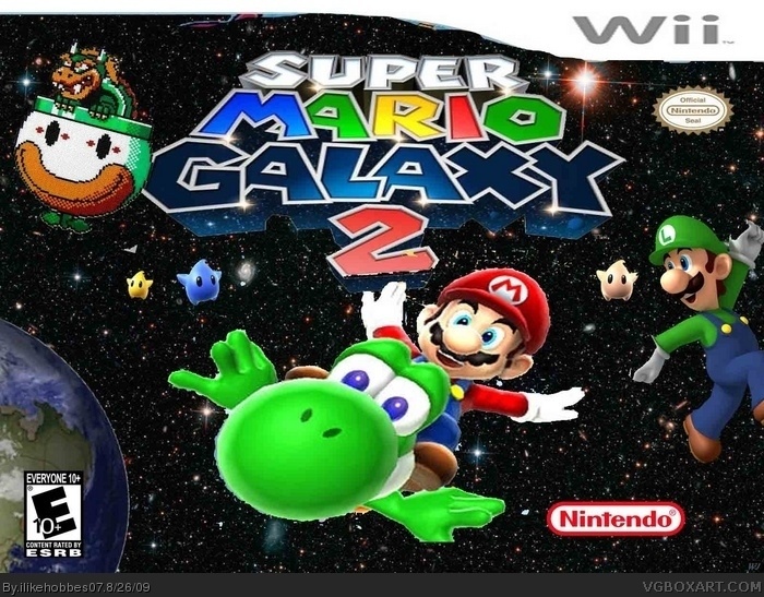
Wow, images are jaggy, the Wii logo at the top still has parts of whatever picture it was cut out of, there's a Bowser sprite for no reason whatsoever. It's rated E10+ for no reason, the Nintendo logo's out of place (as is the Nintendo Seal), and the style of the case seems more like the slip-in case like Wii Sports. Fix these problems and maybe it'll be considered passable.
#4, ok it is shit because bowser is a sprite luigi hands are horribly cut boxx art is slip-in rated 10+ NO REASON WHY IT IT RATED 10+
WTF IT SHOULD BE RATED 3+!
mario horribly misplaced nintendo logo out of place yoshi lost one
of his thumbs
 Super Mario Galaxy 2 Box Cover Comments
Wow, images are jaggy, the Wii logo at the top still has parts of whatever picture it was cut out of, there's a Bowser sprite for no reason whatsoever. It's rated E10+ for no reason, the Nintendo logo's out of place (as is the Nintendo Seal), and the style of the case seems more like the slip-in case like Wii Sports. Fix these problems and maybe it'll be considered passable.
[ Reply ]
boring
[ Reply ]
Horribly cut, Luigi's hands are half gone, Yoshi missing one of his thumbs, rated E10+, and It is stretched and has pointless bowser sprite.
(By the way, why is Luigi even there?)
[ Reply ]
#2, Mind being helpful?
[ Reply ]
#4, ok it is shit because bowser is a sprite luigi hands are horribly cut boxx art is slip-in rated 10+ NO REASON WHY IT IT RATED 10+
WTF IT SHOULD BE RATED 3+!
mario horribly misplaced nintendo logo out of place yoshi lost one
of his thumbs
ilikehobbes7 fix these and it'lll be better
[ Reply ]
jeez its my 1st box its not the worst on this site
[ Reply ]
He's right there are plenty of crappy boxes on this site which are given no effort and Why did you make your template so big?
[ Reply ]