#3, That was rather rude, the text composition did not go out in the 90's So what your saying is don't use western fonts on western games for example? you my friend FAIL!
For the box as usual you impress me greatly with your unique style and very appealing sig ;) i do like how you kept the text and info limited to half of the back as it allows more room for awesomeness.
#3 that was kind of harsh, Anyways I like this box but I agree with shadysaiyan you should make Portal more obvious like put cake there or something i dont know lol
I didn't find his comment harsh. He is entitled to his own opinion and I welcome all C&C for my boxes whether it's good or bad. Not to say that I wont back up up my artistic choices if I feel the negative feedback is unhelpful. Thanks for all the comments and Fav+ everybody :)
Boy you guys are a bunch of Nancys. Comment wasn't harsh at all. I think the front lacks compared to the back and I think Portal should be represented more.
Back > Front by a trillion miles. For me, the front is rather meh for your standard. It just doesn't scream out greatness.
The back however is lik, :o. You really do have gift for just making typography work. Imo, you DO make some of the best backs to covers on the entire site, agree or disagree.
The back of this? 11/10. Absolute perfection. It's beautiful, it's inspiring. It's amazing.
The front? Looks like trash to me. I can't stand just integrating things together for compilation games, and I also think the logo is horribly uncharacteristic.
The back almost makes up for it, though. Damn fine job on it.
I have received lots of mixed thoughts on the front. I flew through making the front cover. Only took like 40 minutes (maybe less). I should have planned it out a little better.
 The Orange's Box Box Cover Comments
sup?
[ Reply ]
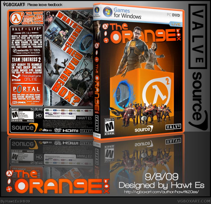
Portal should be more obvious like the others as it just looks like a hole in the side of the box.
Looks great though, love what you did with the back.
[ Reply ]
That style of text composition went out with the 90's. Please let it die.
[ Reply ]
#3, That was rather rude, the text composition did not go out in the 90's So what your saying is don't use western fonts on western games for example? you my friend FAIL!
For the box as usual you impress me greatly with your unique style and very appealing sig ;) i do like how you kept the text and info limited to half of the back as it allows more room for awesomeness.
Keep it up man, +fav
[ Reply ]
I agree with Shady, but other than that, it's fantastic.
[ Reply ]
#3 that was kind of harsh, Anyways I like this box but I agree with shadysaiyan you should make Portal more obvious like put cake there or something i dont know lol
[ Reply ]
#3, I don't know about all that. Artistic styles from all eras are constantly being revamped and improved.
Thanks for all the comments though people!
[ Reply ]
#3, no need to be Harsh man
I like it accept the logo
[ Reply ]
Harsh? Lawl.
Anyway, great work here!
[ Reply ]
I didn't find his comment harsh. He is entitled to his own opinion and I welcome all C&C for my boxes whether it's good or bad. Not to say that I wont back up up my artistic choices if I feel the negative feedback is unhelpful. Thanks for all the comments and Fav+ everybody :)
[ Reply ]
Boy you guys are a bunch of Nancys. Comment wasn't harsh at all. I think the front lacks compared to the back and I think Portal should be represented more.
Edited at 1 decade ago
[ Reply ]
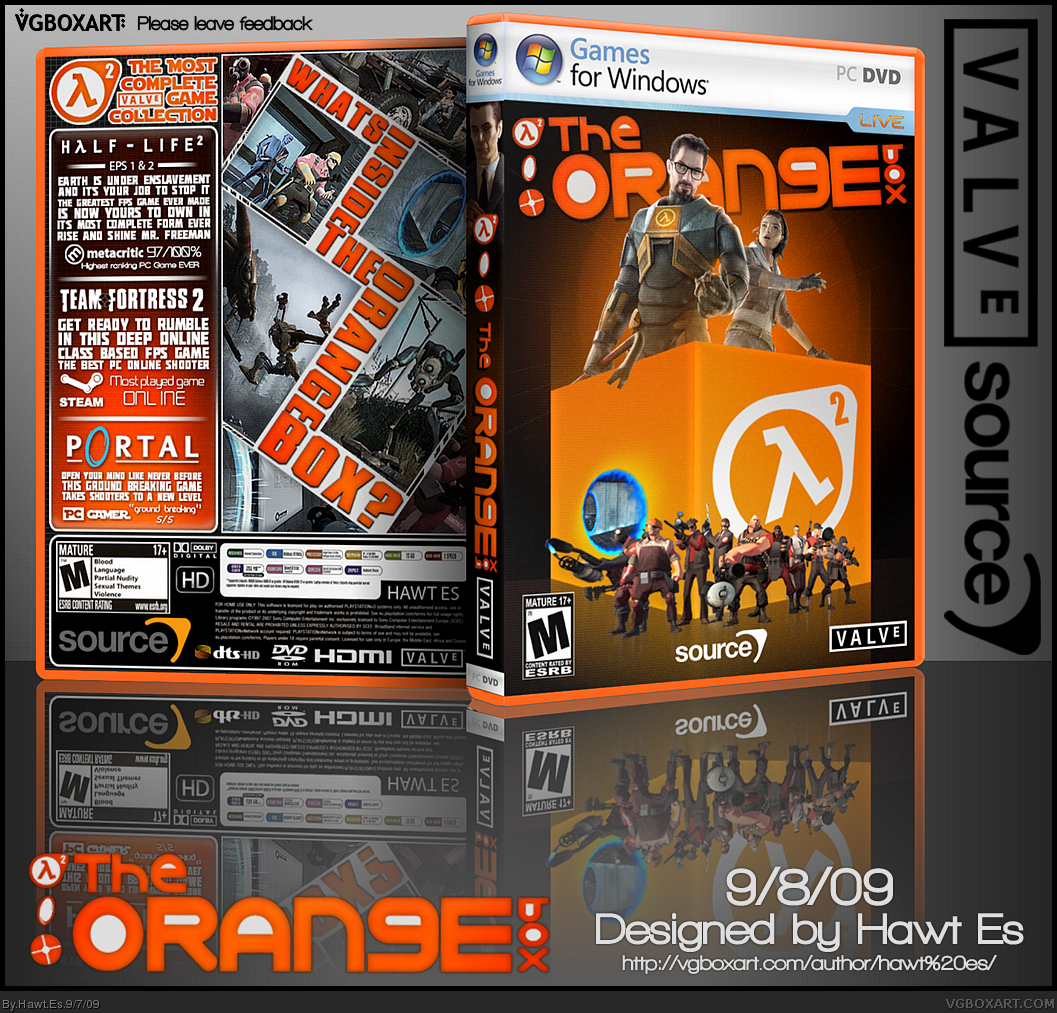
Yeah, I'm going to update this tonight. Going to fix the Portal. It was late and I wanted to finish it before I went to bed ~_~
[ Reply ]
Back > Front by a trillion miles. For me, the front is rather meh for your standard. It just doesn't scream out greatness.
The back however is lik, :o. You really do have gift for just making typography work. Imo, you DO make some of the best backs to covers on the entire site, agree or disagree.
[ Reply ]
Updated it: Fixed the portal and tweaked the box color's casing.
Also I put this under the wrong category, it was late. Any way I can fix this?
Edited at 1 decade ago
[ Reply ]
Is that a Tranq and Nailgun I see?
+fav
The back is the better of the two.
[ Reply ]
anybody want me to upload a flat?
[ Reply ]
Amazing typography on the back as usual.
[ Reply ]
Great update. My favorite Orange Box by far! Also one of my favor boxes on the site. Definitely creative and unique.
[ Reply ]
fukin nasty
[ Reply ]
I just noticed she looks like she's gonna smack Gordon in the face. Nice update.
[ Reply ]
I have added a printable flat for those who are interested. It may require so minor resizing
Much thanks to every user here that has given this box a Fav+/comment
[ Reply ]
The best Orange Box on the site. I Love the back.
[ Reply ]
Oh, man.
The back of this? 11/10. Absolute perfection. It's beautiful, it's inspiring. It's amazing.
The front? Looks like trash to me. I can't stand just integrating things together for compilation games, and I also think the logo is horribly uncharacteristic.
The back almost makes up for it, though. Damn fine job on it.
[ Reply ]
I have received lots of mixed thoughts on the front. I flew through making the front cover. Only took like 40 minutes (maybe less). I should have planned it out a little better.
[ Reply ]
The back looks better than the front imo. Nice to see that you used that box tutorial or whatever it was.
Nice work Mark.
[ Reply ]
This is sweet. Much better than the actual cover art.
[ Reply ]