
[ Box updated on July 16th, 2006 ] [ original ]
 The Legend of Zelda: Twilight Princess Box Cover Comments
Comment on WickedGamer1's The Legend of Zelda: Twilight Princess Box Art / Cover.
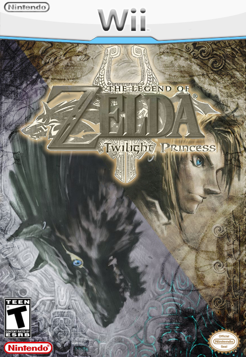
[ Box updated on July 16th, 2006 ] [ original ]
Comment on WickedGamer1's The Legend of Zelda: Twilight Princess Box Art / Cover.
i've been working on this for a few weeks on and off, and it took me that long to get it just how i liked it. and god knows how overused this pic is, but i garantee you wont see one exactly like it. also much thanks to the electric general for the twilight princess logo :)
[ Reply ]
it nice i like it
[ Reply ]
why a 3? whats wrong with it? i wanna have a good LoZ box, so please, suggestions are welcome with open arms.
[ Reply ]
Wicked, this is far from a 3, if the rating system went to a 10, it'd be an 11. This is probobly the GREATIST LoZ box art i have ever seen!
[ Reply ]
I like the tornado patterned lighting (whatever its called) you did you should do a bit more for the diversity you want and make the logo more gold whist being different, its too pale like itÂ’s in black and white!
my suggestive opinions but it still looks gorgeous.
[ Reply ]
GREAT WORK wicked i give it a 10/10
[ Reply ]
Danke :)
and i'll try and work on the logo. i liked the color of it, but if you think it should be changed, i'll try that out.
[ Reply ]
I like the background, but I've always hated the original artwork - the wolf link facing down - to me, just looks stupid. Some parts on it, I can clearly see where you edited it. I'd suggest moving the picture, along with logo, down, so it won't seem like everything's squished up top. Also, the logo needs to have its original colors. The concept is really good, but again, I can't stand the wolf facing down.
[ Reply ]
oh well. and what do you mean by you can clearly see where i edited it?
[ Reply ]
Like the light from the dark; around the bottom-right.
[ Reply ]
i dont get it... :\
[ Reply ]
you could make the logo even golder though but a slight improvement.
[ Reply ]
Zelda boxart should be sweet, simple, and clean cut. This fits all of them, and thus gets a perfect 5. *Drools*
[ Reply ]