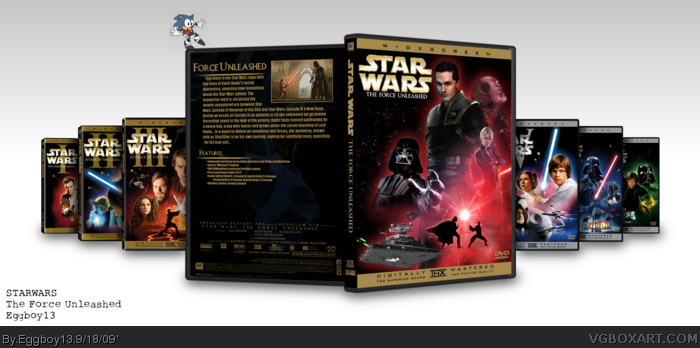
I love the front, keeping in tone with the other 6 yet looking very unique, only thing i don't like is the plain back, maybe a background would've sufficed like something on the official backs.
#2, I took alot of timewith the back, making every little detail work just right, when I got to the idea of what I'd put on the back's image, I relised all the other's were not focussed much on deatail of the picture featured on the back, so I tried to keep it very simple, nothing complex.
Good looking box. I like the concept, the execution is pretty good. I think adding in the other movies is a bit much, though. It's irrelevant and detracts a bit, even if it does belong into the collection.
On a somewhat related note, why won't you ever tell me why you like the goddamn ridiculous idea of Sonic wearing Robotnik's clothing?
#6, Thanks for your thoughts. Though the other boxes are un-necesary, I simpley wanted to stress the fact I wish this mvie was really part of the saga. About the whole Robotnik Sonic deal, that was a image created when I dabbled into spriting for a while.(before I even attempted any boxarting) It's sort of a personal/sentimental kind of thing.
#9, I hope your joking. Anyways I don't think the other movies should be apart of it because the main character isn't a skywalker and the rest are. Looks cool though. Good job.
Very nice box Eggboy! It's obvious you've gotten better. i think there's a bit too much glow on the characters on the front though and Darth Vader fading off at the bottom doesn't look right.
My only sugestion, what if you mae the border on TFU Box a gradient between gold and silver, saying as the New Trilogy borders are gold, and the Original Trilogy borders are silver, and this is a bridge between them. Just a sugestion. Very well done!
 Star Wars: The Force Unleashed Box Cover Comments
What if TFU was a movie?...
IT WOULD BE BLOODY AMAZING IS WHAT IT WOULD BE!!
--Credit--
Indexenos
PlanetRenders
umm?... well mostly material came from Google and the 2 above or myself...
I suggest veiwing the Printable for closer detail.
Thanks!
ENJOY!
[ Reply ]
I love the front, keeping in tone with the other 6 yet looking very unique, only thing i don't like is the plain back, maybe a background would've sufficed like something on the official backs.
[ Reply ]
Great box. And I'm the first to view!
[ Reply ]
#2, I took alot of timewith the back, making every little detail work just right, when I got to the idea of what I'd put on the back's image, I relised all the other's were not focussed much on deatail of the picture featured on the back, so I tried to keep it very simple, nothing complex.
[ Reply ]
I wish TFU was a movie and this looks very good+fav
[ Reply ]
Good looking box. I like the concept, the execution is pretty good. I think adding in the other movies is a bit much, though. It's irrelevant and detracts a bit, even if it does belong into the collection.
On a somewhat related note, why won't you ever tell me why you like the goddamn ridiculous idea of Sonic wearing Robotnik's clothing?
[ Reply ]
I actually like the presentation alot. Is a Shadows of the Empire movie next?
Edited at 1 decade ago
[ Reply ]
#6, Thanks for your thoughts. Though the other boxes are un-necesary, I simpley wanted to stress the fact I wish this mvie was really part of the saga. About the whole Robotnik Sonic deal, that was a image created when I dabbled into spriting for a while.(before I even attempted any boxarting) It's sort of a personal/sentimental kind of thing.
Edited at 1 decade ago
[ Reply ]
#8, Well it's annoying, stupid, and infuriating.
Stop that shit.
[ Reply ]
#9, So is the professor Utonium that never swollows a full mouth... :P
Edited at 1 decade ago
[ Reply ]
#9, I hope your joking. Anyways I don't think the other movies should be apart of it because the main character isn't a skywalker and the rest are. Looks cool though. Good job.
[ Reply ]
#11, What about Vader? :P
I think it's the only non-movie story that really fits into the story of the movies.
[ Reply ]
#12, Well it would fit into the story better than any game but it wouldn't really be apart of the collection if you get me.
[ Reply ]
#13, Yes I get you, I agree, but still... you gotta admit it, Geaorgy needs to get his sorry ass back out there, and make just one more for us!
[ Reply ]
Wow, it looks great ! =D Really like it, the front, and the back.
It would be like this if it existed ;)
[ Reply ]
hell yeah great box this is awesome I would say my favorite is return of the jedi really great job seriously your a pro...
[ Reply ]
#9, Always seem to make me laugh. XD
Very nice box Eggboy! It's obvious you've gotten better. i think there's a bit too much glow on the characters on the front though and Darth Vader fading off at the bottom doesn't look right.
[ Reply ]
My only sugestion, what if you mae the border on TFU Box a gradient between gold and silver, saying as the New Trilogy borders are gold, and the Original Trilogy borders are silver, and this is a bridge between them. Just a sugestion. Very well done!
[ Reply ]
It's not very often that I rate a bog 10/10. You're amazing, Eggboy.
[ Reply ]
EXCELLENT!
[ Reply ]
I totally agree with #5.
[ Reply ]
only problem is the description on the back has some errors, and starkiller's neck isnt the same brightness as his head
oh and sam watz his face is such a good actor, i watched him in smallville for season 8!
[ Reply ]