#2, I do agree, I could have gone slightly overboard with the use of scanlines and what have you. However, the game is scientific to an extent. I tried to get that message across; whilst also a clear showing of the times it is based in. That's what I was going for; If it does not work, I do apolidgize - but hey, at least I tried! :D
#3, Thanks and due to your agreement, read the above :]
#5, Well, I guess that's your opinion =]
But thanks for your thoughts on the slip cover!
By the way, can you guys comment if you're going to favourite ;]
#8, Thanks man, I did try to listen to your words of wisdom =p
#10, I guess you could say that, but I couldn't be bothered to make some crappy DNA effect -_-'
Thanks for the thoughts about the scheme. However, I do agree that it's rather generic; I couldn't really think of any ideas. Even still, I'm proud of my work, so it's all good =D
I don't see how the scanlines fit the "scientific" theme of the game. They're just there to look fancy. I'll agree that you went overboard with them.
To be honest, I don't like it. I commend for sticking to a consistent colour scheme, but the whole thing looks very generic. It's way too simple, and not in a good way. There's nothing really eye grabbing about it.
The colors looks nice, and I can tell you put a great amount of effort into making everything sharp and clean. The design is a bit typical, but there is still a lot to be impressed with from it. Good job sir.
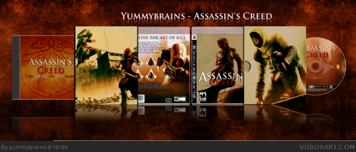
 Assassin's Creed: Collectors Edition Box Cover Comments
''Guess who's back.''
[ Reply ]
Your overuse of the scanline technique seems inappropriate in a game based during the Crusades. It's very overwhelming.
Edited at 1 decade ago
[ Reply ]
Yes, though I agree with koopa
Fav though
[ Reply ]
#2, I do agree, I could have gone slightly overboard with the use of scanlines and what have you. However, the game is scientific to an extent. I tried to get that message across; whilst also a clear showing of the times it is based in. That's what I was going for; If it does not work, I do apolidgize - but hey, at least I tried! :D
#3, Thanks and due to your agreement, read the above :]
[ Reply ]
I like the slip cover, but box itself is a bit too plain for me.
[ Reply ]
#5, Well, I guess that's your opinion =]
But thanks for your thoughts on the slip cover!
By the way, can you guys comment if you're going to favourite ;]
#7, Thanks dude =]
Edited at 1 decade ago
[ Reply ]
like i said on MSN, amazing ;)
[ Reply ]
#2 I'm gonna guess you've never played Assassin's Creed, have you?
Nice job man, you stuck to the colours
[ Reply ]
#8, Thanks man, I did try to listen to your words of wisdom =p
#10, I guess you could say that, but I couldn't be bothered to make some crappy DNA effect -_-'
Thanks for the thoughts about the scheme. However, I do agree that it's rather generic; I couldn't really think of any ideas. Even still, I'm proud of my work, so it's all good =D
Edited at 1 decade ago
[ Reply ]
I don't see how the scanlines fit the "scientific" theme of the game. They're just there to look fancy. I'll agree that you went overboard with them.
To be honest, I don't like it. I commend for sticking to a consistent colour scheme, but the whole thing looks very generic. It's way too simple, and not in a good way. There's nothing really eye grabbing about it.
[ Reply ]
....I will say, amazing
[ Reply ]
The colors looks nice, and I can tell you put a great amount of effort into making everything sharp and clean. The design is a bit typical, but there is still a lot to be impressed with from it. Good job sir.
[ Reply ]
#11, Cheers, Mubby.
#12, Thanks man; Much pride in having a great artist like you to appreciate my work =]
[ Reply ]
#4, I understand what you are going for but the scanlines are just overwhelming, it kind of ruins it for me.
[ Reply ]
#14, Suppose that's your opinion - I guess I could've not used scanlines on the slip.
[ Reply ]
awwww yeah! sweet box! fav'd
[ Reply ]