Here it is, my first ever box, hope you like it. =]
Mainly all the credits go to google for the images etc., i did happen to stumble across the template on google aswell but it was submitted by somebody on here I think.
1st box! like this!? this is something you never see these days. nice box. love to see you add more pics to the back. im keeping my eye on you. you have potential
very good tor a first, only thing I can say is that the tag-line on the back is too simple fo rmy liking try and liven it up a tad, but keep up the good work man
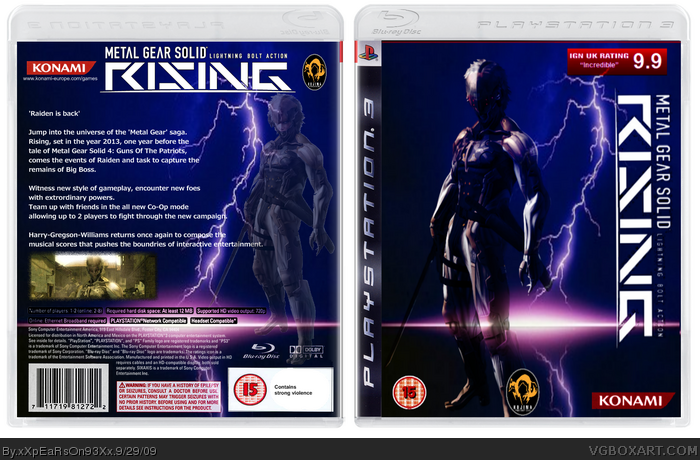
You used the same images in the front and back with little to none difference, you should vary more and the Kojima logo has a bad quality. Look for more renders and some background tutorials to improve your box.
#6, Yeah, I find it hard to find decent renders of raiden without using the only one released for 'Rising' so far, the only difference between them is that on the front is mask is closed, while on the back it's open.
#6, I agree, you shouldn't have used the same picture on the front and back, and the same lightning effect/background. The theme doesn't really match Metal Gear Solid either, typically art covers. I think you should get rid of the rating on the front aswell, and make up the space with a larger logo. The images are also poor quality, and the layout of the back is slightly boring.
However, this is your first, so all in all it's pretty good. Keep up with the effort and you'll seen be making great boxes. Sorry for the big post, but it'll help you in the future.
 Metal Gear Solid Rising Box Cover Comments
Here it is, my first ever box, hope you like it. =]
Mainly all the credits go to google for the images etc., i did happen to stumble across the template on google aswell but it was submitted by somebody on here I think.
Edited at 1 decade ago
[ Reply ]
1st box! like this!? this is something you never see these days. nice box. love to see you add more pics to the back. im keeping my eye on you. you have potential
[ Reply ]
Thanks for commenting folks =]
Edited at 1 decade ago
[ Reply ]
very good tor a first, only thing I can say is that the tag-line on the back is too simple fo rmy liking try and liven it up a tad, but keep up the good work man
[ Reply ]
#2, =O, thank you, i wasn't expecting such a nice response =]
[ Reply ]
You used the same images in the front and back with little to none difference, you should vary more and the Kojima logo has a bad quality. Look for more renders and some background tutorials to improve your box.
[ Reply ]
#6, Yeah, I find it hard to find decent renders of raiden without using the only one released for 'Rising' so far, the only difference between them is that on the front is mask is closed, while on the back it's open.
[ Reply ]
#6, I agree, you shouldn't have used the same picture on the front and back, and the same lightning effect/background. The theme doesn't really match Metal Gear Solid either, typically art covers. I think you should get rid of the rating on the front aswell, and make up the space with a larger logo. The images are also poor quality, and the layout of the back is slightly boring.
However, this is your first, so all in all it's pretty good. Keep up with the effort and you'll seen be making great boxes. Sorry for the big post, but it'll help you in the future.
[ Reply ]
#7, That is why you shouldn't do a boxart like this. If your new you should work with games with a lot of material.
[ Reply ]