[ Box updated on April 18th, 2016 ] [ original ]
 Call of Duty : Complete Collection Box Cover Comments
Comment on AB501UT3 Z3R0's Call of Duty : Complete Collection Box Art / Cover.
[ Box updated on April 18th, 2016 ] [ original ]
Comment on AB501UT3 Z3R0's Call of Duty : Complete Collection Box Art / Cover.
Great concept. The contrasts seem a bit off though... But it's still good.
[ Reply ]
Thanks ,This is my first Boxart And if anyone could give me there opinion / out of 5 i would apiciate it Thanks
Edited at 1 decade ago
[ Reply ]
well... I'd say 3/5. I like the front alot the only problem is that the contrast is a bit off, but I allready said that. ^^
Really good for first one though.
Edited at 1 decade ago
[ Reply ]
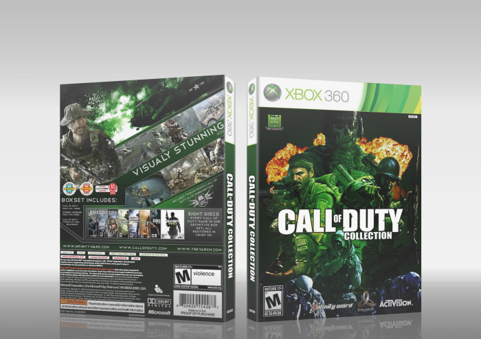
Well it is not without its problems.The disks look too similar and the text on the back is too big and not plentiful.
However its your first and I respect that so you have earned you first fav.I expect great things from you :)
[ Reply ]
im gonna change some things for v2
[ Reply ]
Wow great for a first, better than mine anyway :)
5/5 for effort
4/5 for design
The discs are too alike but i understand thats its a disc collection so a good idea for keeping them similar. I suggest making your border bigger because it is difficult to see the bottom half of the back cover. I like the front but one of the characters is covering part of the logo so maybe make the logo the top layer. over 4.5/5 + fav good job.
Edited at 1 decade ago
[ Reply ]
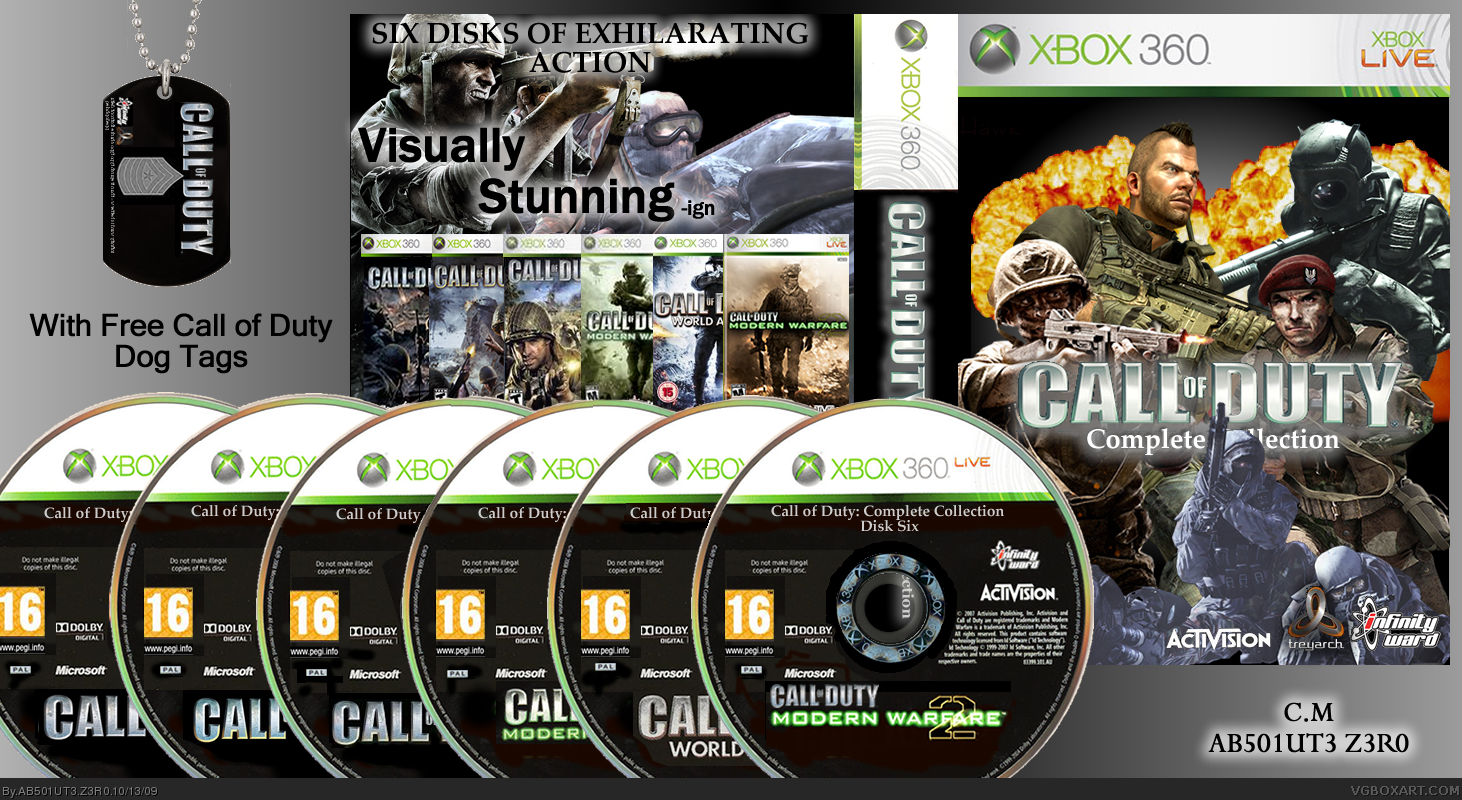
thanks heres v2 ive change the back
[ Reply ]
yeah i like the back, and ive realized your only covering the legal info on the back so we can still see the design, and i like how the discs are spread out more definatly an improvement :)
[ Reply ]
thanks
[ Reply ]
Not a bad first. You really should switch up your presentation so the entire box can be viewed though.
[ Reply ]
coolio! certainly an improvement from the last one.
[ Reply ]
o dear, i can clearly see all the paint brush marks you made on the discs. great idea though
[ Reply ]
ITs a first, and for that this is nicely done. I mean, if youve seen most peoples firsts they are not all that great. With that said, yours is actully well done for a first. +fav
[ Reply ]
For a first not bad, I really don't like the idea though. Renders on front don't seem to go well together either. Also the discs block me from seeing a lot of the back cover. For a first though, I think it's pretty great. 2.25/5 :)
[ Reply ]
Its good for a first, but I think it needs a bit of work to get 'there', if you know what I mean.
[ Reply ]