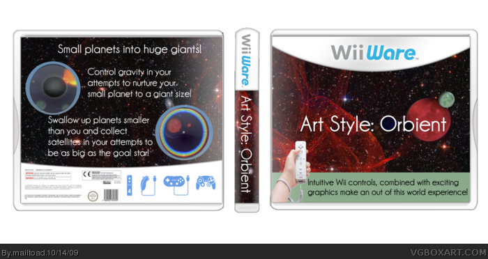
So yeah, my latest box. This took me about five hours to complete - I made a lot of the effects on the stars background. Logo was created by me. Credit to Silent Oblivion for the screenshot borders, and to Hsoldier for the template. I hope you like it, and as usual, comments and favs are more than welcome.
well, that's an interresting box, the front as really something, but the back is really weird, i don't get the "screenshots" "planet" or something. it ruins the idea to my eyes
as Grahamz but i cannot fav for an half liked box
It's a competent design for sure, but it's a bit to plain for my tastes.
Perhaps creating a more exciting logo, or adding some effects to the imagery would help a bit. Nice layout work though. :)
Hmmm, pretty much all that I said for your LostWinds box applies here. The simplistic text and logotype seems to work for me, as it is a game for casual gamers to pick up and play.
Admittedly, the template is slowly starting to look a little more appealing.
 Art Style: Orbient (WiiWare) Box Cover Comments
So yeah, my latest box. This took me about five hours to complete - I made a lot of the effects on the stars background. Logo was created by me. Credit to Silent Oblivion for the screenshot borders, and to Hsoldier for the template. I hope you like it, and as usual, comments and favs are more than welcome.
[ Reply ]
Pretty nice, but if there was one thing I could change, it would be the logo/back text.
[ Reply ]
i actually like this! and it is no doubt your best to date
[ Reply ]
I don't know what i'm looking at...
but i like it somewhat.
+fav
[ Reply ]
well, that's an interresting box, the front as really something, but the back is really weird, i don't get the "screenshots" "planet" or something. it ruins the idea to my eyes
as Grahamz but i cannot fav for an half liked box
Edited at 1 decade ago
[ Reply ]
It's a competent design for sure, but it's a bit to plain for my tastes.
Perhaps creating a more exciting logo, or adding some effects to the imagery would help a bit. Nice layout work though. :)
[ Reply ]
thanks for the comments anf favs guys! to drakxxx, what kind of effects would you suggest?
[ Reply ]
thanks for the comments anf favs guys! to drakxxx, what kind of effects would you suggest?
[ Reply ]
This is actually pretty good. that profile visitor message was worth reading!
[ Reply ]
It was an interesting approach that you took on it...
But it worked well. +fav!
[ Reply ]
It looks nice, but i think it could have been a little more "artsy".
I mean, this is ART STYLE here, so some graphics seem wanted. Also, the Wii hand at the bottom left could be rendered better.
I do however like where it is going.
[ Reply ]
I actually like this. Good job!
[ Reply ]
I have to admit i know nothing about the game (havent really looked into WiiWare yet) but i love your design ;)
Please check my new boxes out if you get chance
[ Reply ]
Very nice!
[ Reply ]
#14 worth a fav?
[ Reply ]
oops double post
Edited at 1 decade ago
[ Reply ]
I like it, pretty original, good template by the way :]
[ Reply ]
i like it
[ Reply ]
pretty good
[ Reply ]
Hmmm, pretty much all that I said for your LostWinds box applies here. The simplistic text and logotype seems to work for me, as it is a game for casual gamers to pick up and play.
Admittedly, the template is slowly starting to look a little more appealing.
[ Reply ]