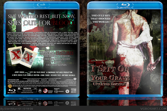
I like this, a great grunge piece, looks great. A little grainy yes and the blurb is a bit hard to read but still a winner. Good composition here. Interesting movie name too.
Oh, and that chick on the cover has a pretty nice ass, great choice!! Just saying cos, well, no one else has...
 I Spit On Your Grave Box Cover Comments
This was made for Round 1 of the Halloween comp.
[ Reply ]
Great, but the red text on the back is hard to read...
+Fav
[ Reply ]
#2, Its only two words. Blood and Features.
[ Reply ]
Yeah, but they're hard to read.
[ Reply ]
I like it, but I think the grain effect is a tad too strong.
[ Reply ]
I like this, a great grunge piece, looks great. A little grainy yes and the blurb is a bit hard to read but still a winner. Good composition here. Interesting movie name too.
Oh, and that chick on the cover has a pretty nice ass, great choice!! Just saying cos, well, no one else has...
+fav
[ Reply ]
i want to see this in the hall
[ Reply ]
#7, Me too. I think this box fits the movies feel so well.
[ Reply ]
Lol, i love how the front says unrated but the back says R. Nice box btw, it looks amazing
[ Reply ]
EPIC DOUBLE POST!!!!
Edited at 1 decade ago
[ Reply ]
Great design for a definite grindhouse horror classic! Super job Kyle.
[ Reply ]