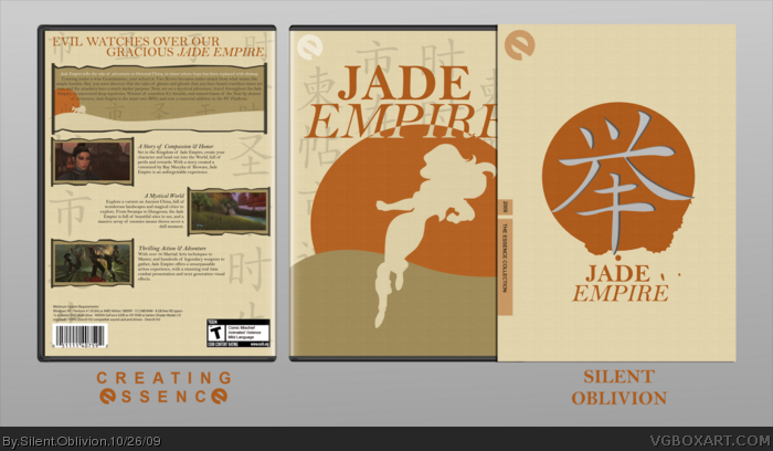
Well, just about everything went into this, and really needs full view to really appreciate it. The whole thing is mostly based off a scroll, you can only really see the effect used in full view.
Again, most of this is hand-drawn, all of the border things, the woman render, back text box etc etc.
This game is great, and if you haven't played it, you must.
Hope you like this, any feedback is really appreciated =)
#2 - Using Silhouettes complentments the style I was aiming for. Adding a full blown render would simply wreck the whole box. Originally, I had just eyes showing, but that didn't work either. And just because silhouettes were used doesn't mean this took no work. Because, this took a hell of alot.
Really loving the color scheme here, you must have put a lot of effort in here. Only thing I would say is that the blue tinted symbol looks a little odd, being the only blue thing there. Great job! +fav
What I love about this the most is the detail and quality. It's a shame to see boxes that look great from far away, but when viewed up close look like a terrible mess. I think the movie Clueless had a term for this. Anyway like I said the detail is great, especially the woven pattern you have on the front and back. Very nicely done.
I agree with Dan; the use of texture really complements the clean silhouettes. It has the perfect amount of detail, which makes this stand above the other essence boxes. Great job.
 Jade Empire Box Cover Comments
Whoa...
Okay that's way too freaking awesome, man. :O
Edited at 1 decade ago
[ Reply ]
Very Nice Dude but...
DAMN SILHOUETTES!
[ Reply ]
Proberly my last Essence box.
Well, just about everything went into this, and really needs full view to really appreciate it. The whole thing is mostly based off a scroll, you can only really see the effect used in full view.
Again, most of this is hand-drawn, all of the border things, the woman render, back text box etc etc.
This game is great, and if you haven't played it, you must.
Hope you like this, any feedback is really appreciated =)
#2 - Using Silhouettes complentments the style I was aiming for. Adding a full blown render would simply wreck the whole box. Originally, I had just eyes showing, but that didn't work either. And just because silhouettes were used doesn't mean this took no work. Because, this took a hell of alot.
Edited at 1 decade ago
[ Reply ]
Really loving the color scheme here, you must have put a lot of effort in here. Only thing I would say is that the blue tinted symbol looks a little odd, being the only blue thing there. Great job! +fav
[ Reply ]
#4, Blue tinted symbol? If you mean the slipcover one, its actually a cut out, meaning when you slide it over the boxart, you can see through it.
Thanks guys =)
[ Reply ]
#5, Oh I see, sorry man, didnt notice, lol.
[ Reply ]
Damn, that's lovely :)
[ Reply ]
What I love about this the most is the detail and quality. It's a shame to see boxes that look great from far away, but when viewed up close look like a terrible mess. I think the movie Clueless had a term for this. Anyway like I said the detail is great, especially the woven pattern you have on the front and back. Very nicely done.
[ Reply ]
#8, I agree about your statement. +vote for comment.
Awesome box,perhaps one of the best Essence boxes I have seen.
[ Reply ]
This is AWESOME! Terrific job Josh.
[ Reply ]
Stylish.
[ Reply ]
#2, I don't see a thing wrong with using silhouettes, especially on this box. It turned out great!
[ Reply ]
Really well done man. THIS is when silhouettes are done right, people.
[ Reply ]
I agree with Dan; the use of texture really complements the clean silhouettes. It has the perfect amount of detail, which makes this stand above the other essence boxes. Great job.
[ Reply ]
I love the front, but i hate the back. Its really empty. No fav from me this time, sorry =(
[ Reply ]
holy god! too beauty, man!
[ Reply ]
It's about time this got in, congrats!
[ Reply ]
This looks pretty solid
[ Reply ]