Not at all your best. Its a very bland design and not original at all. The back is the biggest isue for me. Dont like how theres the little bit of yellow, the font used just seems not right for the box, and the glow on the text is too mutch. The screens are hard to see. Also the spine...yea. Like i said not your best
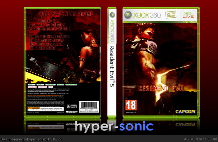
 Resident Evil 5 Box Cover Comments
Hello!
Cred to Sharshi,Teknee and PR.
[ Reply ]
Thats pretty cool :)
[ Reply ]
Not at all your best. Its a very bland design and not original at all. The back is the biggest isue for me. Dont like how theres the little bit of yellow, the font used just seems not right for the box, and the glow on the text is too mutch. The screens are hard to see. Also the spine...yea. Like i said not your best
[ Reply ]
#3, There is no glow on the text at all.
[ Reply ]