Thanx! I tried the font in black but it sunk into the shadows of the leaves and the trunk. Thanx for your tips! Hopefully this will be my rank 4 box if enough people fav ;)
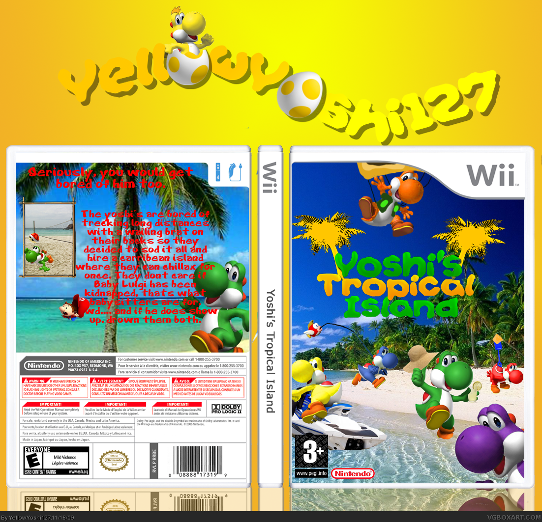
The back is too text heavy and there are quite a few grammar/spelling errors. Also, the red text doesn't work for me. Try using white with the drop shadow/stroke people have been mentioning and try to pull together or edit more screenshots.
It's a cute idea. The execution of the idea is a little weak, though.
The front cover is great! The text on the back should be white with a black dropshadow/stroke and there should be more screenshots. So the front is great, but the back needs work :D
 Yoshi's Tropical Island Box Cover Comments
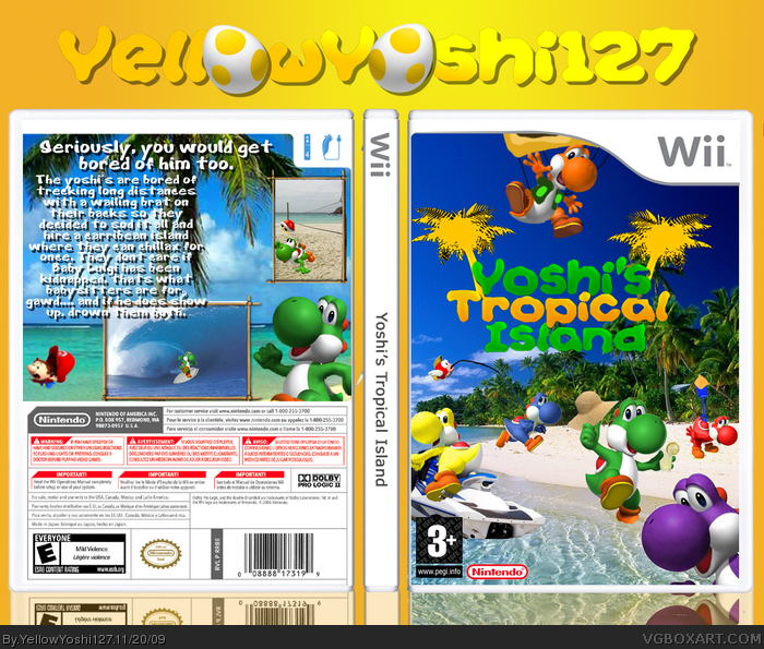
Ok this took a while to make and I would like to credit a dew people;
Tmrd for the userlogo
Paper Sonic for the game logo
And jevan for the temp.
[ Reply ]
Pretty cool! I would make the text on the back stand out a bit more with a black stroke or a drop shadow. Fav :)
[ Reply ]
Thanx! I tried the font in black but it sunk into the shadows of the leaves and the trunk. Thanx for your tips! Hopefully this will be my rank 4 box if enough people fav ;)
Edited at 1 decade ago
[ Reply ]
Also I think Baby Mario is covering some of the text.
#3, Just a black outline on the red text would do I think :)
Edited at 1 decade ago
[ Reply ]
I don't like the back, but the front is awesome! Work on the text and screenshots on the back.
[ Reply ]
#5, OK thanx, i'll fix that , worth a fav? ;)
[ Reply ]
The back is too text heavy and there are quite a few grammar/spelling errors. Also, the red text doesn't work for me. Try using white with the drop shadow/stroke people have been mentioning and try to pull together or edit more screenshots.
It's a cute idea. The execution of the idea is a little weak, though.
[ Reply ]
The front cover is great! The text on the back should be white with a black dropshadow/stroke and there should be more screenshots. So the front is great, but the back needs work :D
[ Reply ]
#7, If you fix the box then yes.
[ Reply ]
#9, I don't want to fix the box, lol.
[ Reply ]
I have updated the box, now with a better back with better text and more screenshots. Please fav if you like.
[ Reply ]
Hahaha, loving that baby mario xD
[ Reply ]
#12, thanx is it better now? Congrats on rank 7!!!
[ Reply ]
Looks great now! I will fav, but can you change Baby Mario? It looks like he's floating.
[ Reply ]
#14, Thanx, baby marios ot really floating more drowning...
[ Reply ]
shadows.
But nice.
[ Reply ]
#16, Thanx, havent figured out how to get them closer to the writning yet.. Damn Elements 7, its so damn complicated....
[ Reply ]
The front is great!!
but the back needs a little work
the screen shots look like artworks insted of screenshot
[ Reply ]
#15 thanx!! I couldn't really find any shots that looked beachy and with yoshi. I ll search again tonight. Thanx!
[ Reply ]