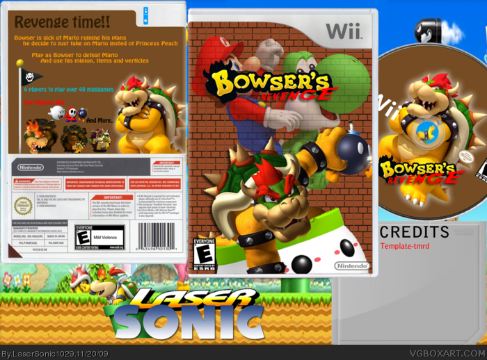
I like the logo too. The front is good but I say move bowser into the middle and put koopalings and bowser he around him. Love the editing actuallY TO bowser, he looks great . Back has a bit of a plain background screenshots look good but the text is a bit plain and the colours are a bit confusing. Otherwise great box!
The front is really good, but the back needs some work. Change the the screenshot borders, take away the floating characters (it looks awkward), and change the background to a neater pattern instead of a bland color. the white glow on bowser looks really good, though.
 Bowser's Revenge Box Cover Comments
Forgot to mention:
Disc by Nerdysimmer
And Rate!!
Edited at 1 decade ago
[ Reply ]
gz
[ Reply ]
#1, Rate? 2/5. Back is terribly plain. Front looks awkward. But who made that logo, Its really good
[ Reply ]
I like the logo too. The front is good but I say move bowser into the middle and put koopalings and bowser he around him. Love the editing actuallY TO bowser, he looks great . Back has a bit of a plain background screenshots look good but the text is a bit plain and the colours are a bit confusing. Otherwise great box!
[ Reply ]
The front is really good, but the back needs some work. Change the the screenshot borders, take away the floating characters (it looks awkward), and change the background to a neater pattern instead of a bland color. the white glow on bowser looks really good, though.
[ Reply ]