Yeah I forgot about game play screen shots when I was looking for something to fill in space on the back so I just put the coin and ring in! After I finished the front I got a little lazy with the back - the back is so much harder to make look good!
Yea box arts are really difficult. I've personally tries my hand at everything from blended sigs to stocks to vectors and vector wallpapers and difficulty wise box arts top everything. That said, it's alright for a first. It needs some more substance to it. There's too much dead space and your typography needs a lot of work. Screenshots are essential to the back and you should get more varying images/colors.
The front is better than a lot of firsts on this site. I would use a different background for the PRESENTATION as it makes the box a lot less impressive-looking. Try to go for something with the red colour scheme but not that exact image.
Also, the words "Theyre back" are very contrasting and hurt my eyes xD
But waaay better than my first. (On the front at least :D)
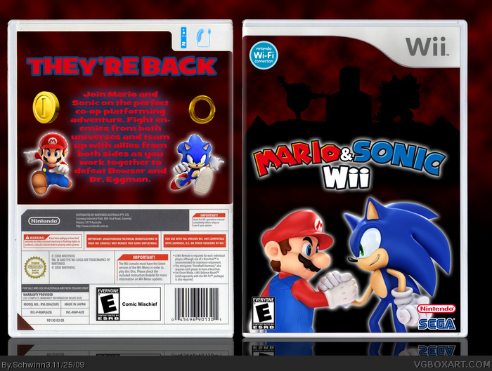
 Mario & Sonic Box Cover Comments
My first box art =) It was way harder / more time consuming than I thought!
Credit goes to:
tmrd (Wii Box Template & Mario and Sonic picture)
Cerium (Nintendo & SEGA logos)
E_G (ESRB "E" Box)
[ Reply ]
I think this is too plain, you should add some screenshots in the back and get a better background.
[ Reply ]
Yeah I forgot about game play screen shots when I was looking for something to fill in space on the back so I just put the coin and ring in! After I finished the front I got a little lazy with the back - the back is so much harder to make look good!
[ Reply ]
Yea box arts are really difficult. I've personally tries my hand at everything from blended sigs to stocks to vectors and vector wallpapers and difficulty wise box arts top everything. That said, it's alright for a first. It needs some more substance to it. There's too much dead space and your typography needs a lot of work. Screenshots are essential to the back and you should get more varying images/colors.
Edited at 1 decade ago
[ Reply ]
Agreed, but not bad for a first.
[ Reply ]
i like it but you could add screenshots to im gonna fav+ still
[ Reply ]
I'm working on a new boxart and I'll try to fix all the problems that were wrong in this one, on that one :)
[ Reply ]
i enjoy the box... but it needs screen shots, which i admit are hard to make, but its still good.
[ Reply ]
The front is better than a lot of firsts on this site. I would use a different background for the PRESENTATION as it makes the box a lot less impressive-looking. Try to go for something with the red colour scheme but not that exact image.
Also, the words "Theyre back" are very contrasting and hurt my eyes xD
But waaay better than my first. (On the front at least :D)
[ Reply ]
Thanks and I noticed that the background makes it look sort of flat so I'm gonna fix that with my next box, thanks for all the tips
[ Reply ]
Wow, this is amazing! Best Mario+Sonic box I've seen.
10/10
[ Reply ]
#11, thanks :) I have trouble making the backs though because I like the artistic part more than all the information :P
[ Reply ]