This is, possibly, one of the most fitting Essence boxes on the site. Truly, this should be used as an example of how to do good essence. Not only is it a very inspiring boxart, but a brilliant piece of art to match. Well done, in my opinion, you just clocked number 1 spot for Essence.
Damn, thanks guys. I seriously DID NOT expect a reception this good.
Best Essence box on the site, that's a big comment amongst the other awesome boxes, and I truly appreciate it.
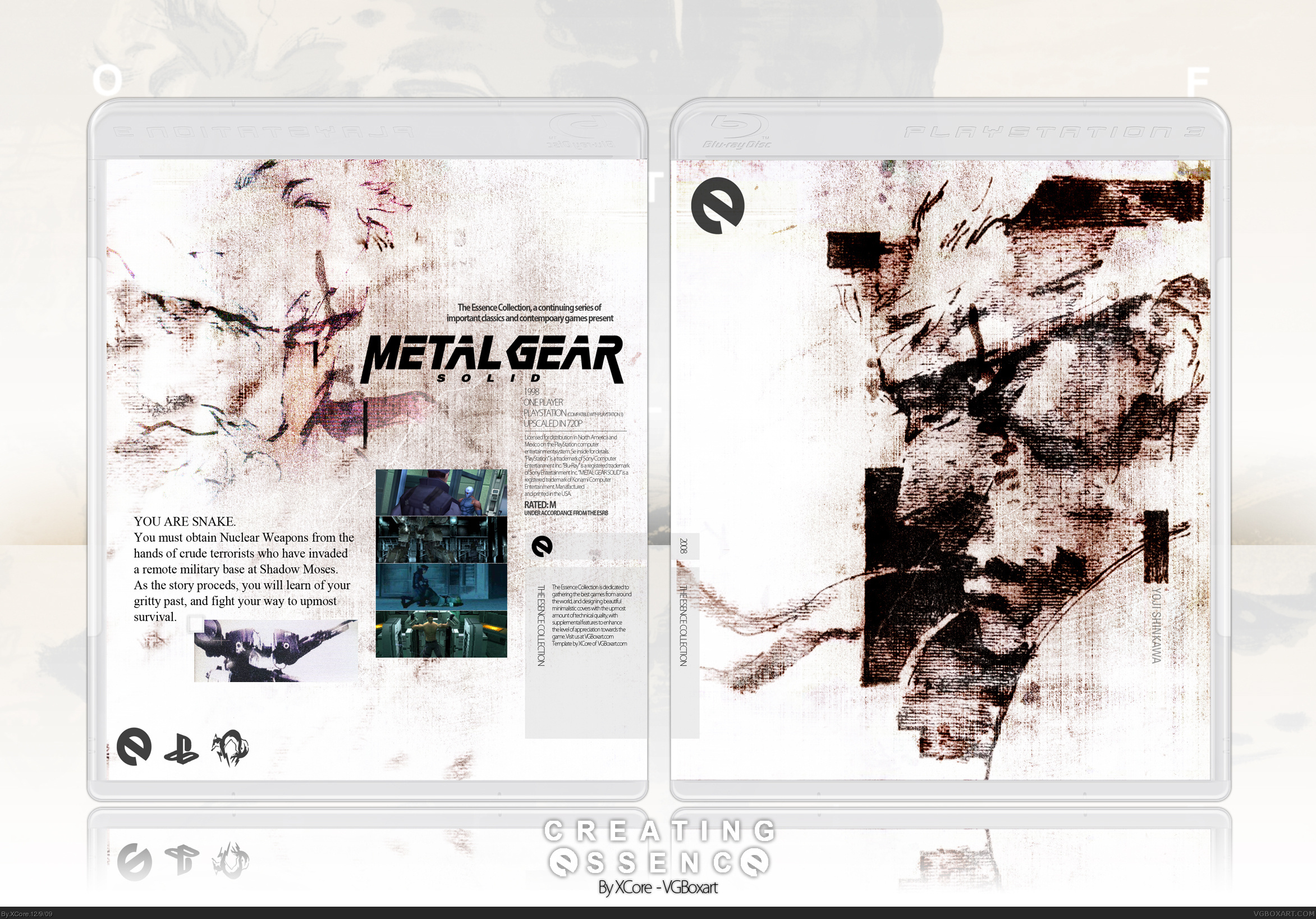
not bad but the fonts tracking is horrible ( maybe this will help you? link and you are mixing fonts with and without serifs in the copy on the back. Both is a very big no go!
#21, you don't see? there's almost no room between 95% of all characters and between a lot of words. the "00" of "2009" looks almost like a giant, squeezed 8. the "r" of "registered" is a "i" without the point on top, since it's that much on the "e". the "cl" of "classics" is more a "d", and so on. from a typographic point of view it's just horrible, I am sorry. something that sould give any designer the shivers.
#22, I don't know at all. I didn't edit the spacing at all. I typed normally, using Kozuka Gothic Pro. Maybe the problem lies with the font, I don't know. I didn't edit the tracking or anything.
It's a nice box, only I don't think it lives up to some of the comments people have been saying. I don't think it's your best MGS box, personally - Maybe I just can't particularly see the effort or the 'essence' part of the box, it looks fairly simple in terms of editing.
Anyway, I'm favouriting this, I like the colours and cold mood of the box. Good work.
I'm sorry, i don't see how this box is capturing the essence of the game..
It just seems like a 'normal' metal gear solid box.
A very fancy,good-looking one though.
#27, I guess your implying, by capturing the Essence of a game, you must capture the essence of gameplay?
Because, as far as I can see, I have captured the essence of Metal Gear Solid. If you look at the artistic value the title provides, then you can see what I mean. Capturing the essence, doesn't necessarily mean capturing the essence of gameplay, as I believe your implying. I can capture the essence of various other aspects of a game, and in my case the artwork.
And, making an essence box doesn't mean you must capture the essence of the game itself.
#30, If that's all he did, then sure. But looking past the technical aspects of the box, it is clear that he designed this very well. The storyline is reflected in this design, as well as the artwork. And most of all, it has EMOTION--defeated, doomed, yet conquering and hopeful.
I just noticed that I didn't fav this! *facepalm*, *quickly favs*
A really good cover, but not the best. Like #24 said, "I don't think it lives up to some of the comments people have been saying". Some fantastic boxes from other people are underated... I mean, why???
I'm sorry, but I have to agree with wasa-bi. Times New Roman doesn't fit here. The clash of TNR and the font you used for the specifications and 'Essence Collection presents...' is simply a nightmare.
Visually, it is pretty impressive due to the minimalism, but I'm really disappointed with the way you treated the typography.
 Metal Gear Solid Box Cover Comments
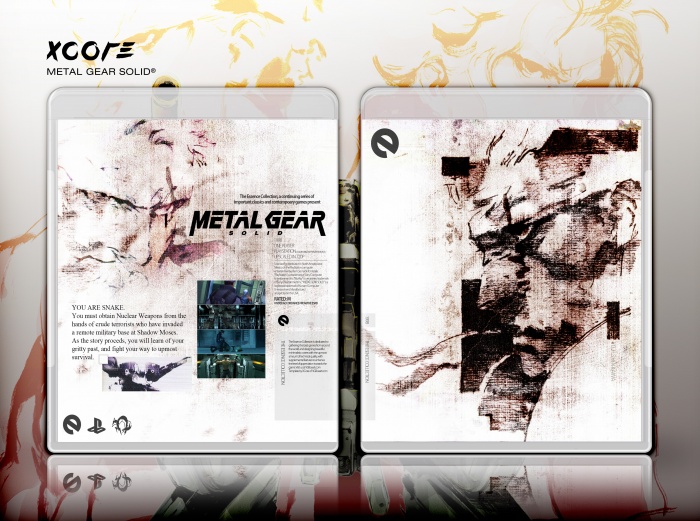
The back sucks, I know.
[ Reply ]
Oh my.
This is.. Just amazing. Honestly, that front cover is just stunning and the back wonderfully complements it, love what you did to the logo.
[ Reply ]
I really like it!
[ Reply ]
Woah.
[ Reply ]
Oh my.
[ Reply ]
Woaaahhhh
[ Reply ]
Oh my.
[ Reply ]
Oah my.
[ Reply ]
Fav cause it looks like a piece of artwork. Nice Jorb
[ Reply ]
#8, way to be a combo-breaker :P.
[ Reply ]
This is kick-ass!
[ Reply ]
I like it , I like it (JSRF)
And I would so print this...
And indeed respects the game.
All of it is great
[ Reply ]
this is so sick.
more games need to have an artistic feel to them like this here box.
NICE JOB +fav
touch up some of the stuff on the back and this would be the coolest most creative box i have yet to see
[ Reply ]
This is, possibly, one of the most fitting Essence boxes on the site. Truly, this should be used as an example of how to do good essence. Not only is it a very inspiring boxart, but a brilliant piece of art to match. Well done, in my opinion, you just clocked number 1 spot for Essence.
[ Reply ]
#14, Agreed.
This is the best Essence box on the site, bar none. It's truly a piece of art.
[ Reply ]
I'd expect nothing less than this level of awesome from you sir. Grade A gorgeous work across the board.
[ Reply ]
Damn, thanks guys. I seriously DID NOT expect a reception this good.
Best Essence box on the site, that's a big comment amongst the other awesome boxes, and I truly appreciate it.
Thanks to all, you have possibly made my day.
[ Reply ]
I'm just not digging it as much as everyone. Also, why would it be a Blu-Ray disc if it's a PSX game?
[ Reply ]
#18, Dunno. I just slapped it on a Blu-ray template because my essence template fits the dimensions of it.
Are you not digging it because, it "doesn't capture the essence of the game"?
[ Reply ]
not bad but the fonts tracking is horrible ( maybe this will help you? link and you are mixing fonts with and without serifs in the copy on the back. Both is a very big no go!
I am missing some logos on the front as well
Edited at 1 decade ago
[ Reply ]
#20, It's an Essence box, which is why I'm missing some logos on the front.
I don't see whats wrong with the spacing at all...
I've updated the box, clearing minor nitpicks, and also added a printable.
[ Reply ]
#21, you don't see? there's almost no room between 95% of all characters and between a lot of words. the "00" of "2009" looks almost like a giant, squeezed 8. the "r" of "registered" is a "i" without the point on top, since it's that much on the "e". the "cl" of "classics" is more a "d", and so on. from a typographic point of view it's just horrible, I am sorry. something that sould give any designer the shivers.
Edited at 1 decade ago
[ Reply ]
#22, I don't know at all. I didn't edit the spacing at all. I typed normally, using Kozuka Gothic Pro. Maybe the problem lies with the font, I don't know. I didn't edit the tracking or anything.
[ Reply ]
It's a nice box, only I don't think it lives up to some of the comments people have been saying. I don't think it's your best MGS box, personally - Maybe I just can't particularly see the effort or the 'essence' part of the box, it looks fairly simple in terms of editing.
Anyway, I'm favouriting this, I like the colours and cold mood of the box. Good work.
[ Reply ]
#23, even though you did not edit it it's horrible. a designers job is to look at such stuff
[ Reply ]
#25, I'll make sure I do so next time.
[ Reply ]
I'm sorry, i don't see how this box is capturing the essence of the game..
It just seems like a 'normal' metal gear solid box.
A very fancy,good-looking one though.
Please, explain me how this captures the essence.
[ Reply ]
#27, I guess your implying, by capturing the Essence of a game, you must capture the essence of gameplay?
Because, as far as I can see, I have captured the essence of Metal Gear Solid. If you look at the artistic value the title provides, then you can see what I mean. Capturing the essence, doesn't necessarily mean capturing the essence of gameplay, as I believe your implying. I can capture the essence of various other aspects of a game, and in my case the artwork.
And, making an essence box doesn't mean you must capture the essence of the game itself.
[ Reply ]
Superb.
Edited at 1 decade ago
[ Reply ]
#28 What do you mean by capturing the essence of the artwork? Does that mean taking 2 pieces of art and putting a filter over them?
[ Reply ]
#30, If that's all he did, then sure. But looking past the technical aspects of the box, it is clear that he designed this very well. The storyline is reflected in this design, as well as the artwork. And most of all, it has EMOTION--defeated, doomed, yet conquering and hopeful.
I just noticed that I didn't fav this! *facepalm*, *quickly favs*
[ Reply ]
I love you, please let me pleasure you sexually.
[ Reply ]
#32, Sure.
[ Reply ]
A really good cover, but not the best. Like #24 said, "I don't think it lives up to some of the comments people have been saying". Some fantastic boxes from other people are underated... I mean, why???
[ Reply ]
Nah.
[ Reply ]
I'm sorry, but I have to agree with wasa-bi. Times New Roman doesn't fit here. The clash of TNR and the font you used for the specifications and 'Essence Collection presents...' is simply a nightmare.
Visually, it is pretty impressive due to the minimalism, but I'm really disappointed with the way you treated the typography.
[ Reply ]
I would love to see a version of this without screen shots and block images =]
[ Reply ]
Agree with Trev. Amazing though.
[ Reply ]
Nice box. Good detail and nice color.
[ Reply ]
2 of your boxes have become MasterWorks in 1 day? Crazy.
[ Reply ]
#40, just what i was thinking, lol.
[ Reply ]
:/
[ Reply ]
:/
[ Reply ]
Here's a neat little fun fact. If you invert the colors, you get the black/blue-green color scheme that's often used for MGS.
[ Reply ]
nicee. I never knew that,
[ Reply ]