sorry but the renders are kinda placed on the box randomly.... i say this is kinda below par for you but thats just my opinion. but the renders are nice :D
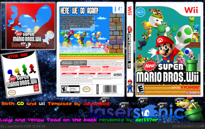
#17, For starters, the red on the template. Not likin.
Also, Character placement, and choices, seem a bit too random. For instance, why that one koopaling instead of another one? Also, yoshi is randomly placed in mid-air. Also, the colour of that sky is gross.
The back is 10000x better than the front, but not perfect. The way you have done the screenshots seems a bit similar to my NSMBW box, which I dont have a problem with, but I can help you make them look better. Try turning the opacity of the blocks or changing the layer mode to overlay. Another thing is that the characters on the back seem a bit too straight and organised. Try moving the characters vertically to make it look a bit more like the frenzy this game is suppposed to represent. Also, I would like the tagline/text moved a bit more to the right.
Also, that soundtrack is revolting. Sorry, but a red gradient with silhouettes is very effortless as well as unattractive. Especially the bright red against bright blue also makes a really painful contrast.
Finally, that game guide is the worst bit. Its shocking. It honestly looks like you made it in microsoft word. You obviously put no effort into that whatsoever, as the words "Game guide" arent in the centre, the character silhouettes arent straight, and the logos are not straight either and overlapping the logo.
 New Super Mario Bros. Wii Box Cover Comments
your best box EVAR i love it creative nice renders and just awsome 5/5 10/10 +fav
[ Reply ]
Hey guys
my latest work
I usually don't post this much
but it's been snowing in where I live so there's no school for 3 days
Please view in full
EDIT:#1,Wow you beat me
Edited at 1 decade ago
[ Reply ]
Alright, this is better then good. Better then great. Well it's just F*ckin' great!
[ Reply ]
#2, really lasersonic i dont know how you can top this
[ Reply ]
#4, I meant beat me to first to comment
#3, Thanks
[ Reply ]
#4, i know i beat you to first comment i was just saying this is your best box
[ Reply ]
Um, give credit to del337er, he made those renders.
[ Reply ]
#7, I did, it's on the image
So.... how's the box
Edited at 1 decade ago
[ Reply ]
Wow, really big improvement over your previous ones. Good job, and keep up the good work. BTW, what program do you use?
[ Reply ]
#9, Photoshop CS4
Edited at 1 decade ago
[ Reply ]
Holy freaking crap thats great!
[ Reply ]
#11, Thanks
[ Reply ]
#8, Oops sorry, didn't see it. *Looks down awkwardly*
[ Reply ]
#13, So, do you like the box?
[ Reply ]
TBH, I dont know why everyone loves it. I hate it.
[ Reply ]
sorry but the renders are kinda placed on the box randomly.... i say this is kinda below par for you but thats just my opinion. but the renders are nice :D
[ Reply ]
#15, do you mind saying why?
#16, I know it's randomly placed, that's the point of this box.
[ Reply ]
#17, For starters, the red on the template. Not likin.
Also, Character placement, and choices, seem a bit too random. For instance, why that one koopaling instead of another one? Also, yoshi is randomly placed in mid-air. Also, the colour of that sky is gross.
The back is 10000x better than the front, but not perfect. The way you have done the screenshots seems a bit similar to my NSMBW box, which I dont have a problem with, but I can help you make them look better. Try turning the opacity of the blocks or changing the layer mode to overlay. Another thing is that the characters on the back seem a bit too straight and organised. Try moving the characters vertically to make it look a bit more like the frenzy this game is suppposed to represent. Also, I would like the tagline/text moved a bit more to the right.
Also, that soundtrack is revolting. Sorry, but a red gradient with silhouettes is very effortless as well as unattractive. Especially the bright red against bright blue also makes a really painful contrast.
Finally, that game guide is the worst bit. Its shocking. It honestly looks like you made it in microsoft word. You obviously put no effort into that whatsoever, as the words "Game guide" arent in the centre, the character silhouettes arent straight, and the logos are not straight either and overlapping the logo.
Summary: Ick.
[ Reply ]
awesome box, probably your best work 5/5
[ Reply ]
#18, thank you for NOT beening harsh
#19, Thanks
Edited at 1 decade ago
[ Reply ]
#20 It's called critcism. Deal with it
And besides, I agree with him. It's good, but it could be better. The sky is very boring and has no color and the characters are randomly placed.
Fix all those things and it will be much much better.
P.S: forgot to say, Increase the opacity of the screenshots too
P.S.S: You mispelled "sountrack"
P.S.S.S: #22 I'm a ninja
Edited at 1 decade ago
[ Reply ]
#20, It's called critisism. He was trying to help you.
EDIT: #21, Damn you beat me. xD
Edited at 1 decade ago
[ Reply ]