[ Box updated on January 25th, 2010 ] [ original ]
 The Legend of Zelda Twilight Princess Box Cover Comments
Comment on silent_calling's The Legend of Zelda Twilight Princess Box Art / Cover.
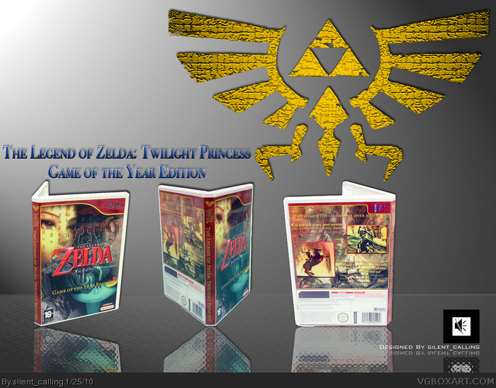
Credit to Deoxys,
Photos taken from google images,
Hylian Text was handtyped with a downloaded font.
[ Reply ]
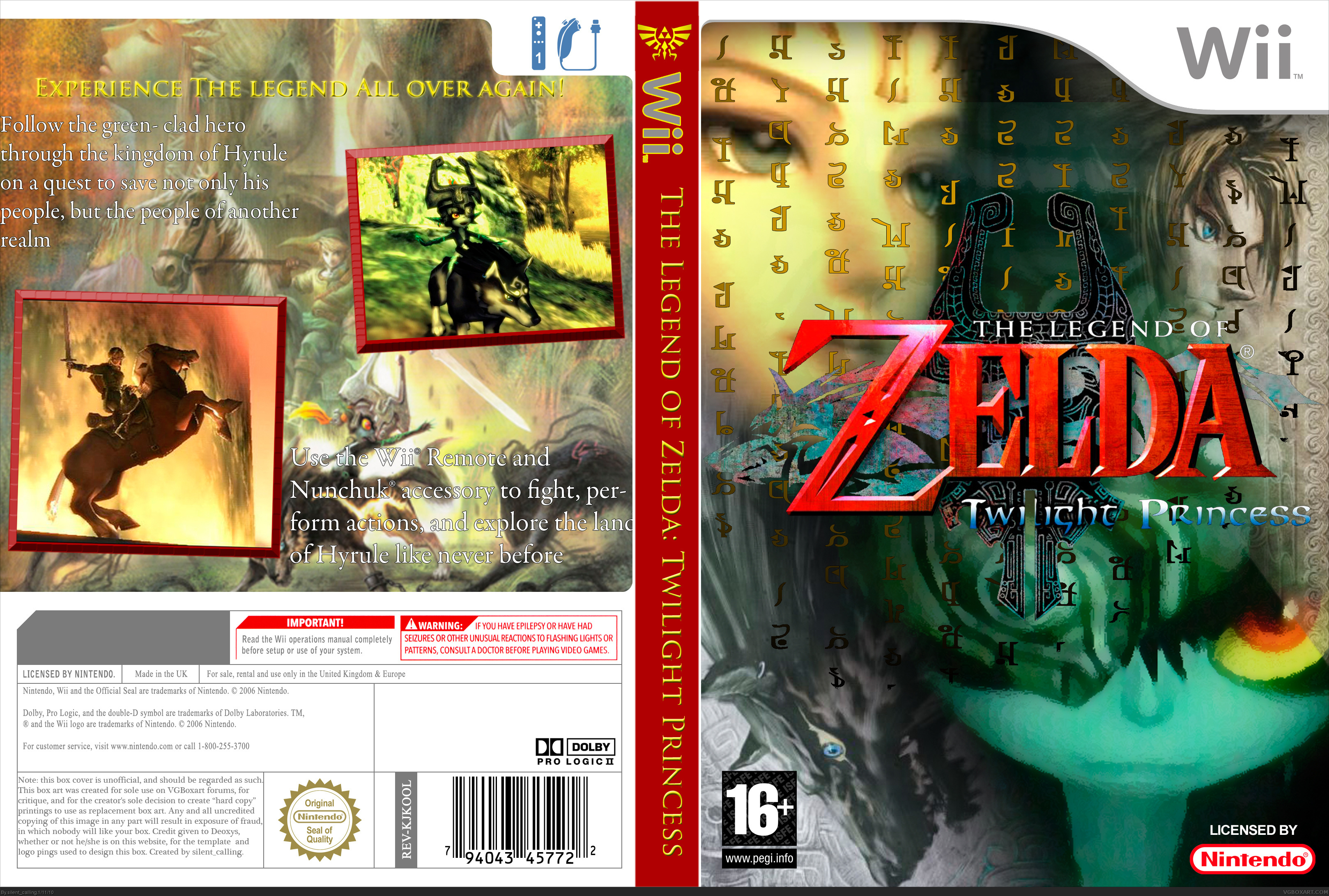
the back isnt that good, (text isnt legible) but i love the front!
[ Reply ]
Front is really nice but the back is bland and the red spine just looks odd.
[ Reply ]
This was good from far away, but when I zoomed in, it looked really bad
[ Reply ]
I LOVE THIS +fav just dont like the back as much as the front
[ Reply ]
#5, Thanks for the fave. I really appreciate it.
For everyone, however,
I will be improving upon this tomorrow at school. The red spine will become similar to the actual box's spine(and if I can pull it off, the rest of the white wii cover outer,too!) and I will be editing the back to be more appealing. I will also re- align the pictures and take the crap border off of them. how's that sound?
[ Reply ]
So, I've updated the box, and I am really pleased with the v2.0 I've created. Opinions?
[ Reply ]
Ohman this is a awesome cover O.O, u did a really great work dude XD
[ Reply ]
Thanks, but this is not the completed work. I'll update it real quick, if I can...
EDIT: got a new version up. What does everyone think?
And I got the printable version up, as well.
Edited at 1 decade ago
[ Reply ]
wow this is still just amazing
[ Reply ]
Good box. Pointless presentation. You'll grow into the artist who looks back at your boxes and says, "Woah, what did I need that giant Hyrule crest up there for, and why the hell did I put the cover art on a box at that angle?"
You're still growing as an artist, so you're prone to make mistakes. I sure did. Overall though, it isn't that bad. I love the set up of the front, although I think you could have applied some text effects to the text on the front, or to the image behind the text to make them blend better together. The back is a bit bland, but you pulled it off nicely, and doesn't scream "I'm taking up space with these screenshots", like I've seen on other boxes. All in all, it's good.
[ Reply ]