Ok, this box is for my college assignment, like I mentioned in the forums. I wasn't sure whether to upload it or not, just incase they find the box, but i can prove its me by logging in I guess :P
Let me know what you think! This has taken me 2 or 3 days to complete and its my favorite box of my creations, I hope you guys like it too.
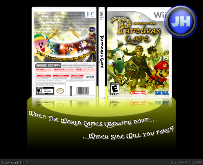
Credit to:
Jevangod - Temp
GameRoomProductions - Mario render
Planet renders - Pit, Ike, Link and Kirby renders.
I did the rest myself. Thanks to everyone who commented in the WiPs to help me out :)
EDIT
View in full if you want to read the synopsis, its actually visible in full view :P
#2, Thanks Seth :)
#3, Thanks Tleeart, and thanks for the help in the WiPs :)
#7, There's nothing wrong with using reconisable fonts, i see people using the sonic font all the time for sonic boxes, but theres nothing wrong with that, you use something that you think goes well with the theme of the box.
#8, Thanks, I've got my fingers crossed that i get a good grade xD
I like it, but...
Mario looks like a giant guy in comparison with the other guys; the upper-right corner of the front side of the template it's kinda choppy; the synopsis is not sharp and it's very hard to read with that colorful background behind it; I don't like the place where you placed the tagline, and the way you placed it; the shadow and the texture on the logo looks weird; the ESRB and the SEGA logos should be placed a bit to the left; and I don't like the way you placed the screenshots and that white glare.
Good box, indeed, but there's some things you can fix.
#12, Thanks for the feedback, I'll try and edit these and update as soon as I can. But I like the placement of the tagline, maybe if i edit it a little bit it might suit where it has been placed and match the rest of the box.
#13, Thanks, it was the best rendered link i could find and someone had edited him to make him look different so I couldnt do much about that :P
#9, Sonic font for Sonic boxes makes sense. But a dark gothic styled font for a light hearted Nintendo game doesn't. Maybe it's just me because I've seen that font used in its intended setting but I don't think it fits well at all.
 SSB: Pandora's Gate Box Cover Comments
Ok, this box is for my college assignment, like I mentioned in the forums. I wasn't sure whether to upload it or not, just incase they find the box, but i can prove its me by logging in I guess :P
Let me know what you think! This has taken me 2 or 3 days to complete and its my favorite box of my creations, I hope you guys like it too.
Credit to:
Jevangod - Temp
GameRoomProductions - Mario render
Planet renders - Pit, Ike, Link and Kirby renders.
I did the rest myself. Thanks to everyone who commented in the WiPs to help me out :)
EDIT
View in full if you want to read the synopsis, its actually visible in full view :P
#2, Thanks Seth :)
#3, Thanks Tleeart, and thanks for the help in the WiPs :)
Edited at 1 decade ago
[ Reply ]
Good job on this dude, i love the logo :D But you prob already kno what i think ;)
[ Reply ]
It came out pretty nice. Like del337er, I'm sure you know what I think, too.
[ Reply ]
I like the logo alot.
Hope you get a good grade.
[ Reply ]
#4, Thanks, glad you like the logo :)
#6, Thanks :)
Edited at 1 decade ago
[ Reply ]
It's pretty good. I also hope you get a good grade. :)
[ Reply ]
Font is The Dark Crystal. Try not to use recognizable fonts.
link
[ Reply ]
#7, What's so bad about him using that font?
Anyway nice job jayhog, hope you get a good grade.
[ Reply ]
#7, There's nothing wrong with using reconisable fonts, i see people using the sonic font all the time for sonic boxes, but theres nothing wrong with that, you use something that you think goes well with the theme of the box.
#8, Thanks, I've got my fingers crossed that i get a good grade xD
Edited at 1 decade ago
[ Reply ]
I LIKE IT+FAV!
[ Reply ]
#10, Thanks :)
[ Reply ]
I like it, but...
Mario looks like a giant guy in comparison with the other guys; the upper-right corner of the front side of the template it's kinda choppy; the synopsis is not sharp and it's very hard to read with that colorful background behind it; I don't like the place where you placed the tagline, and the way you placed it; the shadow and the texture on the logo looks weird; the ESRB and the SEGA logos should be placed a bit to the left; and I don't like the way you placed the screenshots and that white glare.
Good box, indeed, but there's some things you can fix.
[ Reply ]
Good job on this! Not feeling the effect on Link... but not bad.
[ Reply ]
#12, Thanks for the feedback, I'll try and edit these and update as soon as I can. But I like the placement of the tagline, maybe if i edit it a little bit it might suit where it has been placed and match the rest of the box.
#13, Thanks, it was the best rendered link i could find and someone had edited him to make him look different so I couldnt do much about that :P
Edited at 1 decade ago
[ Reply ]
Why is Link the main focus? Its still good though. Fav.
[ Reply ]
Mario seems quite dull, still it's a good box.
[ Reply ]
#9, Sonic font for Sonic boxes makes sense. But a dark gothic styled font for a light hearted Nintendo game doesn't. Maybe it's just me because I've seen that font used in its intended setting but I don't think it fits well at all.
[ Reply ]
#17 I wouldn't say that, the logo font is from Dark Crystal, a rather playful fantasy movie with puppets. It fits with Zelda or Kid Icarus.
Really nice work.
Edited at 1 decade ago
[ Reply ]
#15, I didn't mean to give him the center of attention, I put him in the center at the front because it didn't look right when he was behind them.
#16, That's because I edited the saturation a bit to try and get him the same as the rest.
#17, I thought the font suited the name of the game thats what I usually go for. For the font to suit the name and then i fit the art around it.
#18, Thanks :)
[ Reply ]
Nice concept! Really creative!
+fav
[ Reply ]
#20, Thanks man :)
Oh and I think I'm like only one fav from rank 5 :D
Edited at 1 decade ago
[ Reply ]
I really like this its the kind of thing youd see on shelvs fav
[ Reply ]
Yours will really stand out in the class, I bet your friends haven't even been near Photoshop. A+. why can't my school do fun projects?
[ Reply ]
#23, College :P
I'm from England different courses and education system.
But thanks man, and yeah you're right, they havent been near Photoshop :P
Edited at 1 decade ago
[ Reply ]