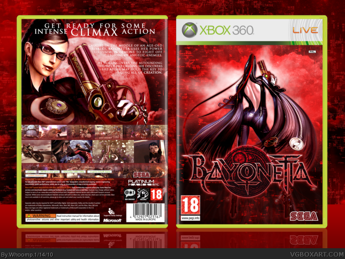
This box is probably the one I have spend the most time on out of all my boxes, I don't think it was in vain and in the end I got the look I had in mind when I started with it.
#2, I was a little curious where you found the shot of Bayonetta you used on the front. It's pretty cool. I love how you continued that gritty red effect across the box. I'm not too keen on the font for your description, but all in all it's really good.
#3, Thanks. I found that pic here: link I heavily edited the colors and had to render the witch as well, which was a challenge. About the font, I wanted to go with something a little more elegant but maybe it's a little boring so I will check if I can find a more fitting font.
#6, Way to pay attention. I rendered Bayonetta and created an custom background composed of 5 pictures with one of them being the japanese cover-image. I realize it looks similar but there really aren't many coverart-friendly images of Bayonetta and since I made the background first (for some odd reason) I didn't want to waste that.
I feel stupid. I can't save the picture...I'm using Firefox. I don't NEED the picture, but if you could tell me what I'm doing wrong it would be helpful.
Technically the front image is the original official front before they changed it ;P looks great though Whoomp. Love the editing and color. i find the top/bottom set of screenshots rather random though and kind of pointless as you can't really see whats going on in them either.
The front is basicly just the japanese and asia front with new color... (yeah and I did read #6, but it doesn't change the fact it is BASICLY just like the japanese/asian one).
 Bayonetta Box Cover Comments
Awesome man, nice job! I was watching this in the WiP's but ididnt really know what you could improve :P
[ Reply ]
#1, Thanks, it really makes me glad to hear that!
This box is probably the one I have spend the most time on out of all my boxes, I don't think it was in vain and in the end I got the look I had in mind when I started with it.
Credits to Indexenos for the fantastic template.
[ Reply ]
#2, I was a little curious where you found the shot of Bayonetta you used on the front. It's pretty cool. I love how you continued that gritty red effect across the box. I'm not too keen on the font for your description, but all in all it's really good.
[ Reply ]
#3, Thanks. I found that pic here: link I heavily edited the colors and had to render the witch as well, which was a challenge. About the font, I wanted to go with something a little more elegant but maybe it's a little boring so I will check if I can find a more fitting font.
[ Reply ]
Just amazing, I agree with Tleeart about the front too, awesome job! The font choice could have been a little better but this one works too.
[ Reply ]
I don't like the front. It's just a red version of the Japanese official.
link
[ Reply ]
Very nice! Love the screens on the back!
Tror du att du kan skicka en lank till Xbox 360-fodralet, har svart att hitta det? :)
Edit:
#6, Please...
Edited at 1 decade ago
[ Reply ]
#6, Way to pay attention. I rendered Bayonetta and created an custom background composed of 5 pictures with one of them being the japanese cover-image. I realize it looks similar but there really aren't many coverart-friendly images of Bayonetta and since I made the background first (for some odd reason) I didn't want to waste that.
[ Reply ]
I feel stupid. I can't save the picture...I'm using Firefox. I don't NEED the picture, but if you could tell me what I'm doing wrong it would be helpful.
[ Reply ]
wow love it fav
[ Reply ]
Intense climax action.
[ Reply ]
#11, Right! *fap fap fap*
Technically the front image is the original official front before they changed it ;P looks great though Whoomp. Love the editing and color. i find the top/bottom set of screenshots rather random though and kind of pointless as you can't really see whats going on in them either.
[ Reply ]
Damn that is too sexy for words, my bayonetta box is comign soon, hey Whoomp can you send me that moon please!
[ Reply ]
The front is basicly just the japanese and asia front with new color... (yeah and I did read #6, but it doesn't change the fact it is BASICLY just like the japanese/asian one).
Edited at 1 decade ago
[ Reply ]
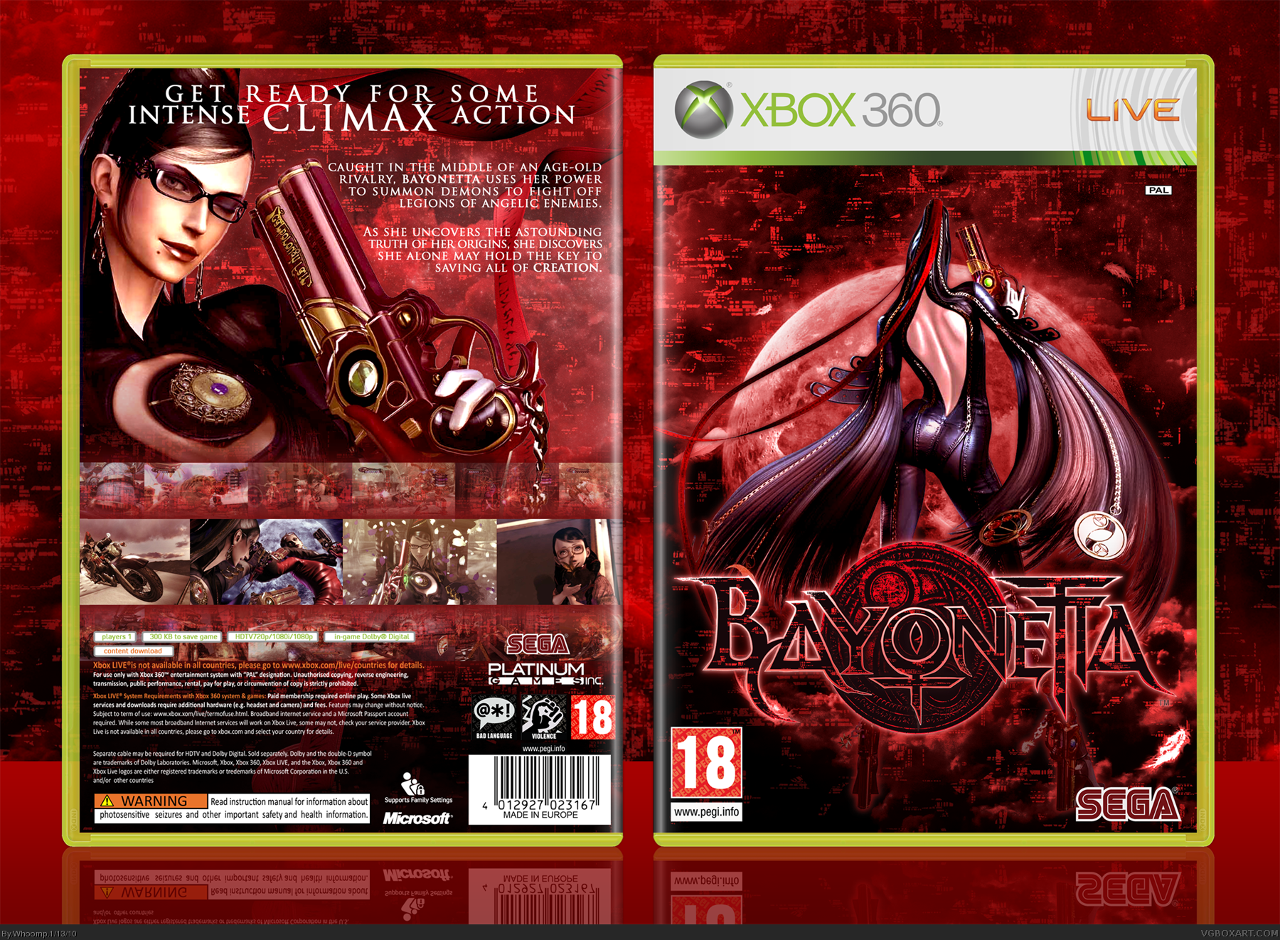
Updated the front and back. Hopefully it looks a little more unique now.
[ Reply ]
#15, yes, but the text on the back is hard to read on the very bright parts of the moon ;)
[ Reply ]
#15, V2 looks great and so does V1 sheesh people :D
[ Reply ]
V1 looked fine to me, but this is great too. Wasa-bi has a point about the font though, a little too plain I think and a little difficult to read.
Nice job, and I really need to try this game sometime...
[ Reply ]