[ Box updated on January 21st, 2010 ] [ original ]
 Super Puzzle Fighter II Turbo HD Remix Box Cover Comments
Comment on spypilot's Super Puzzle Fighter II Turbo HD Remix Box Art / Cover.
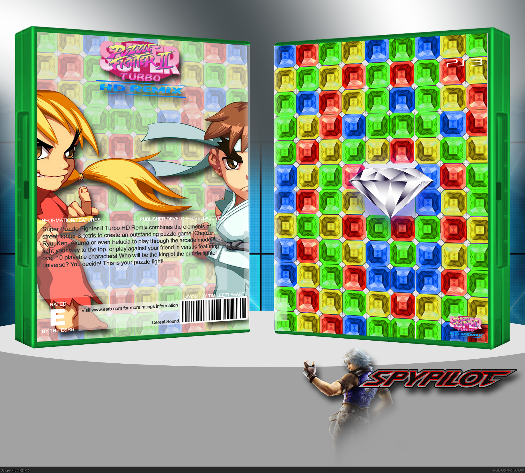
[ Box updated on January 21st, 2010 ] [ original ]
Comment on spypilot's Super Puzzle Fighter II Turbo HD Remix Box Art / Cover.
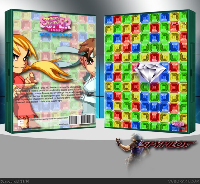
my latest, sorry for the small size, please view in full :)
i wanted to make a simple box, i had this idea ever since i played the game, but i couldnt find any gems, until shady helped me out! thanks for the gems, bro! This took about 2 hours to make.
Credit:
Tleart: Template
Shady: Gems
Stevencho, my username logo
[ Reply ]
Not bad, though I have some crit.
- Its not quite 3D'ed correctly, bits seem to be skewed off a little, and others don't.
- The front just doesn't fit with the back and quite frankly just overwhelmes.
- The back is much better, but there are some really bad spelling mistakes, and you missed out all of the info and left 'template instruction' writing on the back, above your main text.
Like I said, some improvement is needed overall =)
On a second note, I wish Roza + Hyper_Sonic wouldn't fav every box one of thier 'friends' make, haha =P
[ Reply ]
The back is kinda nice but the front is boring. I agree with Silent Oblivion about the 3D, also if it's for the PS3, why the green case? I know it's not mandatory to use the blu ray one, but it looks strange like this.
[ Reply ]
#2, damn, i was hoping someone wouldnt notice the year stuff :P. anyways i cant spell very well, and theres no spellcheck in photoshop, PLUS i did that text stuff in cs4, and cant edit it anymore :(. thanks for your critique, but how come the front isnt good? as a matter of fact, i thought it was better than the back! also, how did i skew badly? i cant see it.
[ Reply ]
#4, The back SSF logo is off, and well as the front diamond. The people may also be slightly off, but thats hard to see, and not much to worry about.
Even if you are bad at spelling, it doesn't mean you can't use Capitals (in your forum posts, I mean)
[ Reply ]
#5, shit, tell me after im done! :P
ill notify you when i update this again, im gonna be really busy, so i wont see another update till next week.
oh yeah, silent, there is no way to center that diamond.
Edited at 1 decade ago
[ Reply ]
#4, There is a spell check in Photoshop..well in 7.0 there is
Anyway yeah I agree with Josh the front and back clash like mad.the look fine on there own but when put together..they clash .I would also put more "Gems" behind the Diamond because the gaps look strange.
But all in all it's not a bad box.. :)
Edited at 1 decade ago
[ Reply ]
#7, yeah, i use 5. okay, ill consider the gems when i update
:)
[ Reply ]
wow, i am not made to make simplistic covers :P
[ Reply ]
I like +fav
[ Reply ]
This game is epic.
This box is epic.
I really like it XD
[ Reply ]