#1, Well, its an improvement. So congrats on that. But it is not great. What you need to work on is placement of stuff on the back.
- The render, good job in using one, but the placement needs to be better.
- The text, you need to work on that, making it more legible. I suggest something like a drop shadow, and a better text.
- Also you might want to use some screen shot borders.
So work on that stuff, but you have made an improvement.
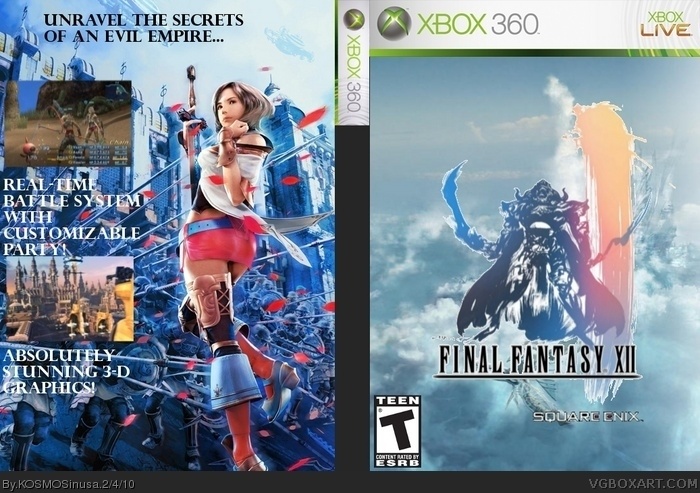
 Final Fantasy XII Box Cover Comments
Besides The fact that the spine is empty what do tou think?
[ Reply ]
its pretty cool reminds me of the final fantasy x box 3.5/5
[ Reply ]
#1, Well, its an improvement. So congrats on that. But it is not great. What you need to work on is placement of stuff on the back.
- The render, good job in using one, but the placement needs to be better.
- The text, you need to work on that, making it more legible. I suggest something like a drop shadow, and a better text.
- Also you might want to use some screen shot borders.
So work on that stuff, but you have made an improvement.
[ Reply ]
This Box design Consists of.
1) A Template
2) a Cut out Background
3) a Logo
ad least it's better than that recent Stupid Digimon upload lol.
[ Reply ]
I think it is a little far from posting. Good start, though.
[ Reply ]
#3, what in the WORLD is drop shadow?!
[ Reply ]
#2, THATS WHAT I WAS AIMING FOR!
[ Reply ]
#6, Really? What program are you using? GIMP?
[ Reply ]
#8, Yup I just recently learned how to use the basics of it (Gimp).
[ Reply ]
#9, your first one with gimp was better... this took under 30 minutes, i think..
#2, seriously? I would give this a 1.2/5
Edited at 1 decade ago
[ Reply ]
#10, What's so bad about it?
[ Reply ]