I am very sorry but this is terrible.
Ok where to begin?
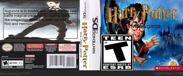
1)The different parts look like they have just been slapped on with no care.
2)Conflicting ratings, On the front it says Teen and on the back it says Mature.
3)The T logo is WAY to big.
4)You have "the video game" going over harry's eyes (In what looks like Arial) And all in lower case
5) The write up is terrible. Apart from the spelling mistakes i would not pick this game up if this were the real box. If you are going to make a back to a box you should put some screens in there and a nice big clump of information about the game (Basic storyline, Features ETC)
There is just so much wrong with this i can't even list it all.
I suggest you start to use the forum and ask for critique before posting any more boxes.
FUCK!!!!(I like to use profanity for these types of boxes in hopes that these underage users' parents will stumble upon it and not let their children visit this site anymore.)
I wont read #2's comment because I am bound to steal his words. So here's my true opinion. I'm not trying to be mean, this is just what I think. 1. Schoolastic isn't a developer or publisher. 2. The teen rating IS FREAKING HUGE. WHY. 3. Cant you have put "the video game" in a different color besides black? And couldn't you have added some upper-case letters? 5. The rating on the back is Mature, even though the rating on the front is Teen. *sigh....* 6. The text on the back looks awful. You just threw a picture of Harry on the background, and slapped on some text. In the text, you misspell Hogwarts, Harry's, Hermione, and Wingaurdian. Again, no other text color besides black? And no capitals? Yeah. Great box. 0/10. No effort was put into this.
WHY THE HELL IS THE TEMPLATE SO DAMN BIG?!!
WHY DOES IT SAY RATED T ON THE FRONT, BUT RATED M ON THE BACK?!!
A SCHOOLASTIC VIDEO GAME?!!
WHICH PART IS THIS? IT JUST SAYS HARRY POTTER THE VIDEO GAME!!
THE FRONT HAS A CARTOON HARRY, BUT THE BACK HAS A REAL ONE!!
 Harry Potter Box Cover Comments
I'm a big fan of HP so I made this one. Wanted it to be for the DS so you could use your stylus to cast spells, etc.
Please rate and comment
[ Reply ]
I am very sorry but this is terrible.
Ok where to begin?
1)The different parts look like they have just been slapped on with no care.
2)Conflicting ratings, On the front it says Teen and on the back it says Mature.
3)The T logo is WAY to big.
4)You have "the video game" going over harry's eyes (In what looks like Arial) And all in lower case
5) The write up is terrible. Apart from the spelling mistakes i would not pick this game up if this were the real box. If you are going to make a back to a box you should put some screens in there and a nice big clump of information about the game (Basic storyline, Features ETC)
There is just so much wrong with this i can't even list it all.
I suggest you start to use the forum and ask for critique before posting any more boxes.
[ Reply ]
Arrrrrrgh it's so horrible! It's like opening the Ark of the Covenant.
Disruptor took up the duty of telling you what's wrong with it and I agree with him 100%
PLEASE stop posting until you get better because your crappy boxes are bumping better ones off the front page.
[ Reply ]
FUCK!!!!(I like to use profanity for these types of boxes in hopes that these underage users' parents will stumble upon it and not let their children visit this site anymore.)
[ Reply ]
Worst box of 2010 I seen so far.
[ Reply ]
I wont read #2's comment because I am bound to steal his words. So here's my true opinion. I'm not trying to be mean, this is just what I think. 1. Schoolastic isn't a developer or publisher. 2. The teen rating IS FREAKING HUGE. WHY. 3. Cant you have put "the video game" in a different color besides black? And couldn't you have added some upper-case letters? 5. The rating on the back is Mature, even though the rating on the front is Teen. *sigh....* 6. The text on the back looks awful. You just threw a picture of Harry on the background, and slapped on some text. In the text, you misspell Hogwarts, Harry's, Hermione, and Wingaurdian. Again, no other text color besides black? And no capitals? Yeah. Great box. 0/10. No effort was put into this.
[ Reply ]
awsome esrb size, dude! the best on the entire world!
[ Reply ]
I am convinced that you were trying to make this one bad.
[ Reply ]
This was my first with paint.net so its not as good as my others because I was jus tlearning how to use the program
[ Reply ]
Wait if it was your first with paint, and you posted this one th 11th, how many other boxes could you make in such a short time?
[ Reply ]
#10, Well it takes him roughly 10 minutes to make a box
EDIT: OMG SCHOLASTIC HAHAHAHAHA!!!!!!
Edited at 1 decade ago
[ Reply ]
WHY THE HELL IS THE TEMPLATE SO DAMN BIG?!!
WHY DOES IT SAY RATED T ON THE FRONT, BUT RATED M ON THE BACK?!!
A SCHOOLASTIC VIDEO GAME?!!
WHICH PART IS THIS? IT JUST SAYS HARRY POTTER THE VIDEO GAME!!
THE FRONT HAS A CARTOON HARRY, BUT THE BACK HAS A REAL ONE!!
THESE BOXES OF YOURS JUST GET WORSE EACH TIME!!
[ Reply ]