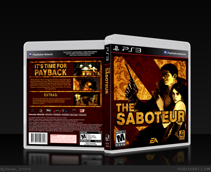
[ Buy The Saboteur at Amazon ] » 2012 Hall of Fame Winner! By Spiner_ 42 on February 13th, 2010 No Printable Available The Saboteur Box Cover Comments Comment on Spiner_'s The Saboteur Box Art / Cover. Cancel Reply Spiner_ 42 [ 1 decade ago ] Hi! Not much to say... Credits: Scorpion Soldier for template Sens for plastic template Comments and critiques are appreciated, as always! [ Reply ] LEGOslayer 42 [ 1 decade ago ] I digging this for sure. [ Reply ] TheSlyder 41 [ 1 decade ago ] It's pretty good. It's definitely fitting with the game's style. [ Reply ] deiviuxs 46 [ 1 decade ago ] Back is a bit plain and I don't like the font used for description, but the overall design and colors are great! +FAV [ Reply ] afifan000 44 [ 1 decade ago ] You really deserve an HoF. [ Reply ] Spiner_ 42 [ 1 decade ago ] #2, Thanks, I'm glad you like it. #3, Thanks. #4, Yeah, I wasn't that sure about the font either. I always have a problem with description fonts. Thanks anyways. #5, Thank you really much! [ Reply ] iNova 27 [ 1 decade ago ] So im pretty much in love with this! +Fav+Fan [ Reply ] sd1833 48 [ 1 decade ago ] More attention is needed, this is one of your best. [ Reply ] RoarShark 40 [ 1 decade ago ] Oh wow, this looks really good. I love the colors. They seems to work really well together. And I agree with sd1833, this needs more attention. [ Reply ] Bastart 49 [ 1 decade ago ] One of those great boxes I never saw, a true shame on me. How could I miss this? I love the colors and symbols :) [ Reply ] Eggboy'13 48 [ 1 decade ago ] I'm a magic man.. :D Congrats. [ Reply ] Majidblack 49 [ 1 decade ago ] It's best cover ever seen for (The Sabateur) Very nice job! [ Reply ] deiviuxs 46 [ 1 decade ago ] Glad to see older boxes getting the recognition they deserve. I wish Spiner was here to see it. [ Reply ]
 The Saboteur Box Cover Comments
Hi!
Not much to say...
Credits:
Scorpion Soldier for template
Sens for plastic template
Comments and critiques are appreciated, as always!
[ Reply ]
I digging this for sure.
[ Reply ]
It's pretty good. It's definitely fitting with the game's style.
[ Reply ]
Back is a bit plain and I don't like the font used for description, but the overall design and colors are great!
+FAV
[ Reply ]
You really deserve an HoF.
[ Reply ]
#2, Thanks, I'm glad you like it.
#3, Thanks.
#4, Yeah, I wasn't that sure about the font either. I always have a problem with description fonts. Thanks anyways.
#5, Thank you really much!
[ Reply ]
So im pretty much in love with this!
+Fav+Fan
[ Reply ]
More attention is needed, this is one of your best.
[ Reply ]
Oh wow, this looks really good. I love the colors. They seems to work really well together. And I agree with sd1833, this needs more attention.
[ Reply ]
One of those great boxes I never saw, a true shame on me.
How could I miss this? I love the colors and symbols :)
[ Reply ]
I'm a magic man.. :D
Congrats.
[ Reply ]
It's best cover ever seen for (The Sabateur)
Very nice job!
[ Reply ]
Glad to see older boxes getting the recognition they deserve. I wish Spiner was here to see it.
[ Reply ]