bigdaddy_gameboy [ Buy BioShock at Amazon ] By MasterKatsumi91 8 on February 23rd, 2010 No Printable Available [ Box updated on February 24th, 2010 ] [ original ] BioShock Box Cover Comments Comment on MasterKatsumi91's BioShock Box Art / Cover. Cancel Reply MasterKatsumi91 8 [ 1 decade ago ] its been a while since i posted a box hasn't it? oh well i like this box i made i find it nice! also i finally learned how to reflect my box! credit: template:roze big daddy:travownz i got the back screen shot of of google, enjoy Edited at 1 decade ago [ Reply ] Sgt.Sqeezle 4 [ 1 decade ago ] Remember when I thought you were better than me at backs? Maybe not anymore, sorry. I don't like the back. the front is pretty good, I guess. [ Reply ] MasterKatsumi91 8 [ 1 decade ago ] #2, its ok i know im not that good at backs but i never recall you saying i was better than you at backs. Edited at 1 decade ago [ Reply ] Adhiboy 37 [ 1 decade ago ] Something I noticed on your boxes are your backs. You shouldn't just put text over a wallpaper, try doing something else next time. [ Reply ] MasterKatsumi91 8 [ 1 decade ago ] #4, yea sorry, but the reason i did that was because it has the big daddy's hand holding the little sisters hand. that's why i put down "it takes a fathers touch.... ...or a daddy's drill" Edited at 1 decade ago [ Reply ] MasterKatsumi91 8 [ 1 decade ago ] #2, #4 UPDATED! i edited the back. you like? credit to silent oblivion for the scroll border around the text! [ Reply ] rpgfreak 14 [ 1 decade ago ] A good idea but not well executed. [ Reply ] MasterKatsumi91 8 [ 1 decade ago ] #7, alright, but i think that the front came out pretty good, but as i always say im not that good with backs. [ Reply ] Adam5366 26 [ 1 decade ago ] Fronts nice but the back is not so good. [ Reply ]
 BioShock Box Cover Comments
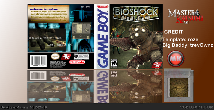
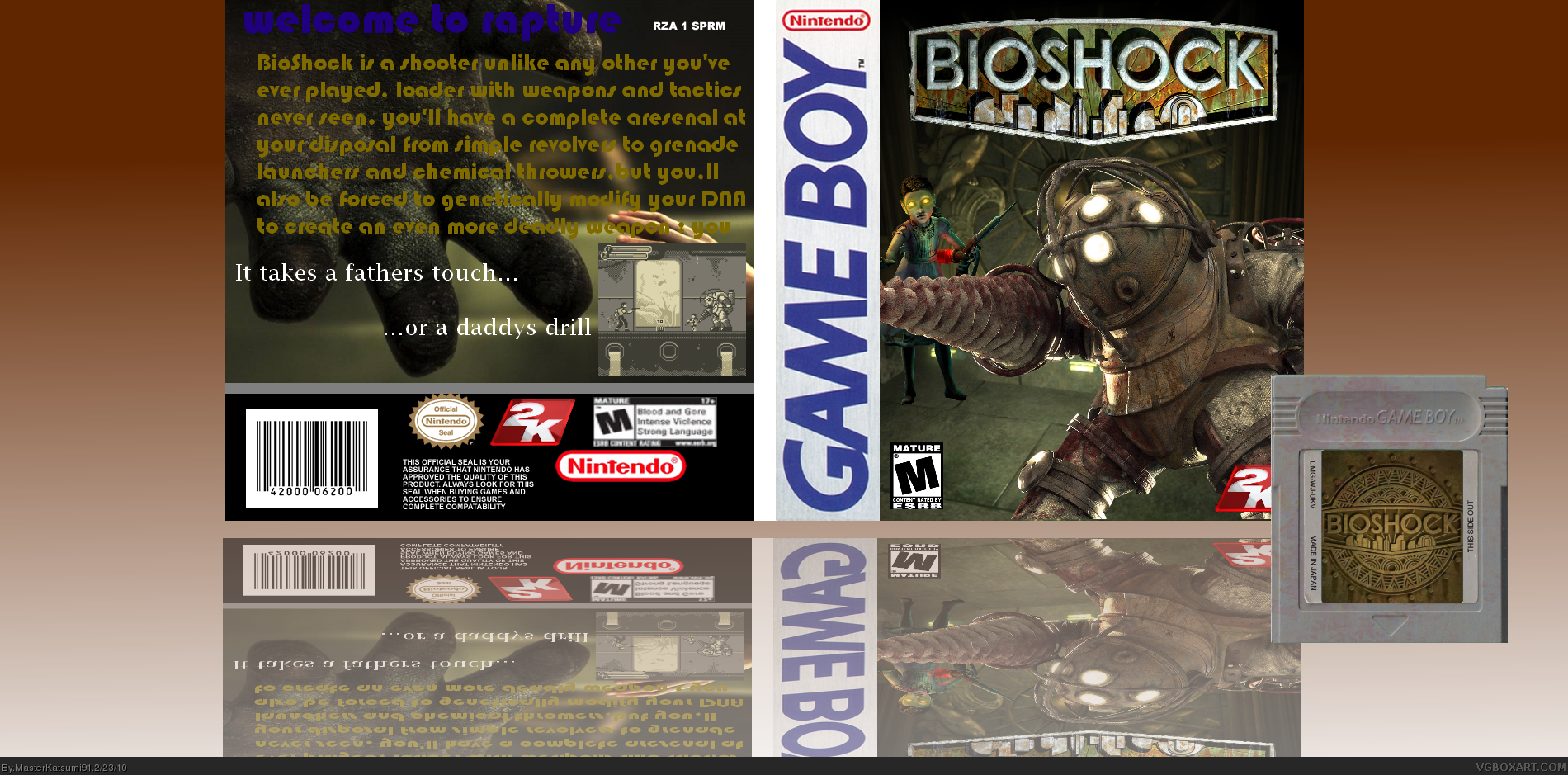
its been a while since i posted a box hasn't it? oh well i like this box i made i find it nice! also i finally learned how to reflect my box!
credit:
template:roze
big daddy:travownz
i got the back screen shot of of google, enjoy
Edited at 1 decade ago
[ Reply ]
Remember when I thought you were better than me at backs? Maybe not anymore, sorry. I don't like the back. the front is pretty good, I guess.
[ Reply ]
#2, its ok i know im not that good at backs but i never recall you saying i was better than you at backs.
Edited at 1 decade ago
[ Reply ]
Something I noticed on your boxes are your backs. You shouldn't just put text over a wallpaper, try doing something else next time.
[ Reply ]
#4, yea sorry, but the reason i did that was because it has the big daddy's hand holding the little sisters hand. that's why i put down
"it takes a fathers touch....
...or a daddy's drill"
Edited at 1 decade ago
[ Reply ]
#2, #4 UPDATED! i edited the back. you like? credit to silent oblivion for the scroll border around the text!
[ Reply ]
A good idea but not well executed.
[ Reply ]
#7, alright, but i think that the front came out pretty good, but as i always say im not that good with backs.
[ Reply ]
Fronts nice but the back is not so good.
[ Reply ]