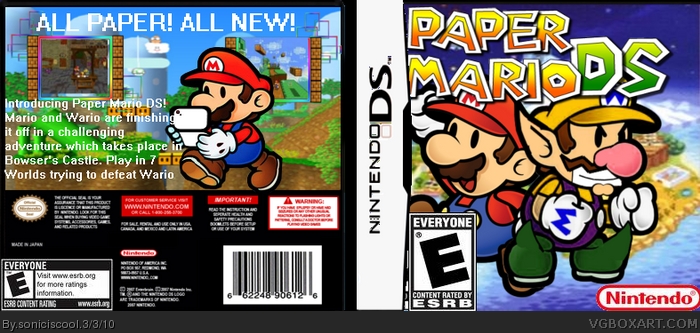
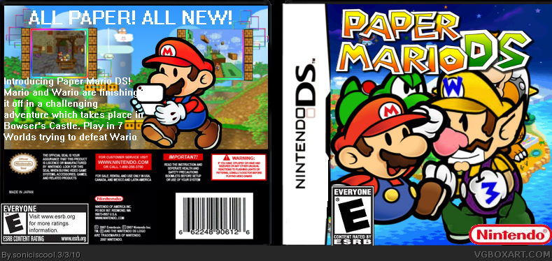
The age rating looks too big, and move the rendera and logo on the front to the right so that it's in the middle. It should also be easier to read the back of the box and see the screenshot.
The render and logo on the front are placed strangely and the ESRB is on steroids. Overall, not that bad. I can see you've improved since your first box.
The text goes over the plastic, ESRB is huge, renders are floating, temp has black dots on it... I could go on. I'm sorry but this is not your best work.
 Paper Mario DS Box Cover Comments
The renders,borders,template and logo all all from the Resource section. Other is from Google Images.
[ Reply ]
the front is a little cluttered; you can't even see bowser's face. also, the font on the back isn't too good. 3/5.
Edited at 1 decade ago
[ Reply ]
#2,I will fix the front.
EDIT:I just did.
Edited at 1 decade ago
[ Reply ]
The age rating looks too big, and move the rendera and logo on the front to the right so that it's in the middle. It should also be easier to read the back of the box and see the screenshot.
[ Reply ]
#4,I'll fix that later.
[ Reply ]
The render and logo on the front are placed strangely and the ESRB is on steroids. Overall, not that bad. I can see you've improved since your first box.
[ Reply ]
The text goes over the plastic, ESRB is huge, renders are floating, temp has black dots on it... I could go on. I'm sorry but this is not your best work.
Edited at 1 decade ago
[ Reply ]