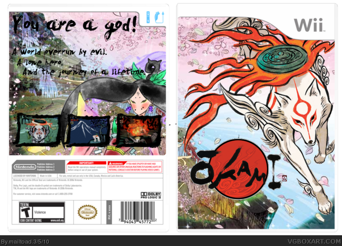
My first in a long time. I kind of see this as a return to form, and I hope you like it. It has a long story behind it, which I would like to touch on briefly. My work on this began after a family bereavement. I felt that I had to have a creative output, and so work began on this. At first, I had no idea which game I was going to do a box for, but then the beauty of Okami hit me. It seemed an obvious choice for me, and I decided to give it a go. This is how it turned out. I hated the esrb and developers logos on the front, so I decided to get rid of them. Comments and favs are more than welcome. Thank you for reading.
Mackjack, please read my first comment about esrb and dev logos. About screenshots, I just couldn't get them to work right. I didn't want to just shoehorn them on there, so I didn't put them on.
Sorry to hear about the bereavement man, but a little designing helps you think outwardly and take your mind off it IMO. And welcome back :)
Great job on the front it's flawless, besides the ESRB's but I actually read the first comment :P
However the back is lacking. The text is pretty hard to read and its very empty. Also I'm not sure whether those screen borders are too think compared to the artwork that you used. But I'm gonna fav it for that sweet front :)
 Okami Box Cover Comments
My first in a long time. I kind of see this as a return to form, and I hope you like it. It has a long story behind it, which I would like to touch on briefly. My work on this began after a family bereavement. I felt that I had to have a creative output, and so work began on this. At first, I had no idea which game I was going to do a box for, but then the beauty of Okami hit me. It seemed an obvious choice for me, and I decided to give it a go. This is how it turned out. I hated the esrb and developers logos on the front, so I decided to get rid of them. Comments and favs are more than welcome. Thank you for reading.
[ Reply ]
good job 10/10 +fav everything like the back :)
[ Reply ]
You forgot the esrb, dev logos and screenshots
[ Reply ]
Mackjack, please read my first comment about esrb and dev logos. About screenshots, I just couldn't get them to work right. I didn't want to just shoehorn them on there, so I didn't put them on.
[ Reply ]
Hm. I would have added screenies in a subtle way, however this is fantastic. If there were more artists like you in VGBA...
[ Reply ]
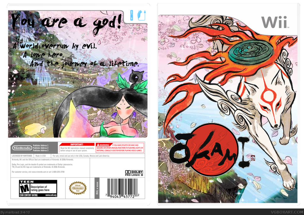
Updated with screenshots. Credit goes to qwerty for the screenborders.
Enjoy. Thanks for the comments #2 and #5, I really appreciate it.
[ Reply ]
I like it, But im not fond of the back text.
[ Reply ]
The front is good, but the back could use some work.
[ Reply ]
The front is missing the logo and esrb, and the back is to plain. But overall nice work, just work on the back a little more and I think you got it!
[ Reply ]
Thanks for the favs guys.
[ Reply ]
#9, Do you not read?
[ Reply ]
I like it :p
[ Reply ]
Damn you double post.
Edited at 1 decade ago
[ Reply ]
There needs to be more stuff on the back, but I like it, an Okami box is always nice to see. X)
[ Reply ]
Sorry to hear about the bereavement man, but a little designing helps you think outwardly and take your mind off it IMO. And welcome back :)
Great job on the front it's flawless, besides the ESRB's but I actually read the first comment :P
However the back is lacking. The text is pretty hard to read and its very empty. Also I'm not sure whether those screen borders are too think compared to the artwork that you used. But I'm gonna fav it for that sweet front :)
[ Reply ]